
TL;DR: Explore 18 iconic wordmark logo examples and discover how typography, spacing, letterforms, and visual balance make each brand distinctive and memorable. (Last updated on September, 18, 2026)
Quick Answers
Wordmark logo examples show how brands use typography, custom letterforms, spacing, and visual style to make their names instantly recognizable.
Famous examples include:
- Coca-Cola
- FedEx
- Disney
- Netflix
- Sony
- Canon
- Visa
- Zara
- Kellogg's
When people think of logos, they often imagine symbols, icons, or abstract marks. But some of the most recognizable brands in the world rely on something far simpler—and far more intentional: typography.
That’s where wordmark logo examples become incredibly useful.
Seeing how real brands apply wordmarks helps you understand why this logo style works, when it works best, and how subtle typography decisions can completely change brand perception.
A wordmark logo is a logo style that uses typography alone—without symbols or icons—to represent a brand name. The entire identity relies on letterforms, spacing, and structure, making design decisions especially important.
Whether you’re exploring logo ideas for your business or studying brand identity design, examples give context that definitions alone can’t.
Why Do Examples Matter When Choosing a Wordmark Logo?
Examples reveal what theory cannot. They show how typography behaves in real-world settings—on websites, packaging, signage, and digital platforms.
Common wordmark logo examples include:
- Global consumer brands
- Professional service businesses
- Digital-first and tech companies
- Personal and founder-led brands
Studying these examples helps you focus on structure, not surface-level trends.
For a clear comparison of a wordmark vs logo and guidance on choosing the right option for your brand, explore our detailed guide here.
Famous Wordmark Logo Examples: 18 Iconic Brands
Some of the world’s most iconic brands use wordmark logos to build trust, memorability, and clarity at scale.
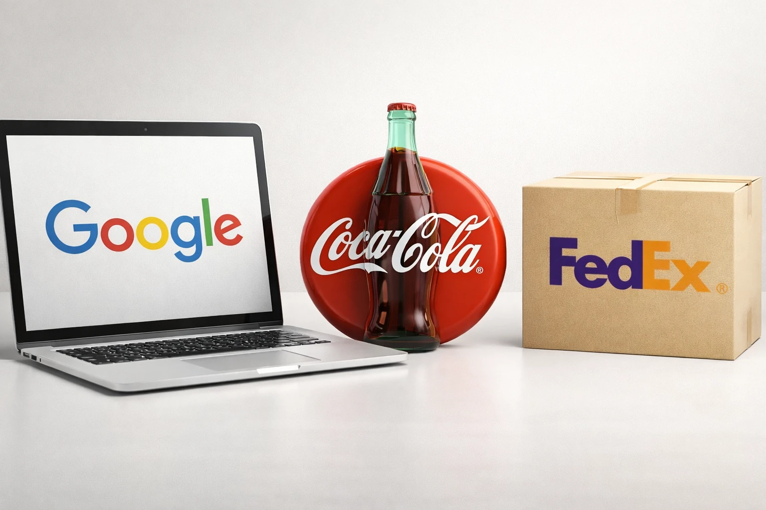
Real-world wordmark logo examples showing how Google, Coca-Cola, and FedEx use typography across different brand touchpoints
- Google’s wordmark is clean, friendly, and highly legible. Its custom sans-serif typography and balanced proportions reinforce approachability while remaining functional across digital platforms.
- Coca-Cola’s flowing script wordmark is a classic example of heritage branding. The typography alone communicates familiarity, nostalgia, and emotional connection—without the need for an icon.
- FedEx’s wordmark demonstrates how precision typography can communicate function. Tight kerning and the hidden arrow between letters subtly reinforce speed and reliability.
- Disney’s handwritten-style wordmark instantly signals imagination and storytelling. The typography itself becomes part of the brand experience.
- Netflix's bold, condensed wordmark creates strong recognition and remains highly effective across digital screens and entertainment marketing.
- Canon's distinctive custom letterforms balance technical precision with heritage, giving the brand a confident and proprietary identity.
- Sony proves that refined proportions and restrained typography can make a simple wordmark feel timeless and authoritative.
- Visa's subtle forward-leaning typography creates a sense of movement and progress while remaining clean and highly legible.
- eBay's colorful, slightly overlapping letters create a friendly and approachable identity that reflects variety and accessibility.
- Kellogg's signature-style script uses expressive lettering to communicate warmth, familiarity, and generations of brand heritage.
- Samsung's clean, geometric wordmark communicates technological confidence through simplicity, balance, and global consistency.
- Zara's tightly spaced, editorial-style typography creates a distinctive fashion-forward identity that stands apart from conventional retail branding.
- Uber's minimal sans-serif wordmark relies on balanced proportions and simplicity to remain clear across a global digital ecosystem.
- The New York Times' historic blackletter masthead uses distinctive typography to instantly convey authority, heritage, and credibility.
- Panasonic's restrained sans-serif wordmark emphasizes clarity and reliability, allowing it to work consistently across a broad product range.
- Ray-Ban's expressive script transforms the brand name into a recognizable visual signature with attitude and personality.
- Hershey's modernized wordmark retains brand familiarity while using cleaner typography better suited to contemporary packaging and digital applications.
- Vans turns a simple typographic modification—the extended stroke of the V—into a memorable and instantly recognizable brand signature.
Many of the most recognizable global brands rely on wordmark logos, demonstrating that typography alone can carry brand recognition and trust when executed correctly.
Real-Business Wordmark Logo Designs ✅
The wordmark portfolio section brings together the definition, real-world examples, and design process behind wordmark logos. Learn what makes a wordmark effective, see how different styles work across brands, and discover how I develop distinctive wordmark designs from concept to final identity.
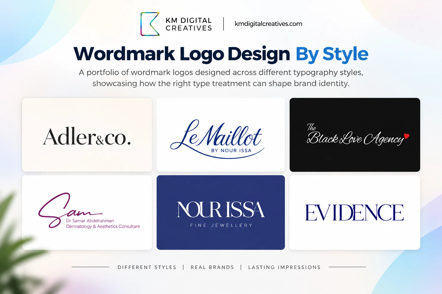
Selected wordmark logo designs from the KM Digital Creatives portfolio, showcasing different typography styles and brand personalities.
How Famous Wordmark Examples Differ
Example | Style | Key Design Feature | What Makes It Memorable |
|---|---|---|---|
Coca-Cola | Script | Flowing custom lettering | Strong personality |
FedEx | Sans-serif | Hidden negative-space arrow | Clever typographic detail |
Google | Sans-serif | Custom proportions and color | Friendly simplicity |
Zara | Serif | Tight letter spacing | Fashion-forward character |
Netflix | Bold sans-serif | Condensed proportions | Strong digital presence |
Disney | Script | Signature-style lettering | Distinctive personality |
Sony | Serif | Refined proportions | Timeless simplicity |
Vans | Custom sans-serif | Extended V stroke | Recognizable letter modification |
Wordmark Logo Examples by Style
Not all wordmark logos look or feel the same. Typography style plays a major role in shaping brand perception.
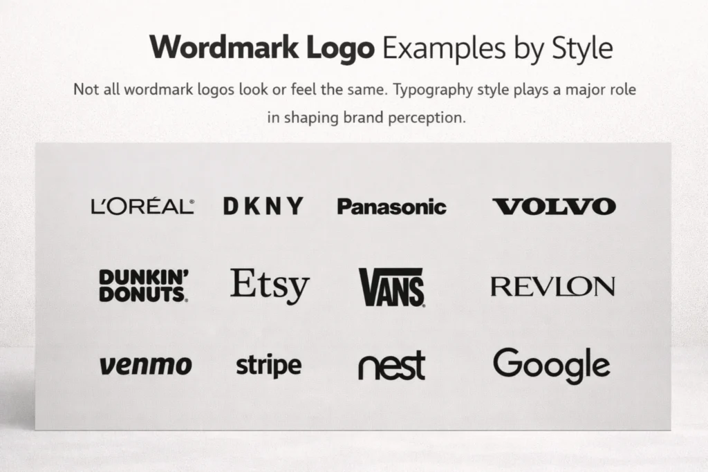
Minimal Wordmark Logo Examples
Minimal wordmarks focus on clarity and restraint. Clean fonts, balanced spacing, and neutral palettes help brands appear modern and professional.
Best suited for: SaaS brands, consultants, startups
Key traits: Simple letterforms, generous whitespace, high legibility
Bold Wordmark Logo Examples
Bold wordmarks use heavier typefaces to create visual impact and memorability, especially in crowded markets.
Best suited for: Retail, fitness, consumer-facing brands
Key traits: Thick strokes, strong contrast, confident presence
Modern Wordmark Logo Examples
Modern wordmarks often involve custom typography or subtle font modifications. These designs feel current without relying on short-lived trends.
Best suited for: Creative agencies, tech companies, personal brands
Key traits: Geometric structure, contemporary fonts, adaptability
Classic Wordmark Logo Examples
Classic wordmarks emphasize timelessness. Serif fonts or script typography convey credibility, tradition, and refinement.
Best suited for: Luxury brands, fashion, hospitality
Key traits: Elegant letterforms, refined spacing, enduring appeal
Wordmark Design Checklist: What to Look for in Great Examples
Not all wordmark logos work equally well. Strong examples consistently share a few foundational traits.
1. Clear Spacing and Kerning
Balanced spacing keeps a wordmark readable and visually polished. Poor kerning can undermine even the strongest brand name.
2. High Legibility at Any Size
Effective wordmark examples remain clear whether viewed on a mobile screen or a billboard.
3. Adaptability Across Media
A strong wordmark works in color, black and white, and reversed layouts without losing impact.
4. Alignment With Brand Personality
Typography communicates emotion. Font style, weight, and structure should reflect the brand's voice and audience expectations.
5. Distinctive Letterforms
The strongest wordmarks often include subtle custom details that make the typography recognizable beyond a standard font.
6. Clear Negative Space
Counters, gaps, and internal spaces should remain open and recognizable, especially at smaller sizes.
7. Strong Visual Balance
Letter weight, proportions, and overall spacing should create a cohesive silhouette rather than making one part feel visually heavy.
8. Single-Color Recognition
A well-designed wordmark should retain its identity when stripped of color, gradients, or other visual effects.
When evaluating wordmark logo examples, these qualities can be tested through a few simple checks:
Quick Ways to Test a Wordmark
Test | Before | After | Quick Test |
|---|---|---|---|
Test it smaller | Details only work at large sizes | Letterforms remain clear when reduced | View the wordmark at around 16px |
Remove the color | Recognition depends heavily on brand colors | Typography remains recognizable in one color | Convert it to solid black or white |
Check the spacing | Individual gaps feel uneven | Spacing feels optically balanced | Blur your eyes slightly and look for uneven gaps |
Look for distinction | A generic font could replace it | Custom details create a recognizable signature | Identify a unique letterform or typographic detail |
Remove effects | Effects carry the visual identity | Typography works independently | Remove shadows, gradients, and textures |
Check overall balance | Parts feel visually heavy or disconnected | Weight and proportions feel unified | View it from a distance and assess its silhouette |
FAQ: Wordmark Logo Examples
Sony, Canon, Zara, Uber, and Vans work particularly well in black and white because their recognition depends on typography rather than color.
Coca-Cola, Sony, Canon, Disney, and Kellogg's show how distinctive typography can remain recognizable across generations.
Google, Sony, Uber, and Samsung are strong examples of clean wordmarks that rely on simple forms, balanced spacing, and restrained typography. Start with your visual identity — it's the fastest-noticed element — then update your bio and Brand Sentence to match.
Examples range from Coca-Cola's expressive script to FedEx's clever negative space and Zara's editorial spacing, showing how different typographic choices create distinct identities.
FedEx uses negative space to create a hidden arrow, while Disney, Coca-Cola, and Vans use distinctive custom letterforms as recognizable signatures.
Netflix, Uber, Samsung, Zara, and Google show how confident typography alone can create a strong modern identity without a separate symbol.
Script wordmarks like Coca-Cola feel expressive, refined serif marks like Zara feel editorial, while bold sans-serifs like Netflix create a modern and confident impression.
Zara uses tight spacing for editorial impact, while Sony and Samsung demonstrate how balanced proportions and alignment can create a polished, confident identity.
Conclusion: Study Structure, Not Trends
Wordmark logo examples offer more than inspiration—they provide practical insight into how typography shapes brand identity. From globally recognized brands to professionally executed real-world designs, wordmarks prove that simplicity can be powerful when supported by strong structure.
Instead of chasing trends, study spacing, legibility, and adaptability. These principles ensure your wordmark remains effective long after design fads fade.
Explore→ detailed logo design process, the ideas behind each project, our approach to handling projects, timelines, and deliverables on our exclusive design page.