
Brand Guidelines: Your Complete Blueprint for Consistent Brand Identity
Whether you're searching for brand identity guidelines, comparing brand guidelines examples, or trying to understand how logo brand guidelines work, this page gives you a practical, no-fluff answer — plus a clear path to getting a professional brand guidelines document built for your business. (Last Updated on: October 18 2026)
What Are Brand Guidelines?
Brand guidelines are the documented rules governing how a brand looks, sounds, and behaves across every touchpoint. If brand identity is the "what" — your logo, colors, personality — brand guidelines are the "how": the instructions that keep that identity consistent no matter who is creating the material. Guidelines have evolved from static print manuals into living, omnichannel rulebooks covering websites, apps, social media, and motion design — not just business cards and letterheads.
Portfolio Brand Guidelines Projects
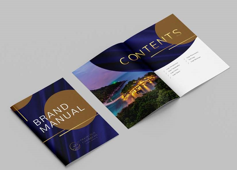
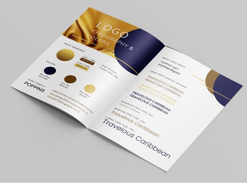
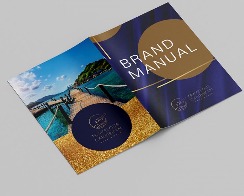
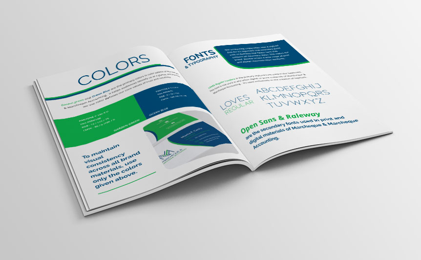
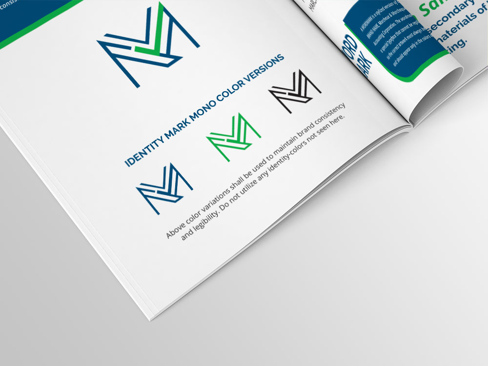
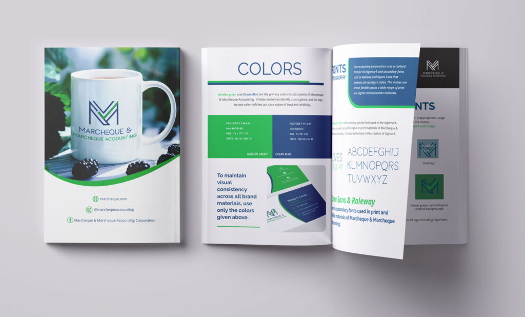
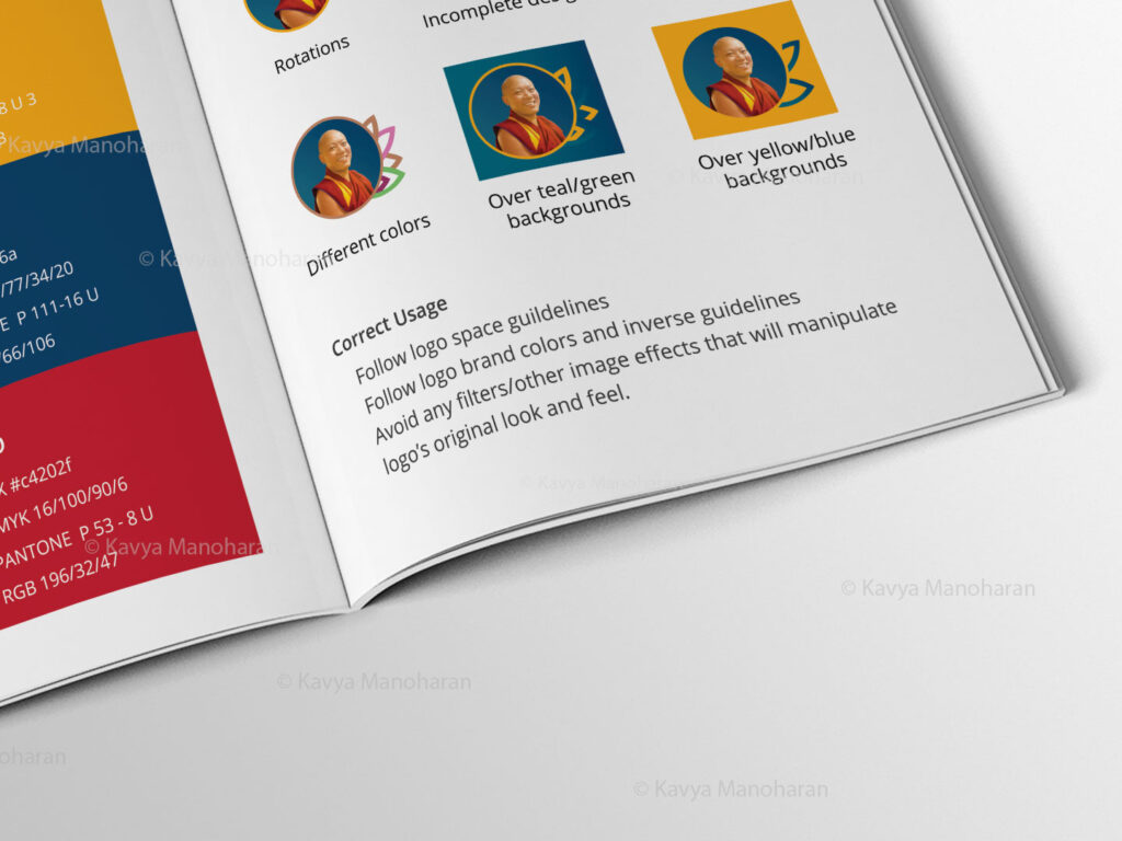
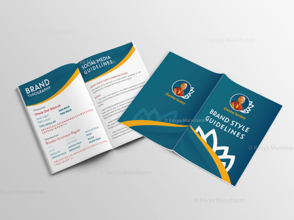
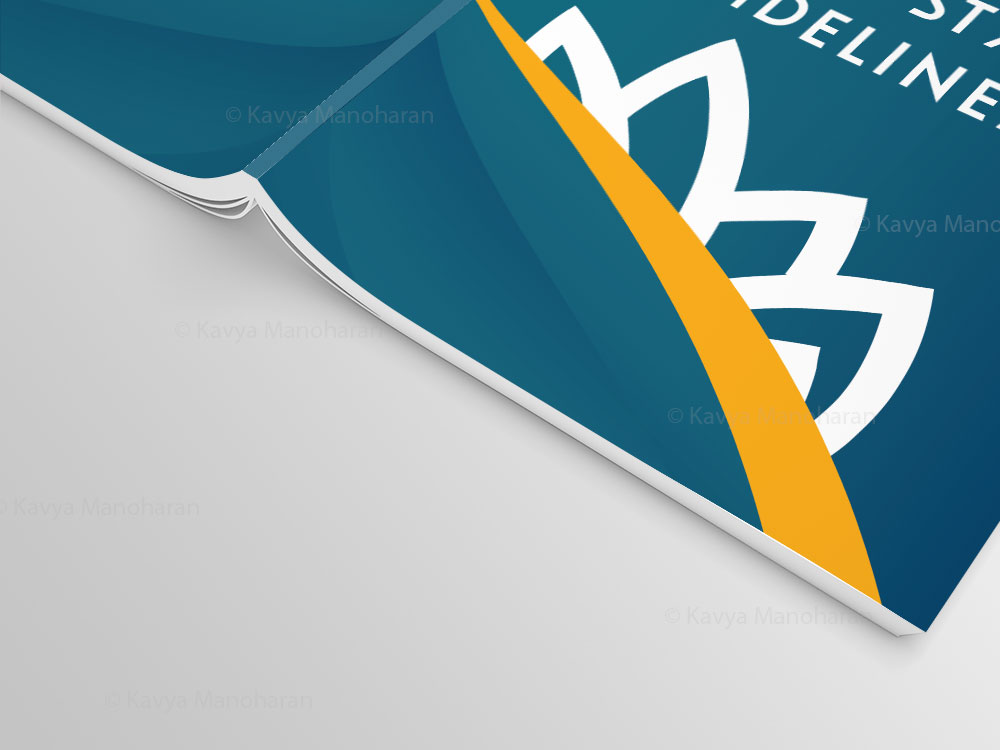
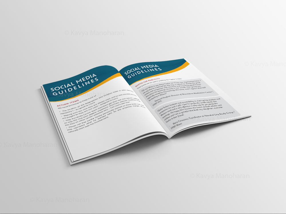
Brand Guidelines in Practice: 5 Essential Rules
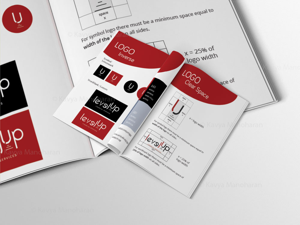
1. Logo Clear Space
- Maintain clear space of at least 1× the logo mark height.
- Keep surrounding elements outside this defined area.
- Apply the same rule across all formats.
2. Logo Minimum Size
- Set a minimum digital size, such as 24 px.
- Define a separate minimum size for print, such as 10 mm.
- Never reduce the logo below readable dimensions.
3. Correct Color Usage
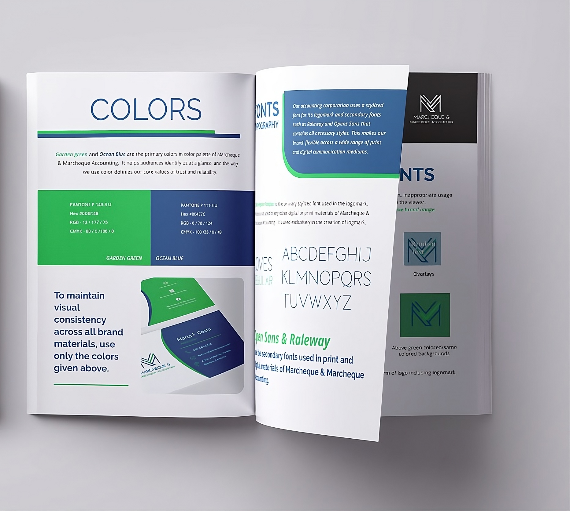
- Use only approved brand colors and values.
- Specify HEX, RGB, CMYK, or Pantone codes.
- Maintain accessible contrast where required.
4. Typography Hierarchy
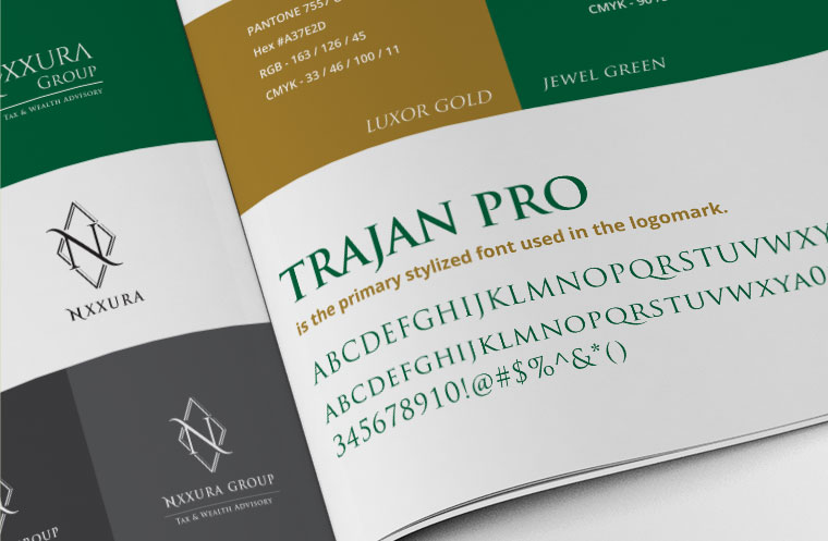
- Define styles for headings, subheadings, and body text.
- Keep font sizes, weights, and spacing consistent.
- Maintain clear hierarchy across applications.
5. Responsive Logo Behaviour
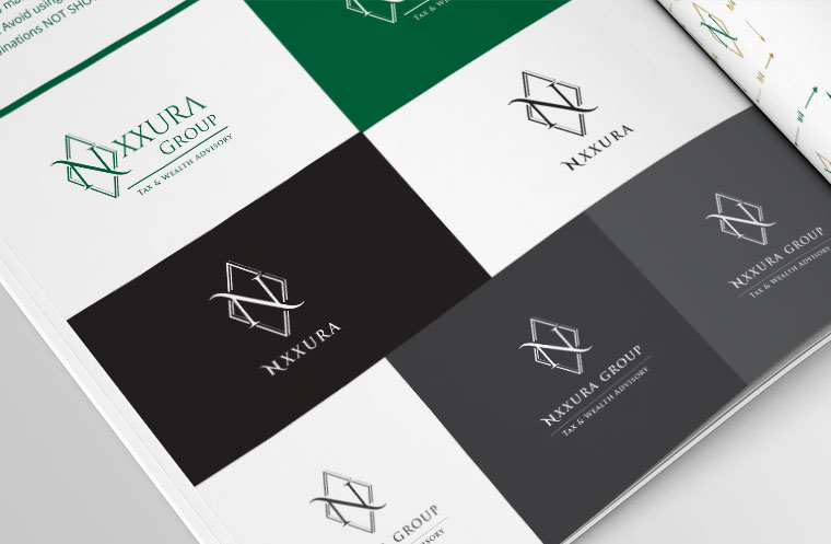
- Define approved horizontal, stacked, and icon variations.
- Switch versions when available space becomes limited.
- Never distort or alter the logo to fit.
More Brand Guidelines Examples & Portfolio
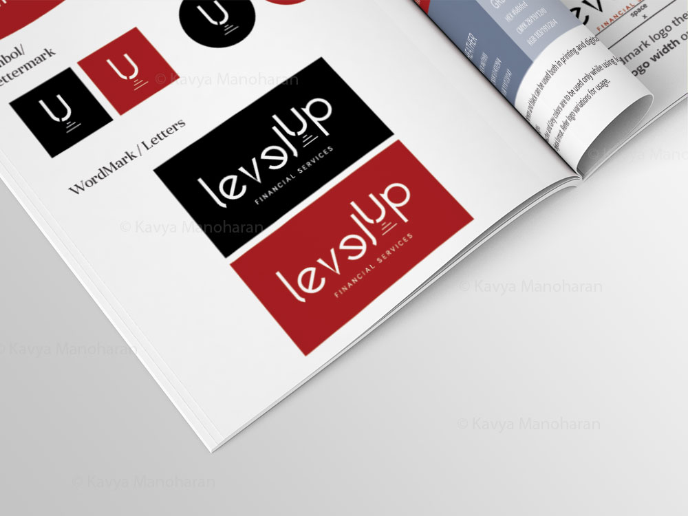
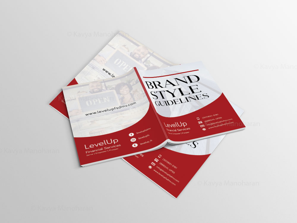
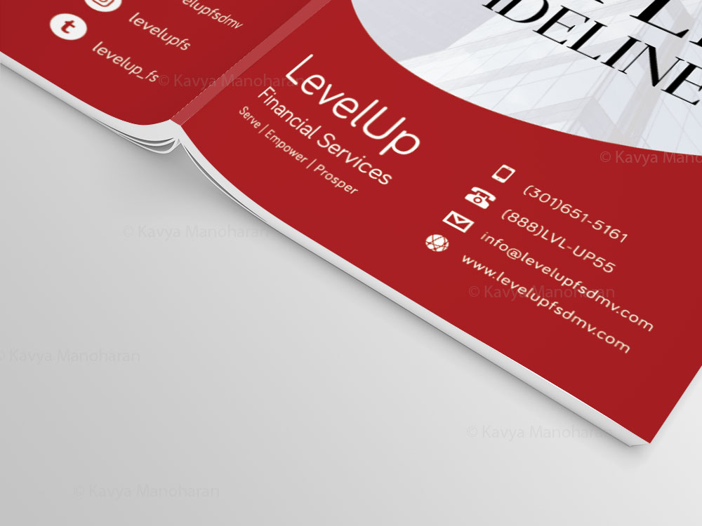
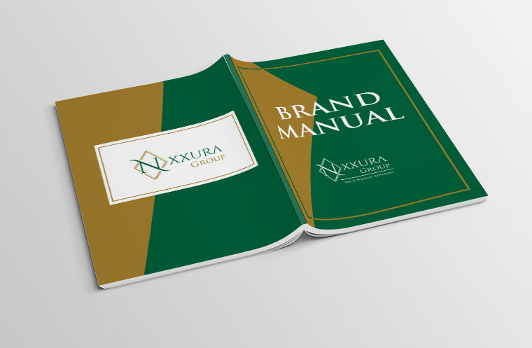
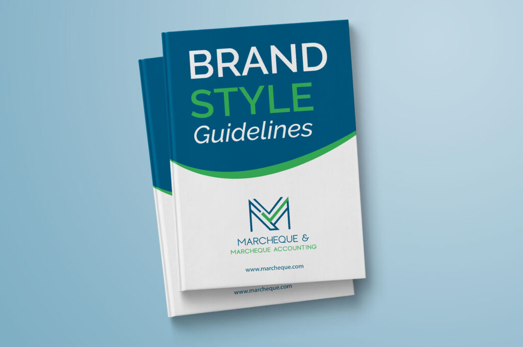
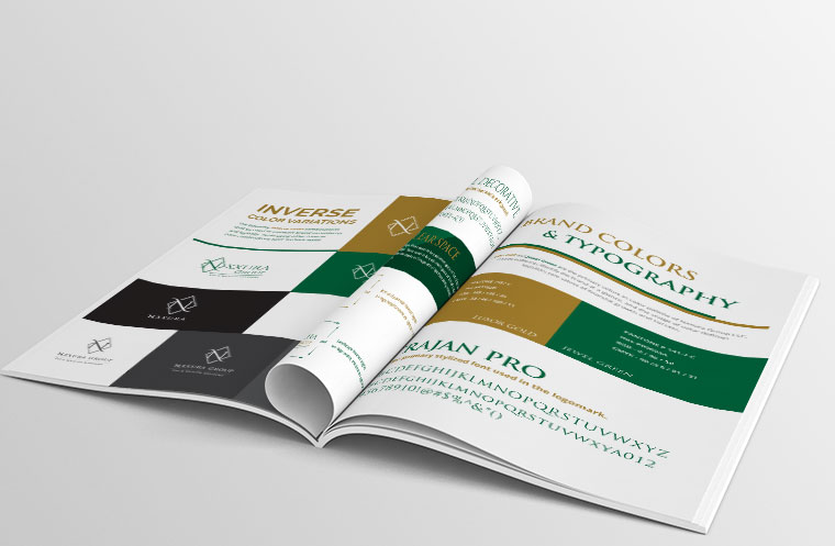
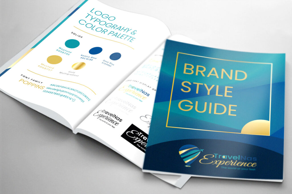
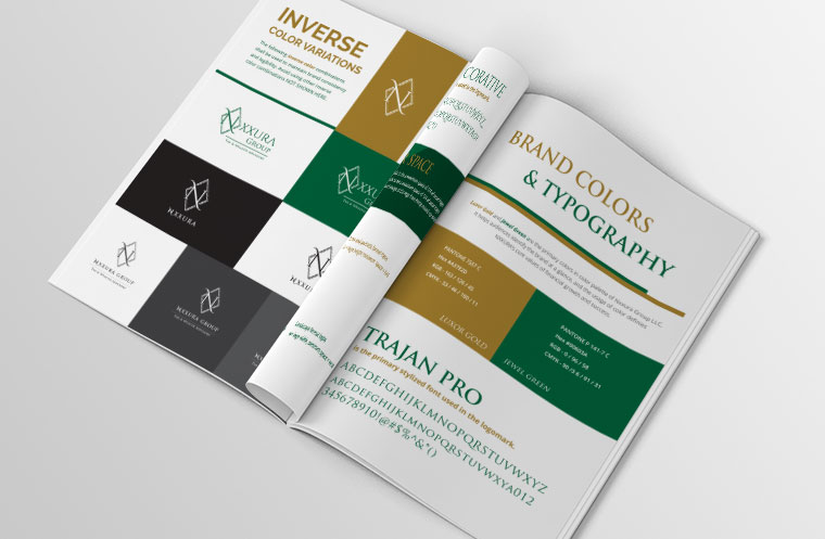
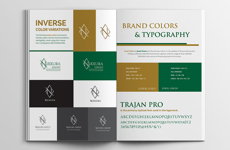
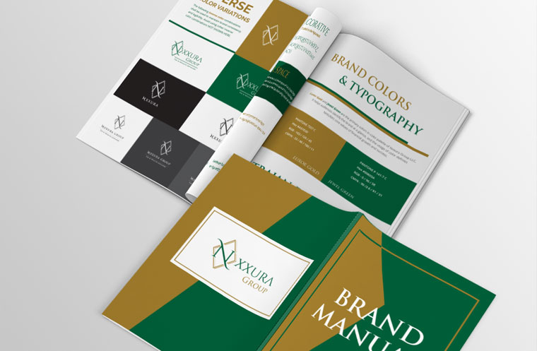
Brand Guidelines Examples: What a Professional Document Actually Looks Like
Before diving into theory, it helps to see the real thing. A well-built brand guidelines document typically includes:
- Logo lockups — primary, horizontal, vertical, and icon-only versions with exact clear-space and minimum-size rules
- Color systems — HEX, RGB, CMYK, and Pantone values with usage hierarchy
- Typography scales — heading, body, and web-safe fallback fonts with defined sizes and weights
- Voice and tone examples — side-by-side do/don't copywriting samples
- Digital UI standards — buttons, social templates, email signatures, and responsive logo behavior
At KM Digital Creatives, every brand guidelines project includes a visual style guide document plus a working digital asset library — so clients don't just receive a PDF, they receive a system their whole team can actually use.
Why Every Brand Needs Guidelines?
- Consistency across touchpoints — website, packaging, social, and print all reflect the same brand
- Time and cost savings — fewer revision rounds, faster onboarding for new designers and vendors
- Brand equity protection — prevents dilution from inconsistent or off-brand usage
- Team empowerment — sales, HR, and partners can create on-brand materials without design help
Research and business education from institutions such as Harvard Business School emphasize the importance of building, managing, and maintaining strong brands and brand equity.
Request sample brand guideline pages →
How KM Digital Creatives Builds Brand Guidelines
Creating brand guidelines isn't a one-day task — it's a structured process:
- Audit existing brand assets and identify inconsistencies
- Define brand strategy — mission, vision, values, and personality
- Document visual elements — logo, color, typography
- Articulate brand voice with real writing examples
- Add digital-specific rules for web, social, and app environments
- Create governance protocols so the guidelines actually get followed
We use this exact six-step framework, paired with editable templates (Figma, Canva, and PDF formats), so clients leave with a system — not just a static file.
Start your brand guidelines project →
Core Components of Logo Brand Guidelines
| Logo Usage Rules
- Primary logo variations: horizontal, vertical, icon-only
- Minimum size and clear space requirements
- Incorrect usage examples: stretching, recoloring, adding effects
- File formats: vector (SVG/EPS) for print, raster (PNG/JPG) for digital
| Color Palette Specifications
- Primary logo variations: horizontal, vertical, icon-only
- Minimum size and clear space requirements
- Incorrect usage examples: stretching, recoloring, adding effects
- File formats: vector (SVG/EPS) for print, raster (PNG/JPG) for digital
| Typography Standards
- Primary and secondary typefaces for headings and body copy
- Web-safe fallback fonts for digital consistency
- Hierarchy rules: sizes, weights, and line spacing
| Brand Voice and Tone
- Personality descriptors (e.g., "professional yet approachable")
- Do/don't writing examples
- Tone shifts across channels (social vs. formal communications)
- Approved vocabulary and banned-word lists
| Digital and Interactive Elements
- Website UI components — buttons, forms, navigation styling
- Social media templates and profile image standards
- Email signature formatting
- Responsive logo behavior and motion/animation rules
| Photography and Imagery Style
- Lighting, composition, and subject-matter direction
- Illustration style and iconography standards
This is where most existing guides fall short — they cover logo and color but skip digital UI and interactive standards entirely. KM Digital Creatives builds these digital-first rules into every project by default, since most brand touchpoints today are on a screen.
Want to discuss a project?
It usually starts with a simple message.
👋 A real human will personally read and respond to your message.
🔒 Your information is used only to respond to your inquiry. Read our Privacy Policy.
A brand style guide defines how a brand looks, sounds, and stays consistent across every touchpoint. From logos and colors to typography, spacing, and usage rules, a well-built style guide helps teams apply the brand correctly and confidently.
This portfolio showcases brand style guide design projects, including brand guidelines and brand manuals, created to support consistent branding across print, digital, and marketing materials.
Need a brand style guide or looking to formalize your brand guidelines?
Frequently Asked Questions About Brand Guidelines
How long should brand guidelines be?
A small business may need 5–10 pages covering logo, color, and typography; larger brands often require 30+ pages including digital, voice, and governance rules.
How often should brand guidelines be updated?
Most brands should review guidelines annually, or whenever a major rebrand, new product line, or new digital platform is introduced.
Who creates brand guidelines?
Typically a design studio, branding agency, in-house design team, skilled freelancer or brand strategist creates guidelines.
Can small businesses benefit from brand guidelines?
Yes. Even a simplified guideline under 5 pages: covering logo usage, colors, and fonts helps small businesses maintain consistency across social media, packaging, and marketing materials.
What's the difference between brand identity and brand guidelines?
Brand identity is the actual look and personality of a brand — the logo, colors, and voice themselves. Brand guidelines are the instructions that document how to use those elements correctly and consistently
Ready for Brand Guidelines That Actually Get Used?
A polished logo means little if your team, vendors, and partners don't know how to use it consistently. KM Digital Creatives designs comprehensive, governance-ready brand guidelines — covering logo systems, color and typography, voice, and digital/UI standards — tailored to businesses of every size, from solo founders to growing teams.
See how we document digital brand rules →
Contact KM Digital Creatives today to request examples, discuss your brand's specific needs, and get a clear proposal for building guidelines your business will actually follow.