
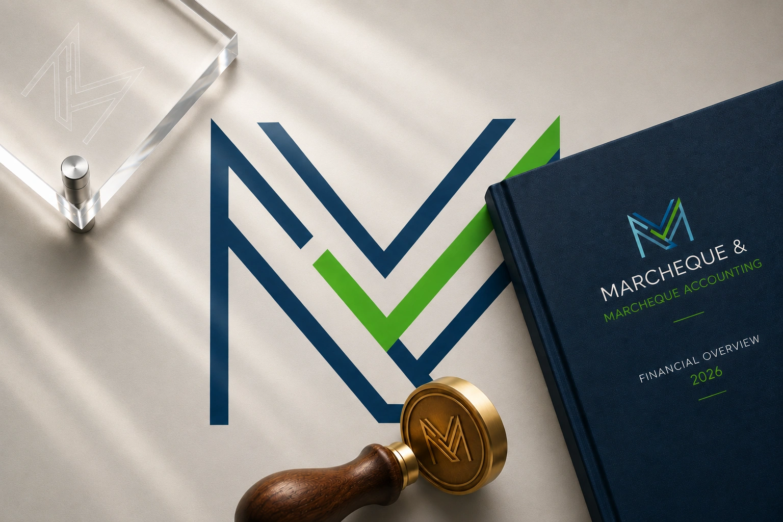
How to Design a Trustworthy Logo for a Finance Business: A Branding Case Study
What is finance branding? Finance branding is the strategic creation of a trustworthy, consistent visual identity for accounting, banking, fintech, and financial services businesses through logo design, colors, typography, brand assets, messaging, and usage guidelines.
Finance Branding Quality Checklist
- Contrast: Maintain WCAG AA contrast of at least 4.5:1 for normal text and essential brand applications
- Minimum logo size: Keep the primary logo readable at 24px digital and 0.75″ print minimum
- Clear space: Maintain at least 1× the mark height around the logo on every side
- File set: Provide at least 12 production-ready exports, including SVG, EPS, PNG @1x and @2x, plus JPG/PDF variations
- Digital icons: Supply a 16–48px favicon set and a 1024px app icon for digital platforms
- Brand colors: Define 3–5 core swatches with HEX, RGB, and print-ready color specifications
- Typography: Establish 2 primary type styles with practical system or web-safe fallbacks
- Usage testing: Test the identity on light/dark backgrounds, print, grayscale, and at 50% zoom before final approval
Table of Contents Anchor Links
- What is finance branding?
- Finance Branding Quality Checklist
- What is a good logo for a finance business?
- What are the best colors for finance logos?
- How much does a finance logo cost?
- What font works best for finance?
- How do you test a finance logo?
The founder of Marcheque Accounting approached me to create a professional accounting firm branding system, including a new accounting brand identity, brand collateral, and brand guidelines designed to build trust, consistency, and support long-term growth.
A successful finance logo goes beyond a professional symbol—it creates instant trust, supports brand recognition, and works consistently across every business touchpoint. This case study demonstrates how to achieve that through strategic logo design and a scalable visual identity system.
How to Design a Trustworthy Logo for a Finance Business: A Branding Case Study
A finance logo has one job above all others: make a stranger trust you within two seconds. Whether it’s an accounting firm, a financial advisory practice, or a fintech startup, the logo is often the first — and sometimes only — signal a prospective client sees before deciding whether to click “contact us” or move on. This case study breaks down a real design framework used to rebuild a finance brand’s visual identity, addressing the exact problems most finance logos face: looking generic, failing on small screens, and feeling outdated compared to modern fintech competitors.
Below, we walk through the strategic decisions behind color, symbolism, typography, and system design — and show how each choice ties directly to credibility, scalability, and measurable brand performance.
What Makes a Finance Logo Look Generic — and How Do You Fix It?
A finance logo looks generic when it relies on industry clichés — a globe icon, a default serif font, and navy blue — without any distinct visual story. The fix is to build the logo around a specific brand attribute (security, growth, precision) rather than copying category conventions.
- **Symptom 1:** Overused icons (globes, columns, generic shields) with no unique geometry.
- **Symptom 2:** Illegible marks at app-icon size (16–60px) or muddy when printed in grayscale.
- **Symptom 3:** Visual tone mismatched to audience — a firm targeting tech-savvy clients still using a 2005-style serif wordmark.
**Key takeaway:** A finance logo becomes memorable when it solves a specific brand problem, not when it simply follows industry norms.
What Is the “Credibility First” Framework for Finance Logo Design?
The Credibility First framework is a three-phase process — audience analysis, competitor audit, and a “Trust Triangle” of Stability, Growth, and Clarity — used to guide every design decision before a single icon is sketched.
- **Audience Analysis:** Define who needs to trust this logo instantly — for example, business owners and decision-makers aged 35–55 who prioritize security and efficiency over trendiness.
- **Competitor Audit:** Review 8–10 direct competitors to identify visual patterns (most finance brands lean on dark blue and shield imagery) so the new logo can differentiate rather than blend in.
- **Trust Triangle:** Every element — color, symbol, type — must reinforce at least one of three non-negotiable attributes: Stability, Growth, or Clarity.
**Key takeaway:** Credibility in finance branding comes from a repeatable framework, not a single “good” color or font choice.
What Colors Work Best for a Finance Logo?
The most effective finance logo colors balance stability with differentiation — deep blues and teals for trust, gold or amber accents for premium positioning, and high-contrast neutrals for accessibility compliance.
Why Choose Deep Teal Over Traditional Blue?
Blue is the default finance color because it psychologically signals stability and calm — but it’s also the most overused hue in the category, making differentiation difficult. Deep teal solves this by blending blue’s trustworthiness with green’s growth signal, creating a color that still feels safe but reads as more modern and distinct.
- **Primary color:** Deep teal — stability + growth in one hue.
- **Accent color:** Warm gold — used sparingly to signal premium, high-net-worth positioning.
- **Accessibility check:** All primary color combinations should meet WCAG AA contrast ratios (minimum 4.5:1 for text) so the logo remains legible for users with low vision.
**Key takeaway:** Choose a color that tells your specific brand story — not just the industry default — while still meeting accessibility standards.
Comparison: Common Finance Logo Colors and What They Signal
- **Navy Blue** — Trust, tradition; risk of blending into the crowd.
- **Deep Teal** — Trust + growth; modern differentiation.
- **Gold/Amber Accent** — Premium, high-net-worth appeal.
- **Black/Charcoal** — Authority, sophistication; can feel cold without a warm accent.
- **Green** — Growth, money; overused in personal finance apps.
What Symbols Work Best in a Finance Logo?
The strongest finance symbols communicate two ideas simultaneously: protection of assets and forward progress. A useful example is a geometric mark combining an upward arrow with a shield-like outline — signaling both security and growth without leaning fully into either cliché.
- **Shield elements** signal protection and risk management — ideal for advisory and insurance-adjacent finance brands.
- **Arrow or ascending line elements** signal growth and performance — ideal for investment and wealth management brands.
- **Avoid full, heavy shield shapes** — they can feel militaristic or overly defensive rather than approachable.
**Scalability test:** Any finance icon should remain crisp and recognizable from 16x16px (browser favicon) up to 1024x1024px (app icon store listing). If detail is lost at 16px, the mark is too complex.
**Key takeaway:** A strong finance symbol should read as both “safe” and “moving forward” — not one at the expense of the other.
What Fonts Should a Finance Logo Use?
Finance logos should use a geometric sans-serif typeface with tight, controlled letter spacing — it reads as modern and remains legible on screens, unlike traditional serif fonts that can feel dated or blur at small sizes.
- **Font style:** Geometric sans-serif (Poppins-style structure) rather than classic serif.
- **Weight hierarchy:** Bold weight for the business name to convey authority; lighter weight for taglines or descriptors to add clarity without competing for attention.
- **Mobile legibility test:** The wordmark should remain fully readable at 60px — the standard display size for iOS app icons and mobile browser tabs.
**Key takeaway:** If your logo’s text becomes unreadable on a phone screen, you lose the trust signal before the visitor even reads your name.
Why Does a Finance Logo Need a Full System Instead of One File?
A single logo file cannot serve every platform — websites, social avatars, app icons, and printed materials all require different proportions and color treatments. A finance brand needs a logo system: multiple lockups and color variations built for specific use cases.
- **Primary logo:** Horizontal lockup for website headers, proposals, and email signatures.
- **Secondary logo:** Stacked vertical lockup for social media profile images and square placements.
- **Icon mark:** The symbol alone, used for app icons, favicons, and watermarks.
- **Color variations:** Full-color, solid white (for dark backgrounds), and solid single-color (for one-color print or embossing).
**Key takeaway:** A finance business needs a scalable logo system, not a single static file, to maintain consistency across every digital and print touchpoint.
How Do You Know If a Finance Logo Redesign Is Working?
A successful finance logo redesign should be evaluated against three measurable indicators: perceived trustworthiness in audience testing, legibility across device sizes, and consistency across every brand touchpoint. Rather than relying on subjective opinion, firms can run simple blind comparison surveys with target clients, test the icon at favicon and app-icon sizes, and audit consistency across the website, business cards, and social profiles.
**Key takeaway:** Treat your logo as a business asset with performance indicators — not just a creative deliverable.
Does Your Finance Logo Need a Refresh?
If your current logo looks generic, becomes illegible on a phone screen, or feels visually outdated compared to newer fintech competitors, it’s likely undermining the trust you’re trying to build with prospective clients. This is one of the most common gaps **KM Digital Creatives** addresses when working with accounting firms, financial advisors, and fintech startups on brand identity projects.
Depending on where your brand currently stands, a few paths typically make sense:
- **Foundation Package** — full identity design for finance businesses starting from scratch, including logo system, color palette, and typography guidelines.
- **Refine Package** — a logo-only refresh for firms with an established brand that needs modernization without a full rebuild.
- **Growth Package** — combined branding and website design for firms ready to align their entire digital presence with a stronger visual identity.
If you’re unsure which fits your situation, a no-obligation conversation is usually the easiest way to clarify scope before committing to a package.
Frequently Asked Questions
How much does a finance logo cost?
Cost varies by scope and package. A logo-only refresh is typically less involved than a full identity system, while a Foundation Package (full brand identity) represents the most comprehensive investment. Exact pricing depends on the firm’s specific needs.
How long does the finance logo design process take?
A typical finance logo project takes 2 to 4 weeks, covering audience analysis, competitor audit, concept development, and final system delivery across all required file formats.
Do you provide trademark guidance for a new logo?
Designers can provide a basic trademark-conflict checklist as part of the research phase, but formal trademark clearance and registration should always be reviewed by a qualified intellectual property attorney.
Can a finance logo be optimized for fintech apps specifically?
Yes. Finance logos intended for app use should be tested at standard app-icon sizes (60px and up) and can include simple motion or micro-interaction treatments for splash screens and loading states.
Key Takeaways: Building a Finance Logo That Earns Trust
- A finance logo must work at 16px favicon size just as well as it does on a printed letterhead.
- Trust is engineered through deliberate color, symbol, and typography choices — not left to convention.
- Deep teal and controlled accent colors can differentiate a finance brand while retaining stability signals.
- Strong finance symbols communicate protection and growth at the same time.
- Legibility at small sizes is itself a trust signal — illegible branding erodes credibility instantly.
- A logo is a system — primary, secondary, icon-only, and color variations — not a single file.
- Accessibility compliance (WCAG AA contrast) is now a baseline expectation, not an optional extra.
A credible finance logo isn’t the result of luck or a trendy color pick — it’s the outcome of a deliberate framework that weighs audience psychology, competitive differentiation, and technical scalability together. Whether you’re rebuilding an accounting firm’s outdated mark or designing a fintech app icon from scratch, the principles remain the same: clarity, consistency, and a visual story that earns trust before a single word is read.
What Symbols, Colors, and Fonts Work Best in a Finance Business Logo?
The strongest finance logos combine meaningful symbolism, restrained color palettes, and professional typography to communicate trust at first glance. For Marcheque & Co., every design choice was made to reinforce credibility while creating a modern, memorable brand identity.
Design Element |
Best Practice |
Applied in This Project |
|---|---|---|
Symbol |
Choose a simple geometric monogram or abstract mark instead of generic finance icons for a timeless identity. |
A custom monogram replaces cliché dollar signs and charts while subtly conveying precision, growth, and stability. |
Color Palette |
Use deep blue to communicate trust with green as a restrained accent for growth and confidence. |
The navy and green palette creates a professional identity that remains consistent across every brand application. |
Typography |
Select clean, highly legible typography that performs equally well in print and digital environments. |
A modern sans-serif complements the monogram and maintains clarity from stationery to websites. |
Scalability |
Design a logo that remains recognizable from app icons to office signage without losing detail. |
The identity adapts seamlessly across business cards, reports, presentations, signage, and digital platforms. |
Brand Consistency |
Support the logo with a complete visual identity system rather than a single logo file. |
Consistent colors, typography, spacing, and layouts reinforce credibility across every client touchpoint. |
Before We Started
Starting from scratch provided the opportunity to create a complete visual identity system using the same strategic approach trusted by a fintech branding agency, tailored specifically for the accounting and financial services industry. Every decision, from typography and colors to logo applications and brand assets was created to communicate professionalism, clarity, and trust.
The Brand Challenge
Marcheque & Co. wanted to move beyond a generic accounting identity by creating a distinctive brand that reflected its expertise and premium client service.
Strong finance branding helps accounting firms, wealth management firms, traditional banks, fintech startups and modern fintech companies build trust while clearly differentiating their services in a competitive market.
What Is Financial Branding?
Financial branding is the process of creating a consistent, trustworthy identity for a finance business by combining its logo, visual identity, messaging, typography, colors, and branded materials into one cohesive brand system. Strong financial branding helps accounting firms, financial advisors, and fintech companies build credibility, improve recognition, and create confidence across every client touchpoint.
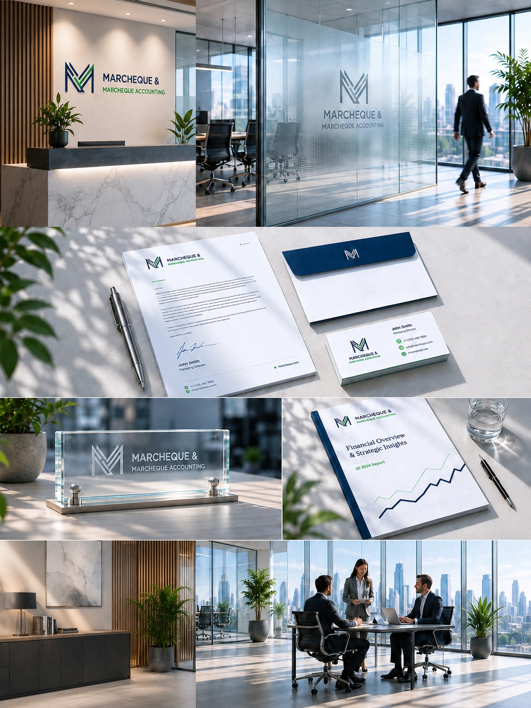
For Marcheque & Co., the financial branding strategy focused on creating a professional monogram logo, a restrained blue and green color palette, modern typography, branded stationery, office signage, and comprehensive brand guidelines.
Together, these elements formed a scalable visual identity designed to strengthen trust and maintain consistency across digital platforms, printed materials, and everyday business communications.
Designing a Finance Logo That Builds Trust and Modernity
A finance business logo needs to inspire confidence while feeling modern enough to represent today’s financial services. Rather than relying on overused symbols like dollar signs or stock charts, effective finance logos combine thoughtful typography, restrained color palettes, and simple geometric forms that communicate professionalism across every customer touchpoint. A finance logo performs best when supported by a complete visual identity, including stationery, digital assets, and corporate materials that reinforce trust at every interaction.
A Geometric Monogram Builds Trust
A clean geometric monogram is one of the strongest logo ideas for finance businesses because it communicates professionalism, precision, and long-term stability without relying on cliché financial symbols.
Abstract Symbols Feel More Modern Than Literal Icons
Instead of dollar signs or stock charts, abstract geometric forms create a distinctive finance logo while subtly conveying growth, structure, and forward thinking.
A Restrained Color Palette Reinforces Credibility
Deep navy paired with a green accent is a timeless finance logo combination that signals trust, stability, and financial growth across every brand touchpoint.
Responsive Logo Systems Improve Recognition
The best finance logos remain recognizable on signage, reports, websites, business cards, and app icons, ensuring a consistent brand experience everywhere.

How to Create a Finance Business Logo That Looks Credible Everywhere
These guidelines for creating finance logos focus on trust, scalability, and consistency across websites, business cards, reports, office signage, and app icons. While many fintech logo design principles emphasize simplicity and digital-first usability, the same approach strengthens the visual identity of accounting firms, wealth managers, and financial advisors.
Requirement |
How This Project Achieves It |
|---|---|
Scalable Logo |
The monogram remains recognizable from app icons to large office signage without losing clarity. |
Responsive Identity |
Horizontal, vertical, and simplified logo variations ensure consistent branding across digital and print. |
Consistent Color System |
Navy and green are applied consistently across stationery, reports, signage, and digital assets. |
Professional Typography |
Clean sans-serif typography maintains readability across websites, business cards, and presentations. |
Production-Ready Assets |
Every logo variation is optimized for print, digital platforms, and merchandise to ensure consistent reproduction. |
These fintech logo design principles also apply to accounting firms, wealth managers, and financial advisors. A strong visual identity isn’t defined by a single logo—it comes from a complete brand system that performs consistently across every client touchpoint. These visual identity tips for financial firms guided every application shown throughout this project.
People Also Ask
What is a good logo for a finance business?
A good finance business logo is simple, distinctive, professional, and easy to recognize at different sizes. Geometric monograms, refined wordmarks, and abstract symbols often work well because they communicate stability without relying on overused dollar signs, charts, or generic financial icons. The logo should also include responsive variations for digital and print applications.
What are the best colors for finance logos?
The best colors for finance logos depend on the brand’s positioning, but navy, blue, green, charcoal, and white are widely effective choices. Blue can communicate trust and stability, while green can suggest growth and financial confidence. A restrained palette of three to five defined colors creates stronger consistency across websites, stationery, signage, and digital assets.
How much does a finance logo cost?
A finance logo can cost anywhere from a few hundred dollars for a basic logo to several thousand dollars for a professionally developed identity system. Pricing depends on research, concept development, logo variations, brand colors, typography, guidelines, and production-ready assets. A complete finance branding system typically costs more because it builds consistency beyond the logo itself.
What font works best for finance?
A finance brand generally benefits from a clean, highly legible typeface that communicates professionalism and remains readable across websites, reports, presentations, stationery, and signage. Modern sans-serif fonts are effective for contemporary financial brands, while carefully selected serif fonts can add authority or sophistication. The most important criteria are legibility, consistency, licensing, and suitable fallback fonts.
How do you test a finance logo?
Test a finance logo at multiple sizes and across real-world applications before finalizing it. Check readability at 24px digital and 0.75-inch print sizes, then test light and dark backgrounds, grayscale, 50% zoom, business cards, websites, signage, and documents. A strong logo should remain recognizable, balanced, and legible without depending on color or excessive detail.
The deliverables shown throughout this portfolio, including the finance logo, brand identity, stationery, visual system, and brand guidelines match our Brand System Package.
Compare all Logo Design & Website Packages we offer.
Whether you’re launching a new business, repositioning an existing brand, or building a stronger digital presence, we create branding systems designed to grow with you. Let’s create something meaningful together. Contact us.