The Autism Logo: History, Meaning & Where to Find Real ASD Support and Autism Logo Ideas (2026 Guide)
last updated on October 14 2026
The autism logo has evolved as understanding of autism spectrum disorder (ASD) has changed. From the blue puzzle piece to the gold infinity symbol, different symbols reflect changing perspectives on autism awareness, acceptance, and neurodiversity.
This guide explains what the most recognized autism symbols mean, clears up common misconceptions about colors such as orange, and points you toward reliable ASD support organizations for autistic people, families, and caregivers including branding and website support for these organizations.
Table of Contents
- Quick Answer: Is the Autism Logo Orange?
- The Two Main Autism Logos Explained
- Why You See “Orange Logos” in Search Results
- From Symbols to Support: Finding Real ASD Resources
- Comparison Table: Puzzle Piece vs. Infinity Symbol
- FAQ: Autism Logo & ASD Support
- Sources & Citations
- Final Key Takeaways
Quick Answer: Is the Autism Logo Orange?
No, the autism logo is not orange. The two colors most closely tied to autism awareness and acceptance are blue (the puzzle piece, popularized by Autism Speaks’ “Light It Up Blue” campaign) and gold (the infinity symbol, used by the neurodiversity movement). If you’ve seen orange logos surfacing in your search, think Fanta, Nickelodeon, or Home Depot, that’s a keyword-matching mismatch, not an actual autism symbol. This article corrects that record right away.
The Two Main Autism Logos Explained
The Blue Puzzle Piece: History & Criticism
The puzzle piece is the oldest and most widely recognized autism symbol, dating back around 1962-63. It was designed by Gerald Gasson for the National Autistic Society in the UK. The original logo showed a puzzle piece alongside the image of a crying child, intended to convey that autism was a “puzzling” condition.
Decades later, the blue color became dominant thanks to Autism Speaks’ “Light It Up Blue” campaign, launched in the 2000s to mark World Autism Awareness Day. Landmarks worldwide were lit blue every April, cementing the color in public consciousness.
However, the puzzle piece has drawn significant criticism from autistic self-advocates. Many argue it implies that autistic people are:
- “Incomplete” or missing a piece
- A puzzle to be “solved” rather than understood
- Tied to a cure-focused narrative rather than one of acceptance
This criticism is a major reason the movement toward alternative symbolism has grown.
The Gold Infinity Symbol: The Modern Alternative
The gold infinity symbol represents the neurodiversity movement shift from “awareness” to “acceptance.” Rather than framing autism as a deficit, the infinity loop symbolizes the infinite variety and potential of neurodivergent minds.
The color gold is intentional: it references “Au,” the chemical symbol for gold on the periodic table, echoing the phrase “the golden ratio of humanity” that some advocacy groups use to describe neurodivergence as a natural, valuable variation rather than a disorder to fix.
This symbol has been embraced by the Autistic Self Advocacy Network (ASAN) and many parent-led, autistic-led support organizations that prioritize identity-first, strengths-based language. Unlike the puzzle piece, the infinity symbol carries no historical baggage tied to “curing” autism, making it the preferred choice for many modern nonprofits and community groups.
3. Why You See “Orange Logos” in Search Results
Search engines sometimes conflate “autism logo” with unrelated orange-branded companies due to keyword and color-tagging overlap. Brands like Fanta, Nickelodeon, and Home Depot use orange prominently in their branding, and algorithmic image-matching occasionally pulls these into autism-related searches, likely due to loose associations with “awareness ribbon” colors used across different causes.
To be clear: there is no widely recognized orange autism logo. The two colors tied to legitimate autism symbolism remain blue (puzzle piece) and gold (infinity symbol). If you’re designing materials for an ASD-related campaign, steer clear of orange to avoid confusing your audience.
4. From Symbol to Support: Finding Real ASD Resources
Case Study: Thoughtful Branding for ASD Support Organizations
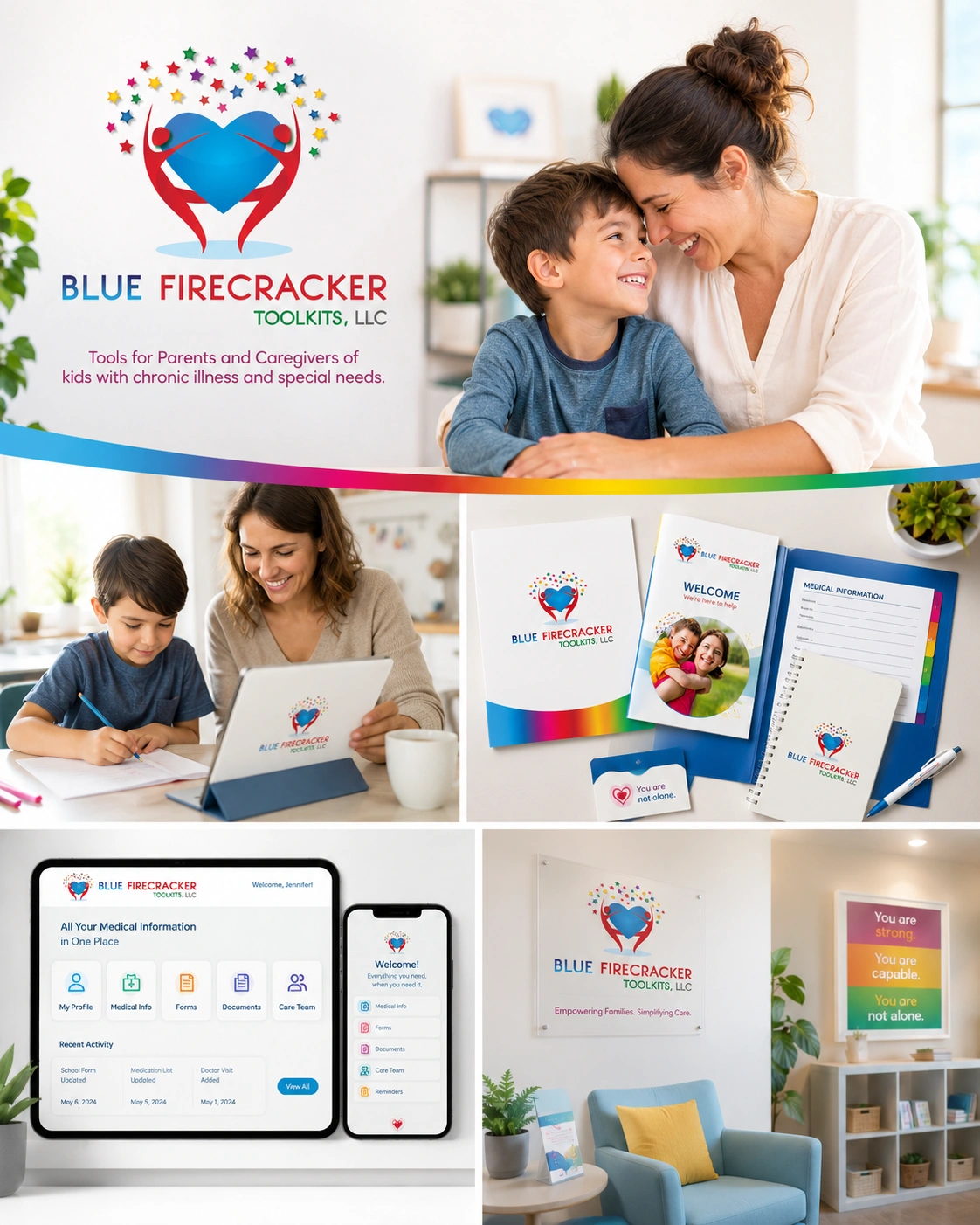
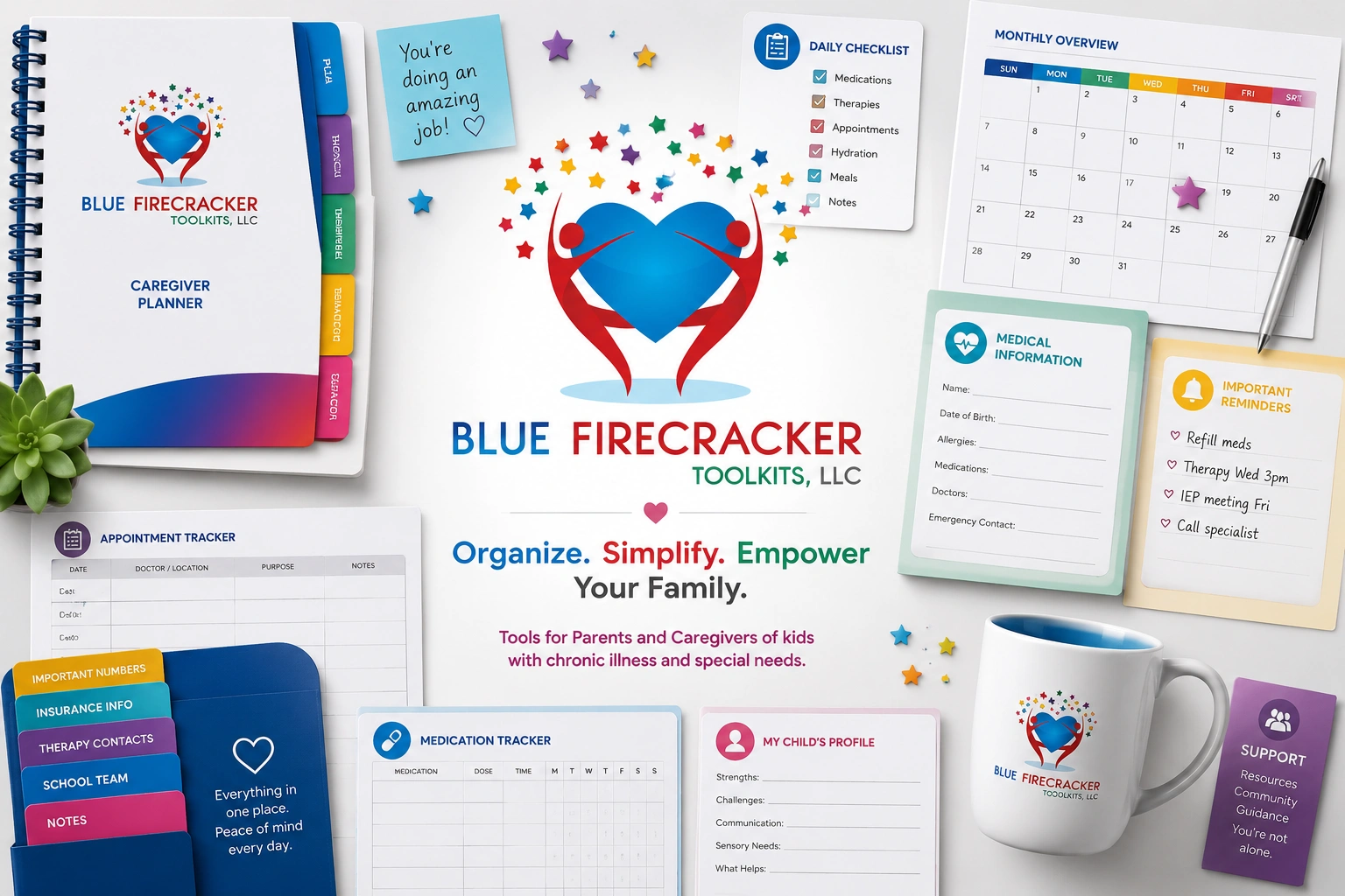
Good ASD support branding feels warm and community-driven, not clinical or corporate. Consider how a small parent-led support group might approach its visual identity: rather than reaching for the traditional puzzle piece, it might choose a soft gold infinity symbol paired with rounded, friendly typography and calming color palettes.
For this ASD support organization project, the branding was developed as a complete visual system covering both the core identity and its practical applications. The project delivered:
- Custom logo design
- Print-ready business card design
- Custom size print-ready letterhead design
- Advertising print banner design
- Flyers and brochure design
- Responsive webpages design
- Social media cover images
- Vector logo files for scalable print and digital use
- Source files for future editing and production
Together, these deliverables gave the organization a consistent visual identity that could be used across its website, printed materials, community outreach, and digital communications.
This kind of choice sends a subtle but powerful message — that the organization sees autism through a lens of acceptance rather than awareness alone. It shifts the emotional tone of every flyer, social post, and website page the group produces, making families feel welcomed rather than “diagnosed.”
Getting Professional Branding for Non-Profits & Support Groups
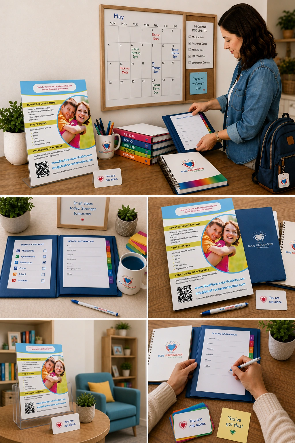
A trustworthy nonprofit brand identity needs more than just a logo — it needs consistency across every touchpoint. That typically includes:
- A primary logo that works in both color and black-and-white
- Brand guidelines covering typography, spacing, and color psychology
- Social media templates for awareness campaigns and event promotion
- Print-ready assets for flyers, brochures, and community events
For organizations that don’t have in-house design capacity, working with a design partner can make the difference between a logo that looks generic and one that genuinely reflects the community it serves. KM Digital Creatives offers logo design and branding packages tailored for nonprofits and support groups, helping organizations build a visual identity that feels empathetic, professional, and consistent — without the sales-heavy, cookie-cutter approach many small groups worry about.
5. Comparison Table: Puzzle Piece vs. Infinity Symbol
Neither symbol is universally “correct.” The better choice depends on your organization’s philosophy, audience, and approach to autism awareness and acceptance.
Feature |
Blue Puzzle Piece |
Gold Infinity Symbol |
|---|---|---|
Origin |
1963, introduced by the National Autistic Society |
2000s, associated with the neurodiversity movement |
Core Meaning |
Historically represented the idea of autism as a “puzzle” or something not yet understood |
Represents infinite possibilities, neurodiversity, acceptance, and inclusion |
Associated Color |
Blue |
Gold |
Community Sentiment |
Mixed; some autistic self-advocates criticize its historical associations |
Generally more favored by neurodiversity advocates and many autistic self-advocates |
Best Use Case |
Legacy autism awareness campaigns and organizations that continue to use the traditional symbol |
Modern, acceptance-focused organizations, nonprofits, and neurodiversity-centered branding |
6. FAQ: Autism Logo & ASD Support
What is the official autism logo?
There is no single official autism logo. The blue puzzle piece and gold infinity symbol are the two most widely recognized, but no governing body has designated either as universally official.
Where can I download the autism logo?
Organizations like the Autistic Self Advocacy Network and National Autistic Society provide brand assets on their official websites. Always check usage rights before using a logo for commercial or campaign purposes.
What does ASD stand for?
ASD stands for Autism Spectrum Disorder, a developmental condition that affects communication, behavior, and social interaction, varying widely in presentation from person to person.
Where can I find ASD support for parents?
Reputable starting points include the National Autistic Society (UK), the Autistic Self Advocacy Network (ASAN), and Autism Speaks, all of which offer helplines, toolkits, and local resource directories.
Why is the autism logo changing?
Many autistic self-advocates felt the puzzle piece implied incompleteness or a need to be “solved.” The infinity symbol emerged as an alternative that emphasizes acceptance and diversity instead.
How do I choose an autism logo that works well in both color and black and white?
Choose simple shapes with strong contrast and avoid relying on color alone to convey meaning — this ensures legibility on flyers, merchandise, and grayscale print materials.
What are some meaningful autism logo ideas that avoid the usual puzzle-piece look?
Infinity loops, rainbow-gradient symbols, and abstract “spectrum” designs using color gradients are popular alternatives that avoid puzzle-piece imagery.
What are the best autism logo concepts for a nonprofit website and social media profile?
Clean, scalable icons that work as small favicons and large banners tend to perform best — simplicity ensures the logo remains recognizable across formats.
Where can I find examples of autism logo designs that look professional without feeling generic?
Design portfolios from agencies specializing in nonprofit branding, such as KM Digital Creatives, often showcase custom examples tailored to specific community missions.
What are the best typography choices for an autism logo that needs to look calm and welcoming?
Rounded, sans-serif fonts with generous spacing tend to feel approachable and calm, avoiding sharp edges or overly bold weights.
How do I create an autism logo that works well on websites, flyers, and social media profiles?
Design it as a vector file first, ensuring it scales cleanly from a small app icon to a large printed banner without losing detail.
What are some creative autism logo ideas for an awareness campaign flyer?
Combining the infinity symbol with local community imagery or hand-drawn elements can make campaign materials feel personal rather than corporate.
What are some ways to use an autism logo respectfully in a community event flyer or awareness post?
Pair the logo with identity-first or person-first language based on community preference, and avoid pairing it with “cure” or “fix” messaging.
How can I tell if an autism logo is appropriate for a support group, nonprofit, or awareness campaign?
Check whether the symbolism aligns with your organization’s values — acceptance-focused groups often lean toward the infinity symbol, while legacy awareness campaigns may still use the puzzle piece.
7. Sources & Citations
This guide draws on established autism organizations and research on visual communication. The National Autistic Society provides historical context on the original puzzle-piece symbol and how its meaning has changed over time.
For the shift toward neurodiversity and self-advocacy, the Autistic Self Advocacy Network (ASAN) provides resources explaining neurodiversity, autistic self-advocacy, inclusion, and disability rights.
The history of blue as an autism-awareness color is also documented by Autism Speaks, including its Light It Up Blue campaign, which began in 2010.
Finally, research on color psychology and nonprofit branding helps explain why color can influence how organizations and their visual identities are perceived. Studies have found that color and logo characteristics can shape perceptions of an organization’s identity, including whether it is perceived as nonprofit or for-profit.
Compare logo design and branding packages by KM Digital Creatives
Final Key Takeaways
- The autism logo isn’t orange, and there isn’t one universally accepted autism symbol.
- The blue puzzle piece is rooted in decades of autism awareness campaigns.
- The gold infinity symbol represents a newer focus on acceptance, neurodiversity, and inclusion.
- The right symbol depends on what resonates with your organization, support group, or family.
- Ultimately, the goal is to connect people with genuine ASD support, not simply use a recognizable symbol.
- For nonprofits and support organizations, an authentic visual identity can help communicate the mission clearly. KM Digital Creatives’ logo design and branding packages can provide a thoughtful starting point for building that identity.