Case Studies
A detailed look into our approach, work-process and results.
BLUE FIRECRACKER TOOLKITS LLC
Business Industry: Health Non-Profit Organization
Blue Firecracker ToolkitS provides a single place for parents and caregivers of special needs and chronically ill children to securely keep all of the data and information needed to complete various forms required from public and private schools, camps, and other activities in which the child is engaged.
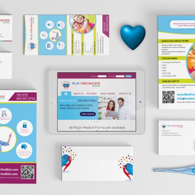
Our client Deana Fuller was looking for a complete branding kit and website UI design for her new venture. Below are our creative and web UI concepts for BFT LLC.
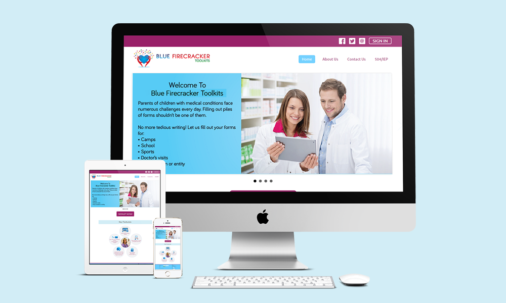
BFC LLC Responsive Website Design
Our Goal
To establish BLUE FIRECRACKER TOOLKITS as one of the reliable charity organization to help parents in storing their kids medical data and to create a brand that feels safe & secure for parents and caregivers.
Our Solution
We created a design to give their business a unique mark that differentiates them from other businesses. Our design served as the perfect visual brand mark for their company.
Finalized a range of colors that can be used on logos, branding materials, a device screen or other interface,and in videos. The finalized color palette reveals a lot about our client's brand, its values, its offerings, its uniqueness etc. We then moved on to create a mood board that defines a brand and its communication. We further took this mood board as a guide in developing website and other brand visual graphics.
We decided to select the right type of fonts to connect with emotions of their consumers and website users. Our chosen typography invokes a feeling, creates a positive atmosphere and makes the brand memorable. Font styles to improve brand's communication through logos, ad copies, magazine headlines, and course books, etc.
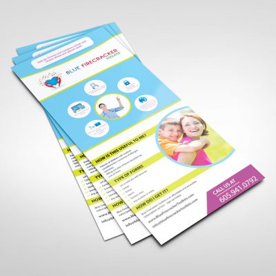
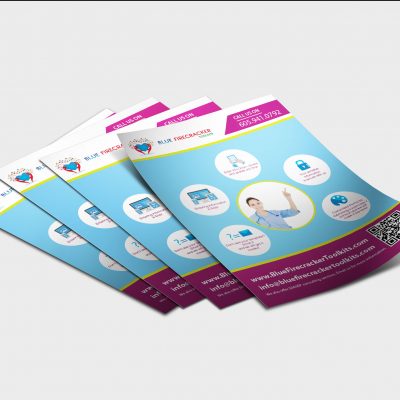
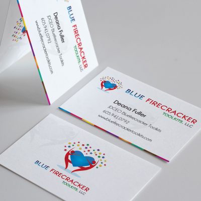
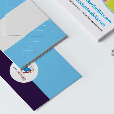
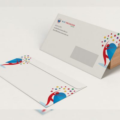
We kept the branding simple enough not to deviate from the functional value of the stationary. At the same time we wanted to mirror what people see on other platforms or ads, such as in flyers, newspapers and billboards. Our goal was to make the brand look consistent and effective across all offline platforms since print stationary are mostly used offline in real world
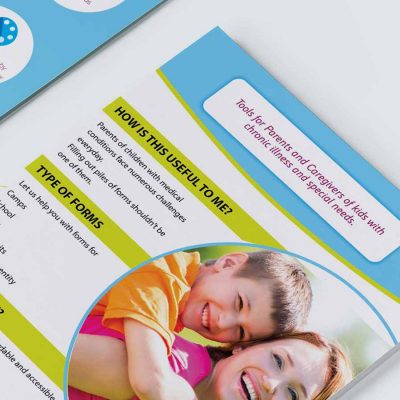
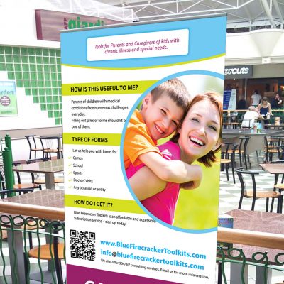
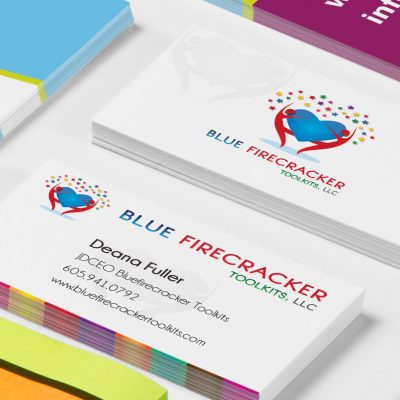
We designed marketing graphics to communicate and promote our client's products and services in a visually attractive and appealing manner. All the materials designed followed the guidelines of company's visual identity. It involved business cards, flyers, posers, gift cards, print ads, certificates, etc.
We created attractive visuals to grab people’s attention on all social media platforms. Professional cover images, banner images and profile images were finalized to maintain brand consistency across all social channels. Social graphics were designed in order to achieve brand's marketing goals.
We designed a professional and intuitive UI /UX interface which more people prefer to use and keep using it. Our goal here was to improve customer retention rate so that our client's brand can stay ahead of its competition. Better user experience leads to more visitors, more leads and more satisfied customers.
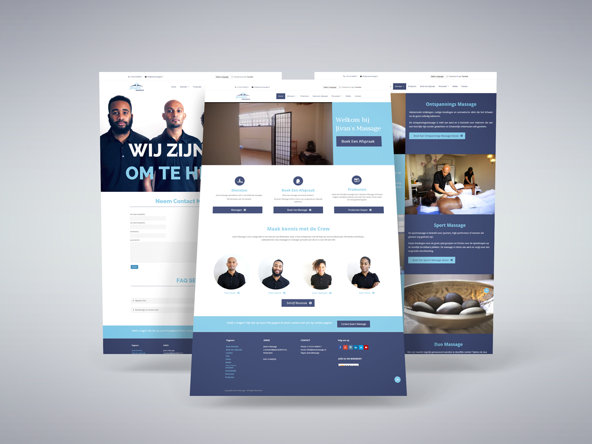
We created a responsive web design to optimise their user’s browsing experience by creating a flexible and responsive web page, optimized for the device their consumers are using. This delivers improved site experience skipping redirection with a unified design approach to create a consistent look and feel.
For website development we chose an open-source website creation platform that is written in PHP and uses a MySQL database. WordPress is probably the easiest and most powerful blogging and website content management system (or CMS) as of today. Our client need a site designed with usability and flexibility in mind and WordPress was the prefect solution for their requirements.
You might also like...
Let's team up for work
