Case Studies
A detailed look into our approach, work-process and results.
Creating a Strong Personal Brand for Jivan's Massage | A Health and Wellness Spa in Rotterdam City
Jivans Massage is a professional and serene massage studio situated in the heart of Rotterdam City where people love to unwind and relax on their holidays to enjoy a healthy and relieving massage therapy. Our client was looking to redesign his existing brand identity design into a modern and clean personal brand thereby giving a fresh outlook to his business.
Our Goal
To create a memorable impression on their client's mind and target audience while distinguishing Jivan's Massage as one of the reliable personal branding and affordable health-wellness center in Rotterdam City.
By developing a strong personal brand, you can differentiate yourself from the competition, establish credibility, and increase opportunities for career growth and success.
It requires thoughtful self-reflection, careful curation of your personal narrative, and consistent alignment of your actions with your desired brand image.
In the dynamic and interconnected professional world and with lot of personal brand example, it has become an indispensable tool for professionals to enhance their visibility, expand their network, and leave a lasting impact.
So, investing time and effort in understanding and shaping your personal brand can significantly boost your professional journey, allowing you to stand out in a crowded marketplace and make a memorable impression with the help of various personal brand examples.
What is Personal Branding and Why is it important?
Personal branding refers to the process of consciously shaping and managing one's image, reputation, and identity. It involves strategically showcasing your unique strengths, skills, and values to create a powerful and positive impression in the minds of others.
The essence of personal branding lies in authentically portraying yourself, both online and offline, as a reliable and trustworthy professional. It encompasses various elements such as your professional appearance, online presence, communication style, and networking skills.
Our Solution for a successful personal branding strategy
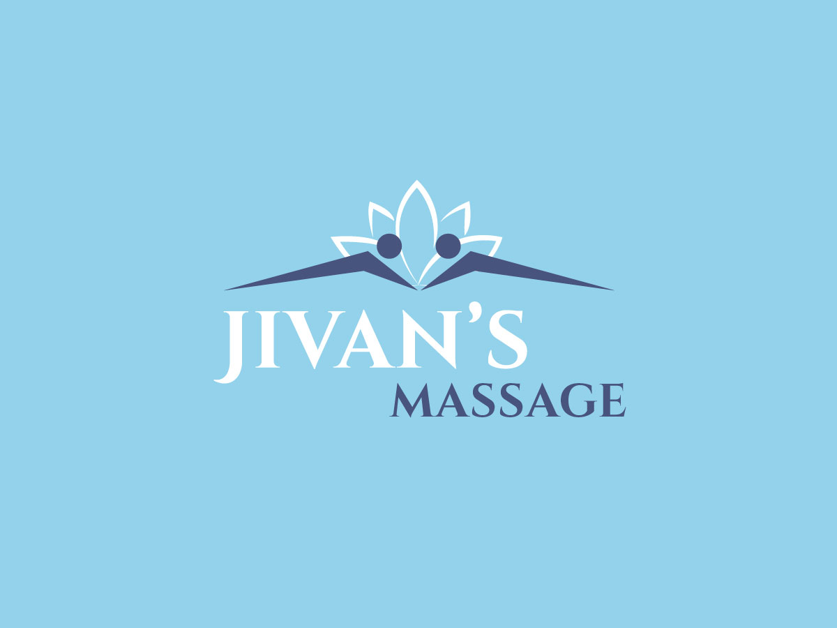
Logo Redesign & Makeover : We started working on their existing logo and made necessary small shifts to what’s already there by updating colors, fonts and simplifying the entire look and feel.
We were after a refreshed look to help the business connect with a new target audience and still maintain their customer base since personal branding important to convey the businses vision to it's target audience
Color Palette & Mood Board: Finalized a range of colors that can be used as an example of personal brand on logos, branding materials, social media, a device screen or other interface,and in videos.
The finalized color palette reveals a lot about our client's business logo, its values, its offerings, its uniqueness etc. We then moved on to create a mood board that defines a perfect brand and its communication. We further took this mood board as a guide in developing website and other personal brand visual graphics.
Typography Fonts: We decided to select the right type of fonts to connect with emotions of their potential customer, and website users. Our chosen typography invokes a feeling, creates a positive personal story, relaxing atmosphere and makes the personal branding important and memorable. Font styles to improve personal branding efforts, brand's communication through brand identity, ad copies, magazine headlines, and course books, etc.
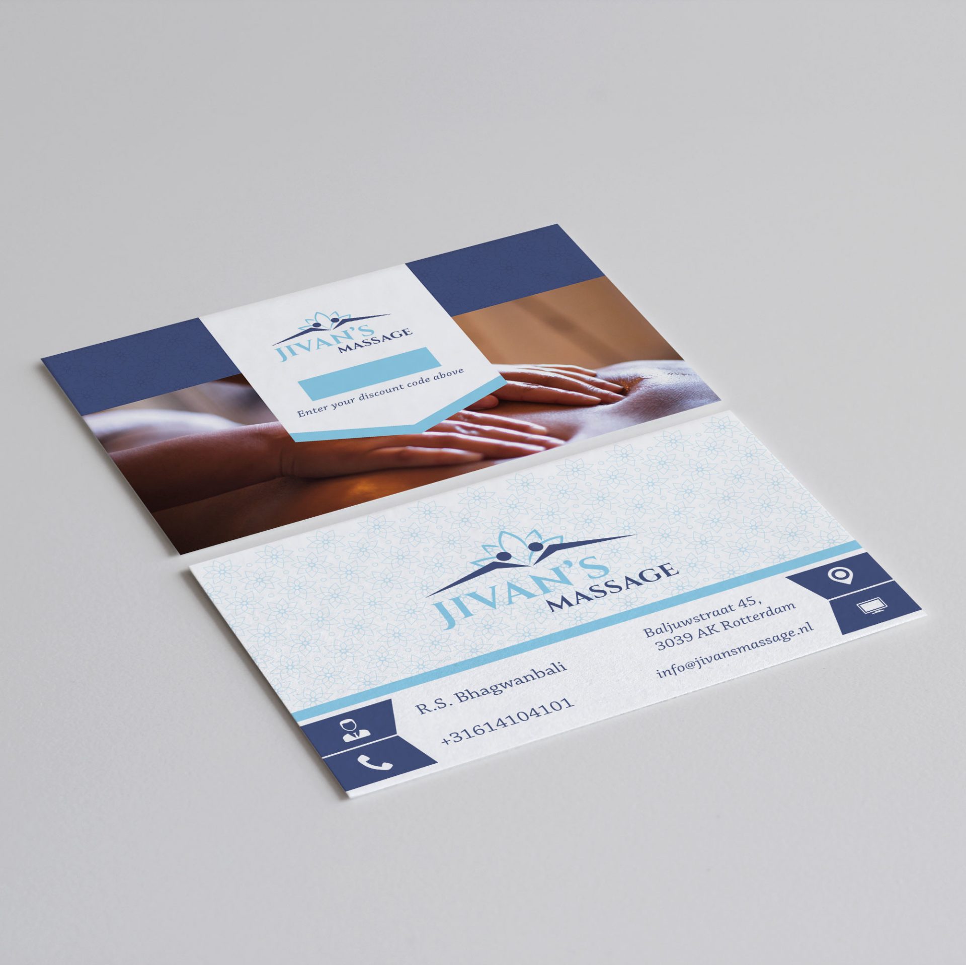
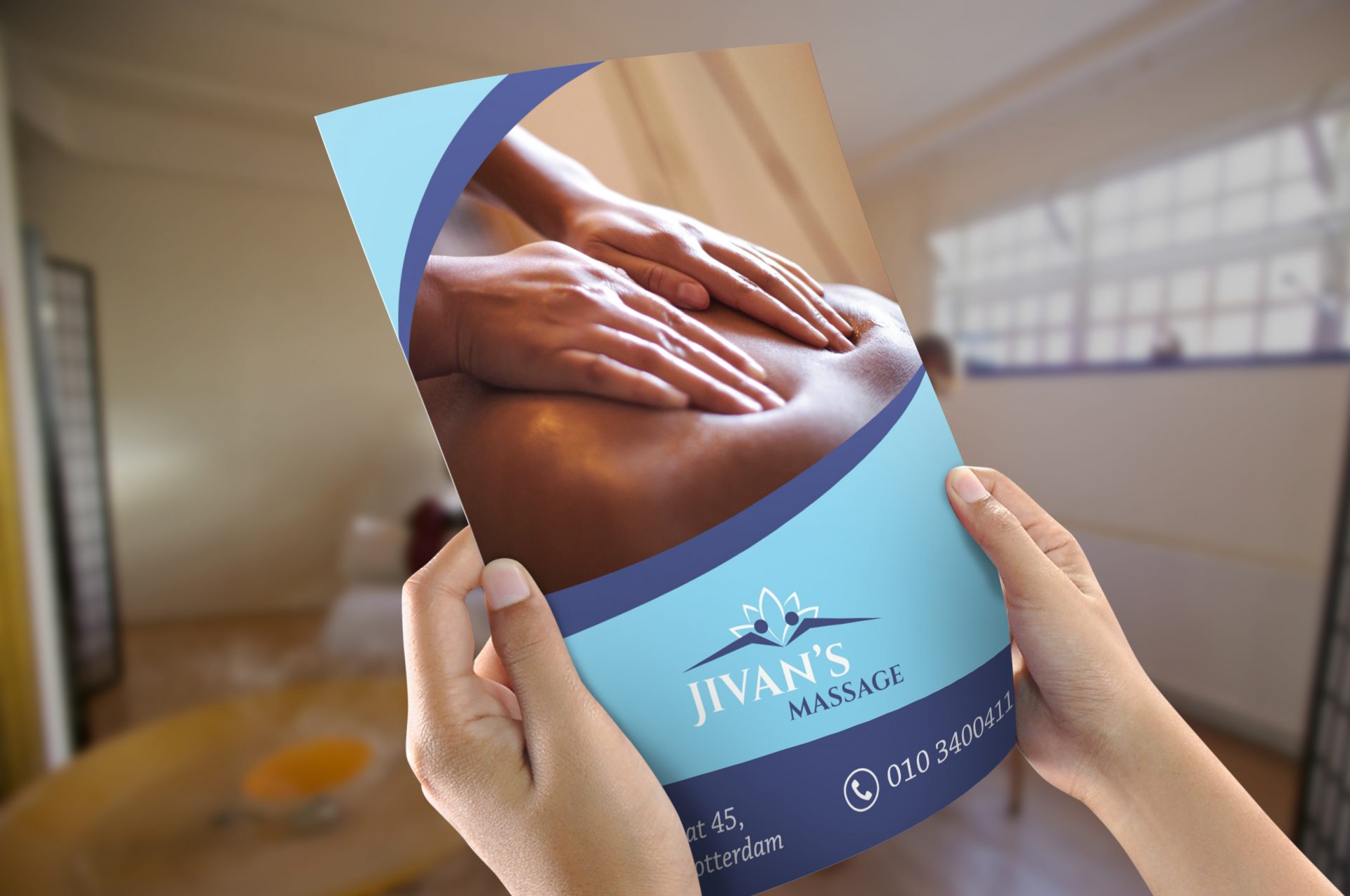
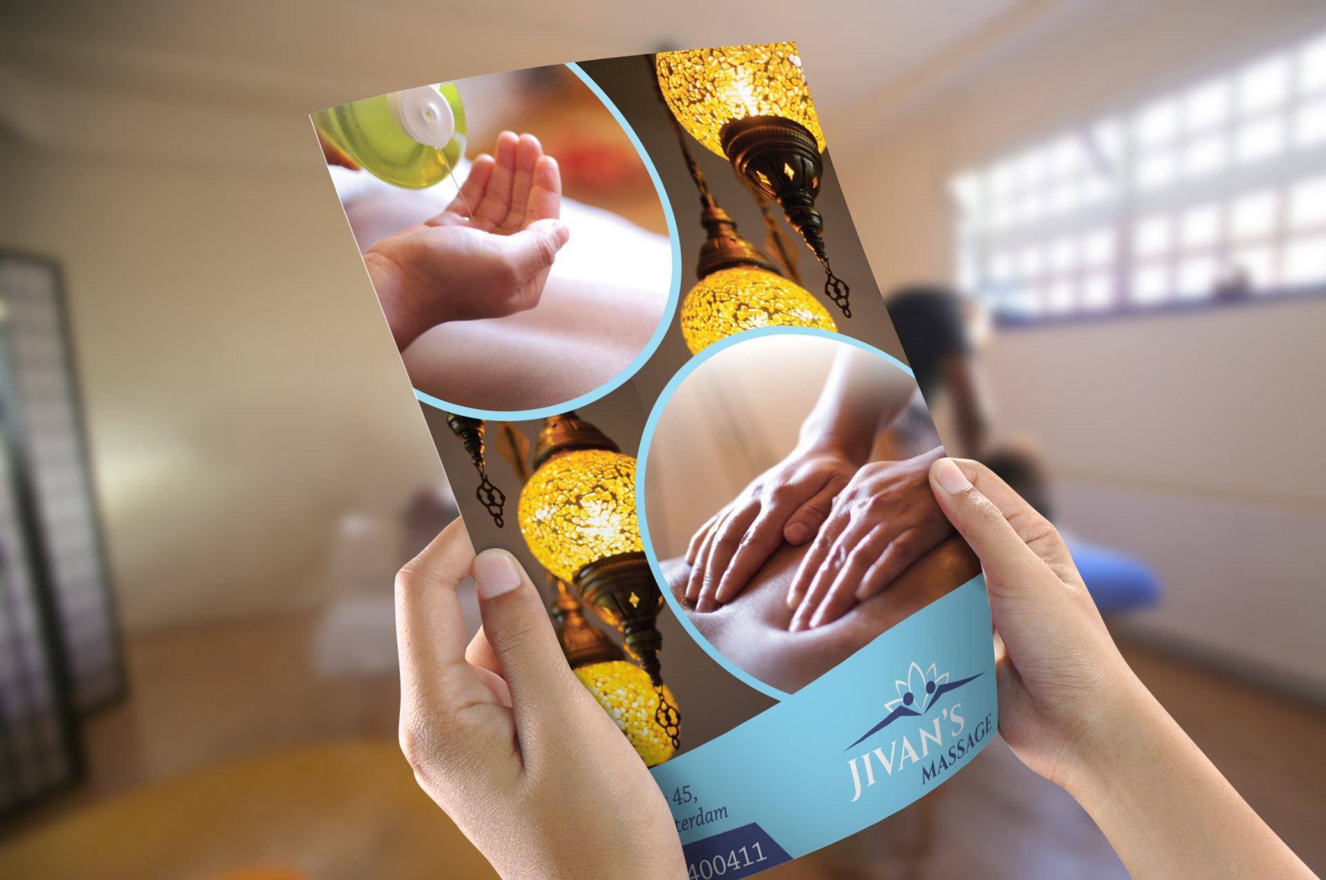
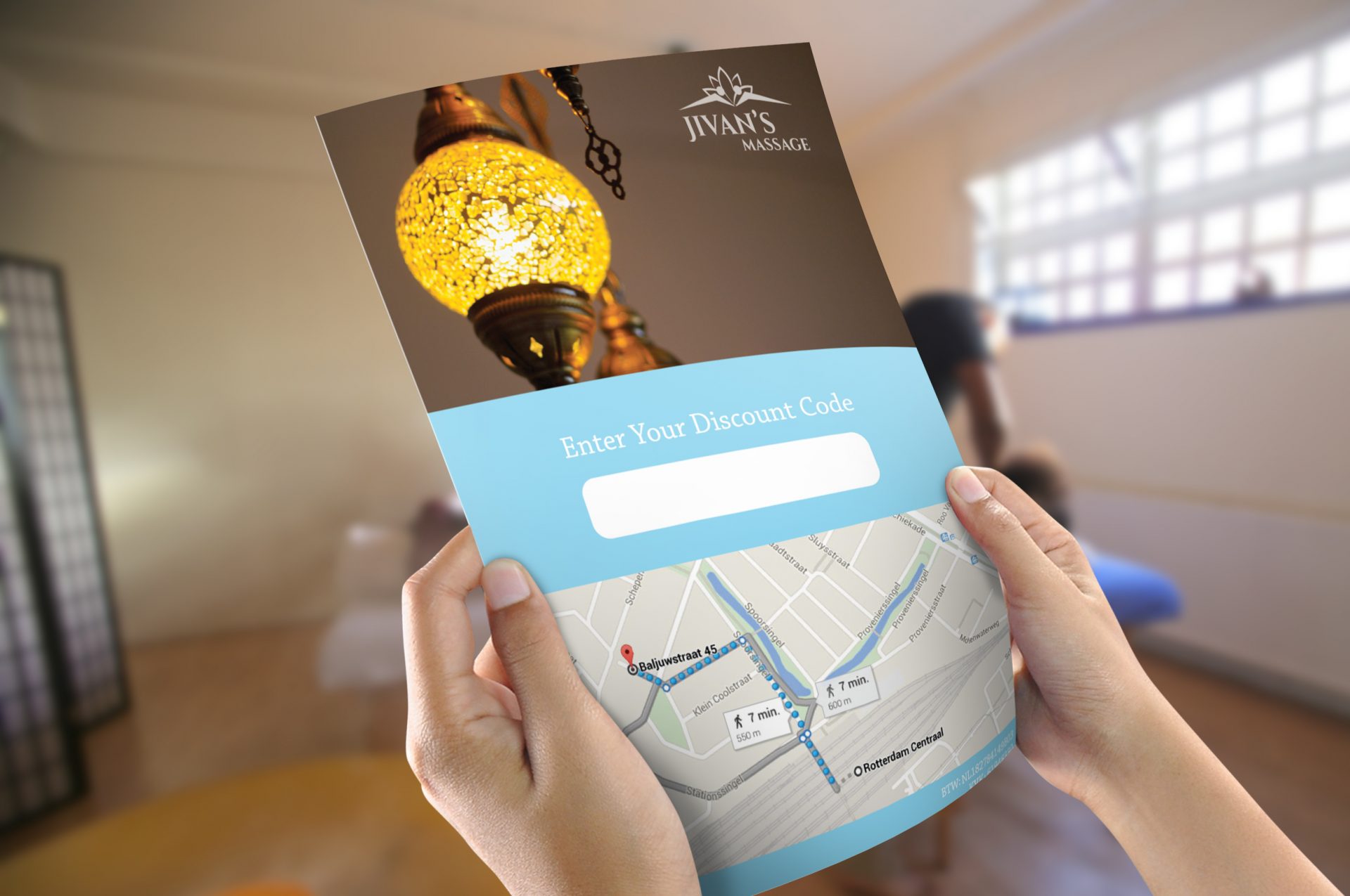
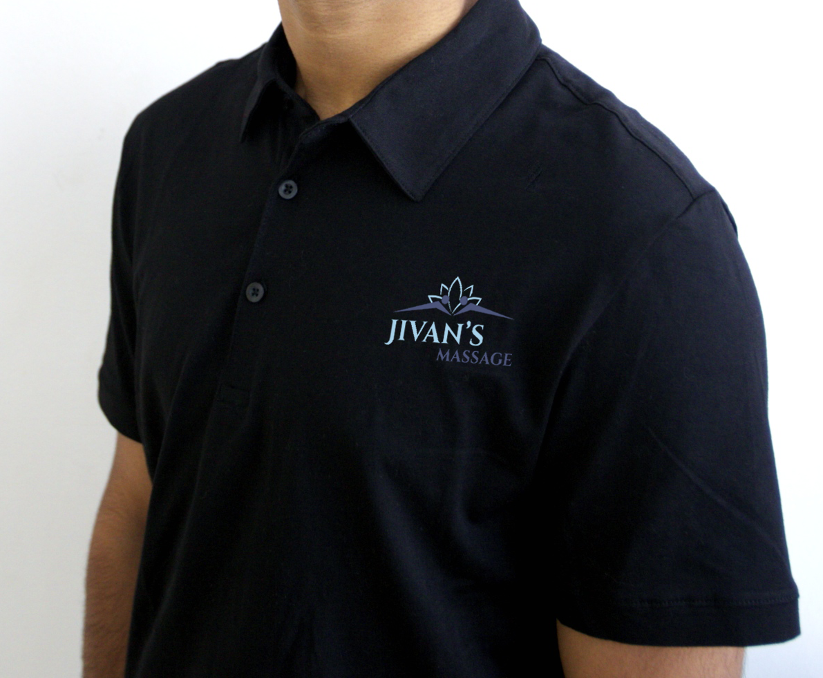
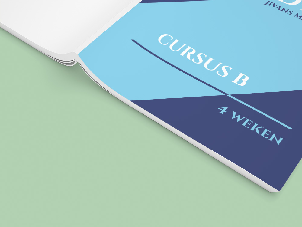
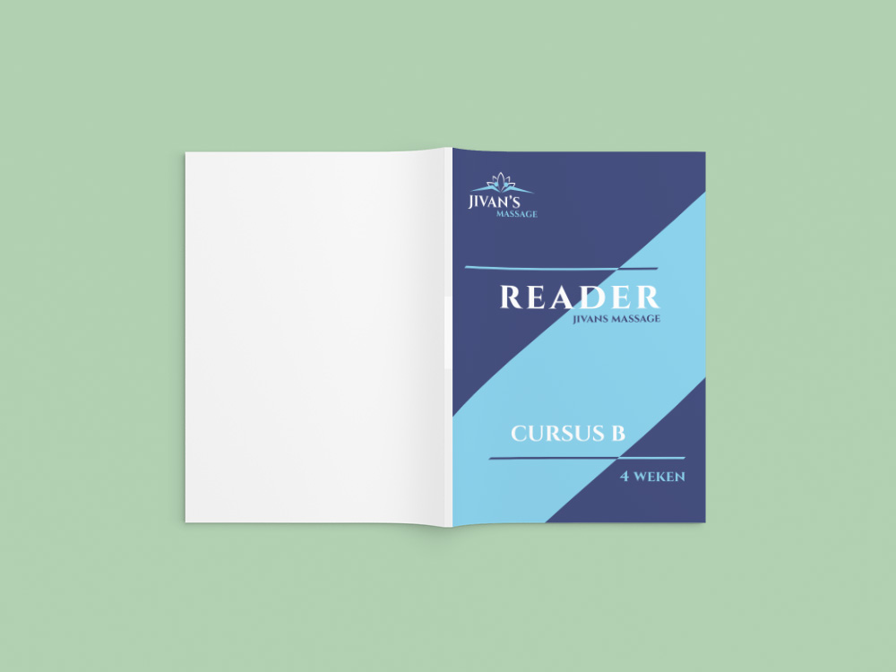
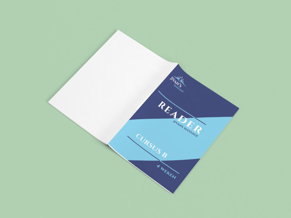
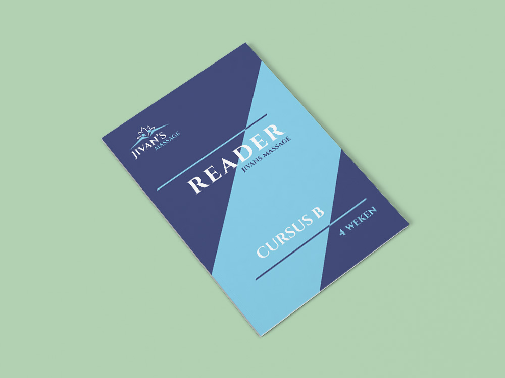
Brand Stationery: We kept the branding simple enough not to deviate from the functional value of the stationary. At the same time we wanted to mirror what people see on other social media platforms or ads, such as in flyers, newspapers and billboards. Our goal was to make the brand look consistent and effective across all offline platforms since print stationary are mostly used offline in real world and is of a great importance for a personal brand.
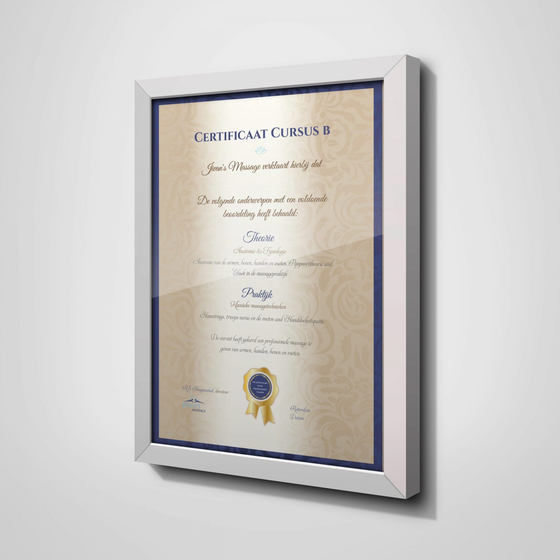
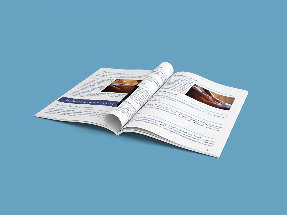
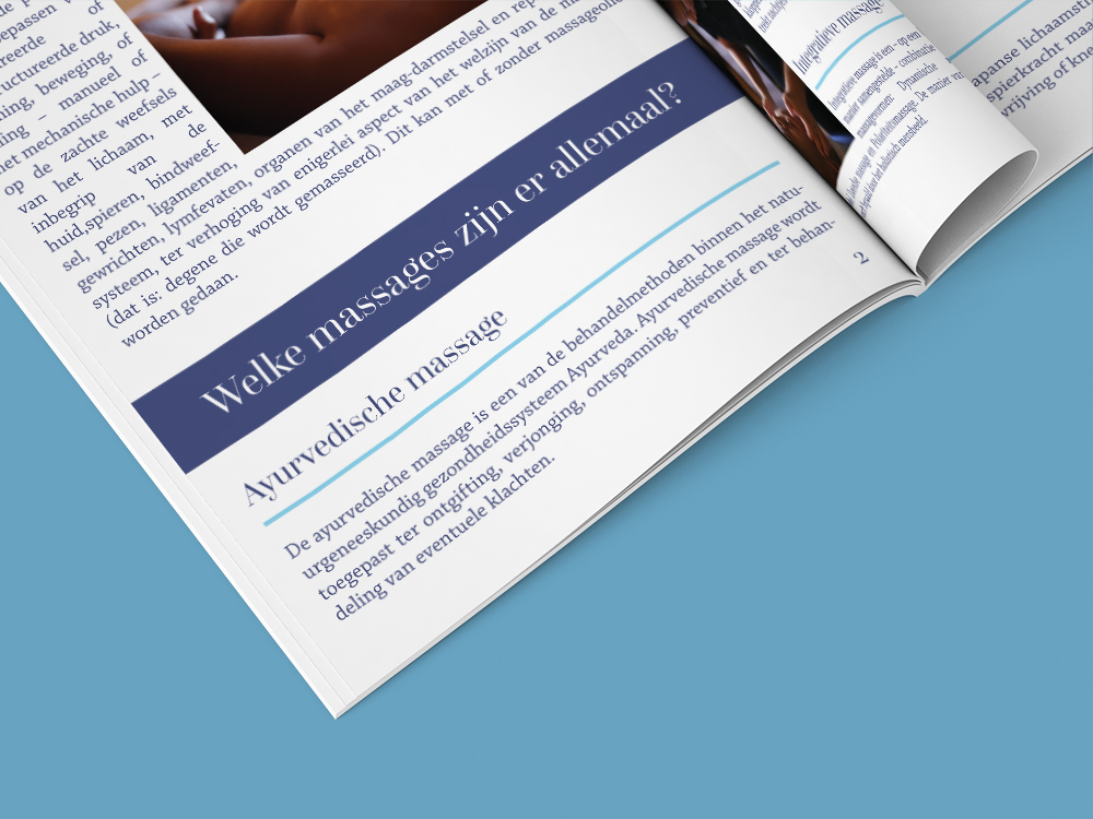
Print Marketing Graphics: With enough personal branding efforts we designed marketing graphics, personal brand statement, personal website,etc to communicate and promote our client's products and services in a visually attractive and appealing manner. All the brand voice materials designed followed the guidelines of company's visual identity. It involved business card, personal branding statement, personal brand story, responsive website, flyers, posers, gift cards, print ads, certificates, etc.


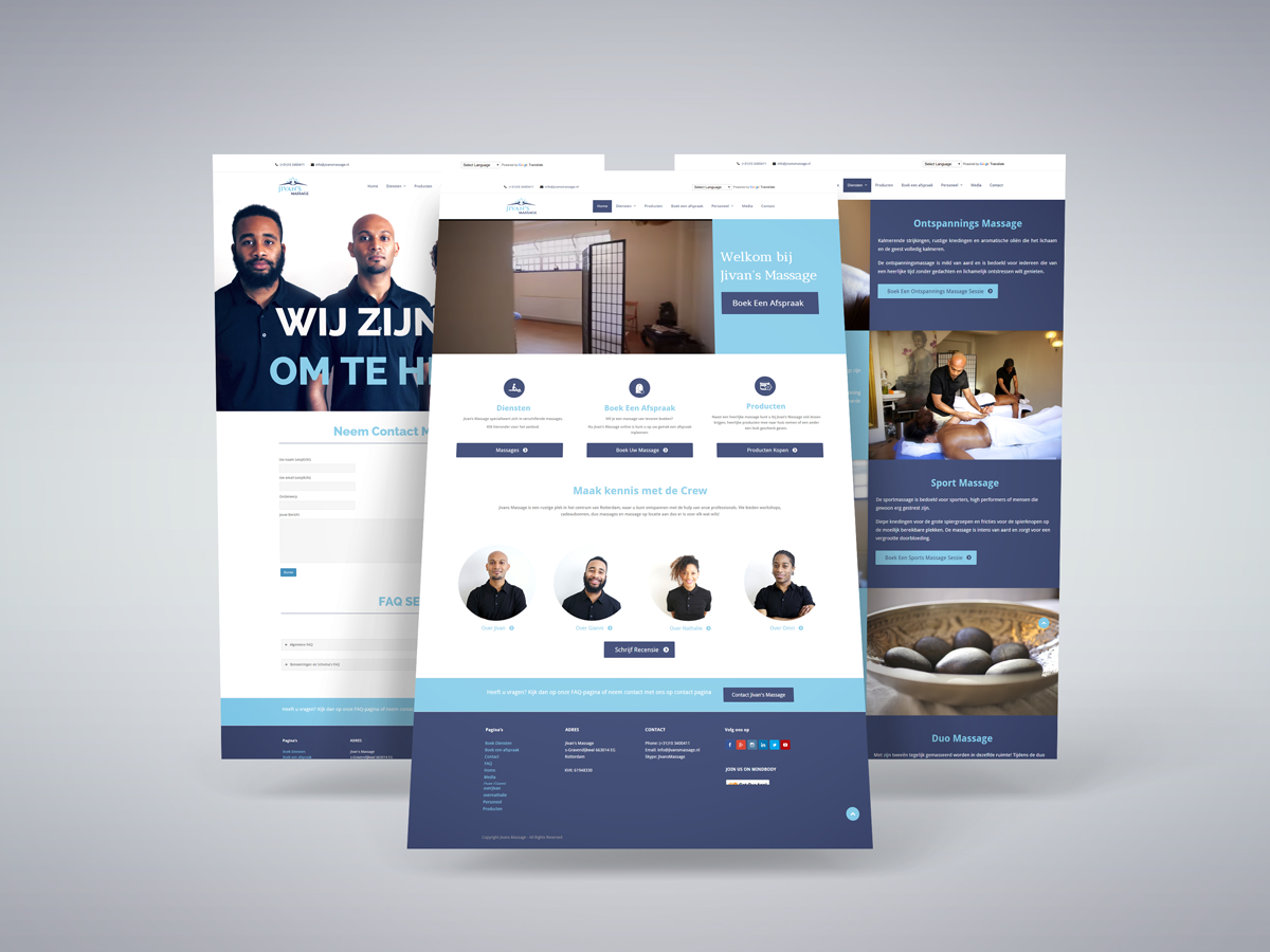
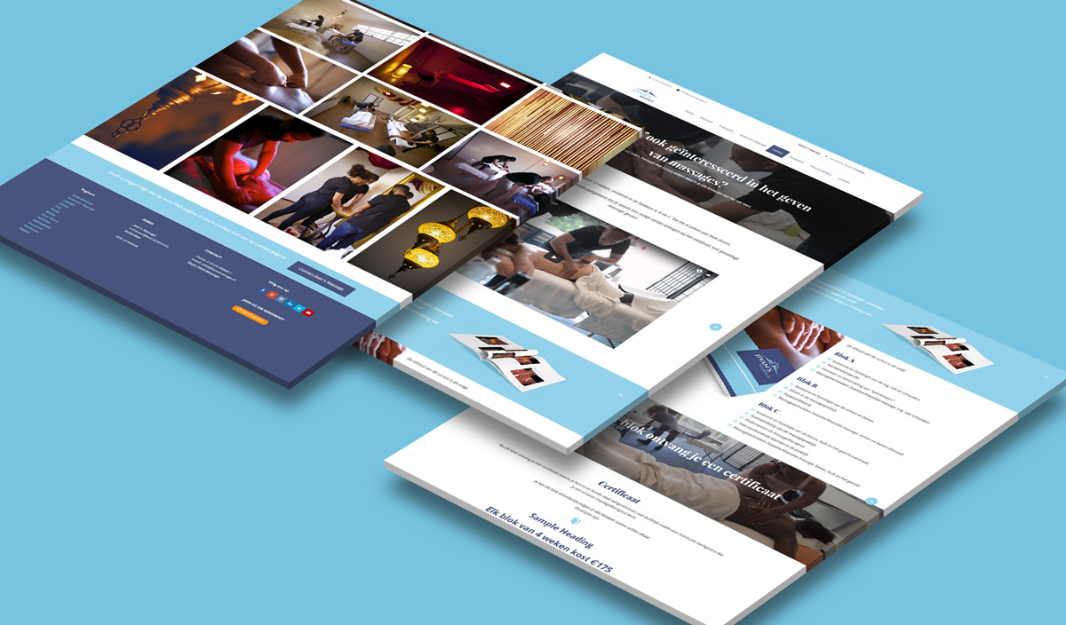
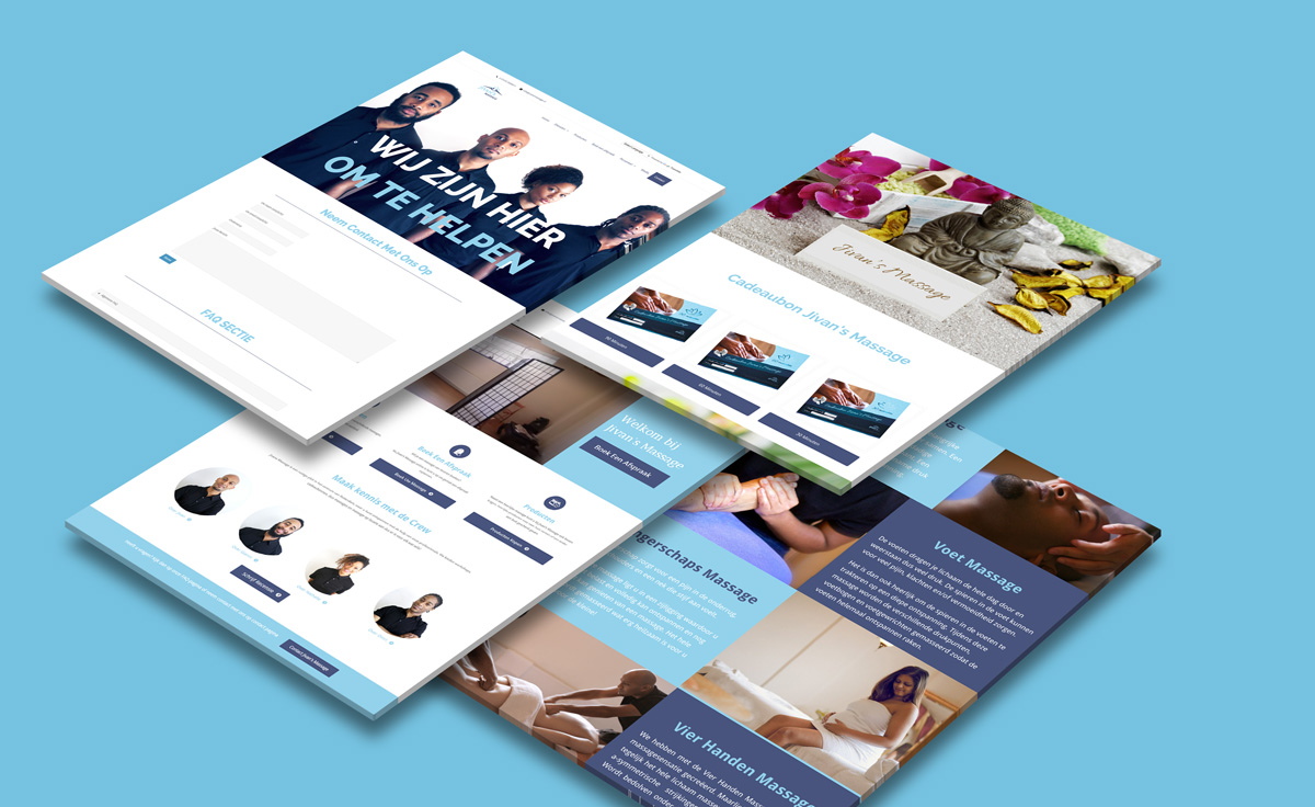
Responsive Web Design for Personal website: Branding yourself can be challenging skill. To learn more you can check related articles here. We created a responsive web design to optimise their user’s browsing experience by creating a flexible and responsive web page for a successful personal brand, optimized for the device their consumers are using. This delivers improved site experience skipping redirection with a unified design approach to create a consistent look and feel and a strong brand.
WordPress Web development: We designed a website with usability and flexibility in mind and WordPress was the prefects choice for their requirements. Choosing a flexible CMS will help us to reduce extra human resources for later maintenance.
Social Media Graphics: We created solid personal brand with attractive visuals to grab potential client attention on all social media platform. Professional cover images, banner images and profile images were finalized to maintain a powerful personal brand and brand consistency across all social channels. As a part of personal branding ideas, social graphics were designed in order to achieve brand's marketing goals.
UI/UX Design: For a successful personal brand we also designed a professional and intuitive UI /UX interface which more people prefer to use and keep using it. Our goal here was to improve customer retention rate so that our client's strong brand can stay ahead of its competition. Better user experience for a person leads to more visitors, online presence, easy content marketing, more leads and more satisfied customers.
Our Solution
We started working on their existing logo and made necessary small shifts to what’s already there by updating colors, fonts and simplifying the entire look and feel. We were after a refreshed look to help the business connect with a new audience and still maintain their customer base.
Finalized a range of colors that can be used on logos, branding materials, a device screen or other interface,and in videos. The finalized color palette reveals a lot about our client's brand, its values, its offerings, its uniqueness etc. We then moved on to create a mood board that defines a brand and its communication. We further took this mood board as a guide in developing website and other brand visual graphics.
We decided to select the right type of fonts to connect with emotions of their consumers and website users. Our chosen typography invokes a feeling, creates a positive atmosphere and makes the brand memorable. Font styles to improve brand's communication through logos, ad copies, magazine headlines, and course books, etc.
We kept the branding simple enough not to deviate from the functional value of the stationary. At the same time we wanted to mirror what people see on other platforms or ads, such as in flyers, newspapers and billboards. Our goal was to make the brand look consistent and effective across all offline platforms since print stationary are mostly used offline in real world
We designed marketing graphics to communicate and promote our client's products and services in a visually attractive and appealing manner. All the materials designed followed the guidelines of company's visual identity. It involved business cards, flyers, posers, gift cards, print ads, certificates, etc.
We created attractive visuals to grab people’s attention on all social media platforms. Professional cover images, banner images and profile images were finalized to maintain brand consistency across all social channels. Social graphics were designed in order to achieve brand's marketing goals.
We designed a professional and intuitive UI /UX interface which more people prefer to use and keep using it. Our goal here was to improve customer retention rate so that our client's brand can stay ahead of its competition. Better user experience leads to more visitors, more leads and more satisfied customers.
We created a responsive web design to optimise their user’s browsing experience by creating a flexible and responsive web page, optimized for the device their consumers are using. This delivers improved site experience skipping redirection with a unified design approach to create a consistent look and feel.
For website development we chose an open-source website creation platform that is written in PHP and uses a MySQL database. WordPress is probably the easiest and most powerful blogging and website content management system (or CMS) as of today. Our client need a site designed with usability and flexibility in mind and WordPress was the prefect solution for their requirements.
Results
Our Work (click to zoomin)
You might also like...
Let's team up for work
Client Testimonials
BEST BRAND DESIGN | BEST BRAND IDENTITY | BEST DESIGN AGENCY | BEST CREATIVE
Let's infuse your brand with bold lines and potent graphics, fresh slogans and clear design. No additives. No pollutants. Nothing but pure design. We are passionate about helping businesses grow and succeed in today's rapidly evolving market. Our successful track record and positive feedback from clients speak for themselves, making us the go-to choice for businesses looking to establish a strong brand identity and reach their target audience.

She is the perfect professional who understands her craft extremely well. Very fast workpace and the highest quality around. Besides design and creating a custom logo & brand, she and her team has a professional insight on what can make your business more profitable and is always checking new ways on how branding and online identity can be improved or set to (better).
Rajiv Bhagawanbali, CEO
Rotterdam Area, Netherlands
jivansmassage.nl

As a first-time project, I can promise it won't be my last time to get help from Kavya, but next time it will be tough for someone to beat the skills and professionalism from her. I have professional commercial and production people around me to survey the work and to accept, as equal professionals they were impressed by Kavya's work. See you soon again...
Kenneth H Christensen, CEO
Valby, Capital Region, Denmark
adlercompany.com
About Us

KM Digital Creatives, the top design agency specializing in brand design and innovative digital media solutions. Serving clients worldwide since 2011 and worked with companies from diverse industry backgrounds to deliver a strong, modern and trustworthy digital presence. Combining creativity and expertise, we deliver unparalleled results to help your brand stand out. Contact KM Digital Creatives today!
Copyright © 2011-2026 KM Digital Creativz (kmdigitalcreatives.com) | All rights reserved | Terms of Service | Privacy Policy