
Combination Logo Design: A Symbol and Wordmark Built to Connect Generations
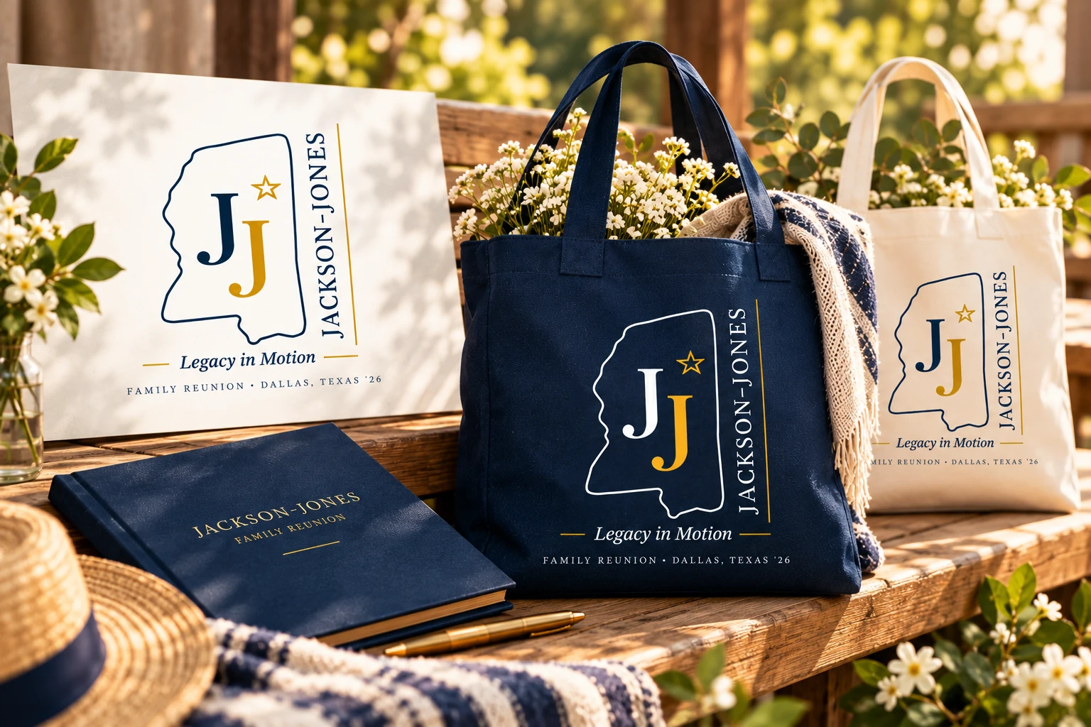
A combination logo brings together a distinctive symbol and wordmark to create a flexible, recognizable brand identity.
For this family reunion, the identity combines a meaningful JJ symbol with the Jackson-Jones name, creating a mark that feels personal, timeless, and easy to recognize across future gatherings. The result is more than an event logo: it creates a visual identity that can extend across print, stationery, keepsakes, and future family celebrations. (Updated on 9, Sep, 2026)
Before We Started
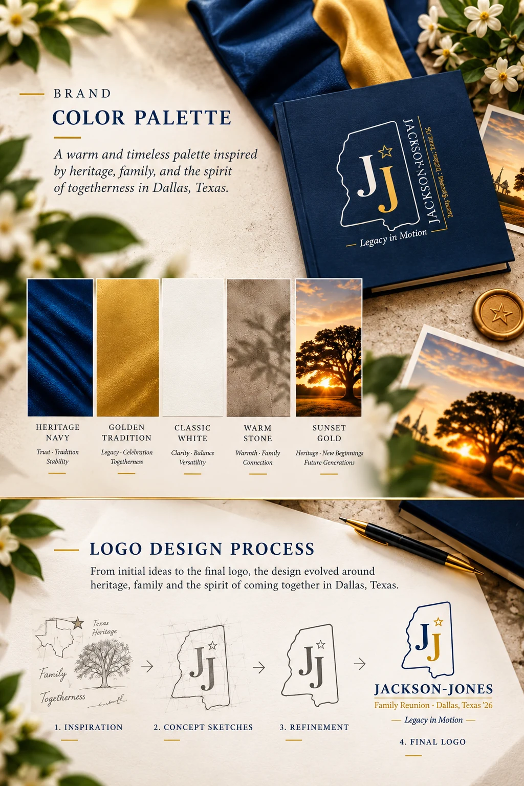
The existing identity needed a more flexible direction. The original event logo felt overly detailed for an identity that needed to work across invitations, apparel, signage, and printed materials. The redesign focused on simplifying the visual hierarchy, improving legibility, and creating a mark that could remain clear and recognizable across different uses.
The Brand Challenge
The new direction needed to feel distinctive without becoming complicated. The symbol and typography had to work together naturally, with balanced proportions and a clear visual hierarchy. The identity also needed flexible horizontal and stacked layouts, allowing the mark to adapt to different compositions while maintaining a consistent character.
Creating an Identity That Felt Personal, Timeless, and Meaningful
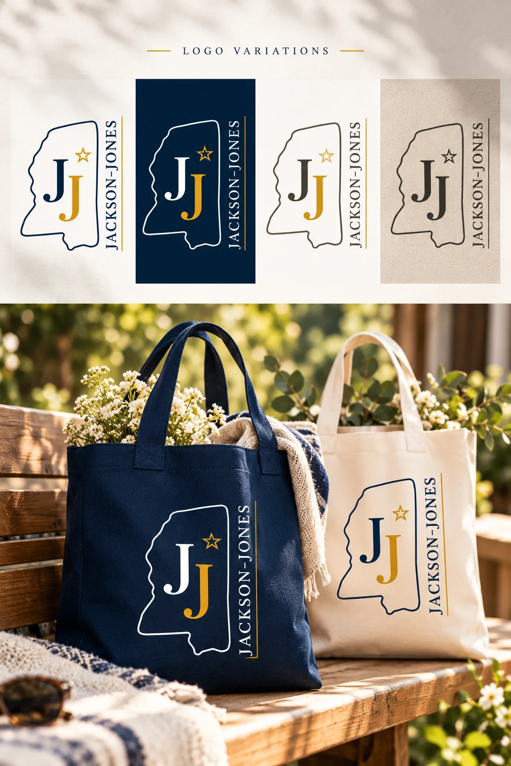
The system was built to remain consistent across color and black-and-white versions, while flexible layouts allowed the identity to adapt to different applications. This made it practical across screen sizes and print formats, from event signage and stationery to apparel, keepsakes, and future family materials, without losing its visual character or recognition.
Why This Combination Logo Direction Worked
A combination logo works best when the symbol and wordmark feel like parts of the same identity rather than competing elements. In this direction, the mark was refined to remain distinctive at different sizes while keeping the typography clear and memorable. The final design also allowed the identity to move naturally between full-color and simpler applications, making it a versatile choice for both digital and printed materials.
Bringing Every Brand Element Together Under One Identity
✓ Custom event logo design
✓ Monogram logo design
✓ Brand identity system
✓ Typography selection and hierarchy
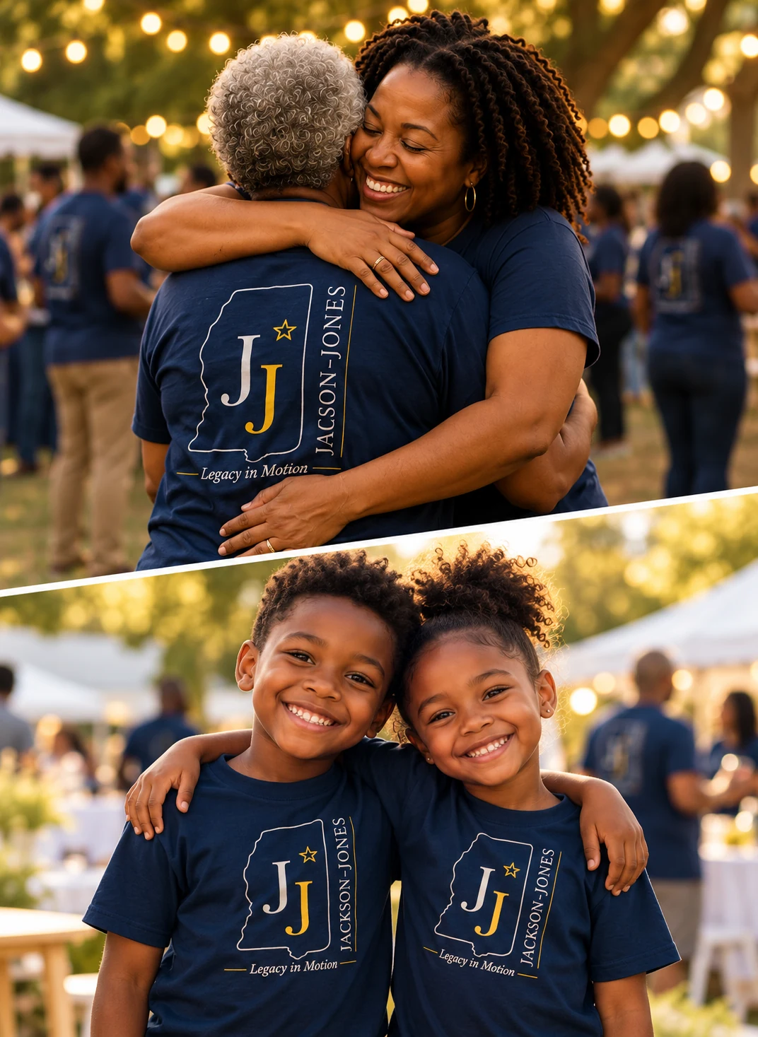
✓ Apparel branding mockups
✓ Brand application mockups
✓ Color Palette Guidelines
✓ Monogram logo design
✓ Brand identity system
✓ Typography selection and hierarchy
✓ Apparel branding mockups
✓ Brand application mockups
✓ Color Palette Guidelines
Result
The final identity brought together the JJ monogram, Texas-inspired outline, classic typography, and heritage-led color palette into one cohesive visual system.
The mark was refined to avoid competing elements or unnecessary detail, while maintaining enough character to feel distinctive and memorable. Its flexible construction allowed the logo to work in full color and black-and-white, as well as horizontal and stacked arrangements, making it practical across invitations, signage, apparel, stationery, keepsakes, and other screen and print applications. The result was an identity that felt rooted in the family’s heritage while remaining flexible enough for future reunions and celebrations.
Ready To Build A Brand People Remember?
Whether you're launching a new business, repositioning an existing brand, or building a stronger digital presence—we create branding systems designed to grow with you.
Let's create something meaningful together. Contact us.
Let's create something meaningful together. Contact us.