When someone searches for a cleaning service, they’re not just comparing prices or services. They’re making a fast judgment about who feels reliable enough to trust with their space. In many cases, your logo is the first thing that judgment is based on.
That’s why choosing the right cleaning business logo ideas isn’t about decoration or trends. It’s about visual signals — cleanliness, consistency, and professionalism — that help people feel confident choosing you.
This guide explains what actually makes cleaning logos effective, how different customer types interpret them, and how to avoid the design mistakes that quietly weaken credibility.
Why Your Cleaning Business Logo Is a Trust Signal
Cleaning is a high-trust service. Clients invite your team into homes, offices, clinics, and private environments. Before they read a review or call your number, your logo already shapes their expectations.
Research on usability and visual trust from the Nielsen Norman Group shows that people associate clear, simple visual design with competence and reliability, especially when decisions are made quickly.
A logo that feels cluttered, outdated, or confusing creates hesitation. A logo that feels calm and intentional reduces it.
What Actually Makes Cleaning Business Logo Ideas Work
1. Simplicity That Survives Real-World Use
A cleaning logo has to work beyond a website header. It appears on uniforms, vans, invoices, WhatsApp images, and Google listings — often at small sizes and from a distance.
Strong cleaning logo design relies on simplicity because:
-
Simple shapes remain recognizable when scaled down
-
Clear contrast improves visibility in motion
-
Fewer elements increase brand recall
Professional logo design standards promoted by AIGA emphasize scalability and legibility as essential requirements, not stylistic preferences. If a logo depends on detail to look “complete,” it usually fails in everyday use.
2. Color Psychology That Signals Cleanliness
Color is one of the fastest ways people judge hygiene and professionalism.
In effective professional cleaning logos, color choices tend to follow consistent psychological patterns:
-
Blue communicates trust, calm, and reliability
-
Green signals eco-friendly or non-toxic cleaning
-
White reinforces cleanliness and order
-
Aqua and teal suggest freshness and water
Color psychology principles explained by the Interaction Design Foundation show why cooler and lighter tones are strongly associated with cleanliness and safety.
Successful cleaning brands don’t stand out through loud color combinations — they stand out through clarity and restraint.
3. Typography That Builds Confidence
Typography in cleaning logos isn’t about personality — it’s about confidence.
Fonts that perform best are:
-
Instantly readable
-
Neutral rather than expressive
-
Balanced in weight and spacing
Highly decorative fonts may appear friendly, but they often reduce perceived reliability, especially in commercial or recurring cleaning services. If the typeface draws attention to itself, it competes with the message of cleanliness and order.
Proven Cleaning Business Logo Styles (And Why They Work)
1. Minimal Icon Logos
Minimal logos use abstract symbols such as sparkles, water forms, or letter marks rather than literal tools.
They work because:
-
They scale effortlessly
-
They look modern and intentional
-
They don’t limit future service expansion
For businesses planning long-term growth, minimal icons often age better than illustrative designs.
2. Text-Based (Wordmark) Logos
Wordmark logos rely entirely on typography and spacing.
They are effective when:
-
The business name is short and distinctive
-
Brand recall is a priority
-
Consistency across locations matters
A clean wordmark paired with a disciplined color system often feels more established than an over designed symbol.
3. Combination Logos (Icon + Text)
Combination logos offer the most flexibility.
They allow:
-
Full logo use on websites
-
Icon-only use on social media and vehicles
-
Strong brand consistency across touchpoints
For most cleaning businesses, this is the safest and most adaptable option.
Logo Ideas by Cleaning Business Type (Why This Matters)

1. Residential Cleaning Logo Ideas
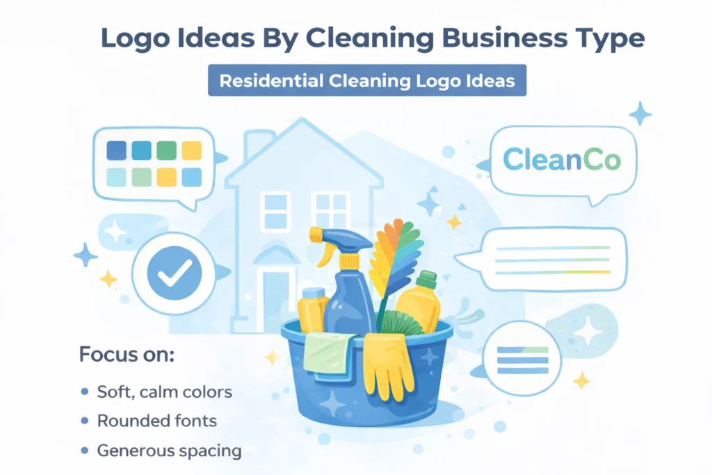
Residential clients evaluate logos through the lens of personal safety and comfort. They want reassurance that the people entering their home are careful, respectful, and dependable.
Effective residential cleaning logo ideas:
-
Use soft but professional color palettes
-
Favor rounded typography and generous spacing
-
Feel calm, not playful
Designs that lean too far into novelty or cartoon visuals often reduce trust, especially for repeat or long-term residential services.
2. Commercial & Office Cleaning Logo Design
Commercial clients prioritize consistency and standards over warmth.
Strong commercial cleaning logo design communicates:
-
Structure and reliability
-
Operational discipline
-
Professional accountability
Neutral colors, sharp typography, and minimal layouts signal efficiency. Overly friendly or decorative logos can quietly undermine credibility in B2B and office cleaning environments.
3. Eco-Friendly Cleaning Logo Ideas
Eco-conscious customers are cautious. They look for authenticity rather than symbolism overload.
High-performing eco-friendly cleaning logo ideas:
-
Suggest sustainability subtly through color and spacing
-
Avoid overused leaf or globe imagery
-
Keep cleanliness as the primary message
Restraint builds credibility. Loud “green” visuals often trigger skepticism instead of trust.
Common Cleaning Logo Mistakes That Hurt Credibility
Most ineffective cleaning logos don’t fail creatively — they fail strategically.
Common issues include:
-
Generic stock icons that signal low effort
-
Overdesigned visuals that break at small sizes
-
Trend-driven effects that age quickly
These mistakes make brands look temporary. In a service industry built on repeat trust, temporary-looking brands struggle to convert.
How Your Logo Supports SEO and Local Visibility
A logo doesn’t rank keywords, but it influences user behavior — which affects SEO indirectly.
Consistent branding:
-
Improves click-through rates
-
Strengthens recognition across local citations
-
Reduces bounce rates
-
Builds trust in Google Business profiles
Guidance from Google Search Central emphasizes clarity, consistency, and people-first presentation as quality signals. Local SEO research from Moz also highlights consistent branding as a trust factor across directories and map results.
FAQs: Cleaning Business Logo Ideas
What makes a good cleaning business logo?
A good cleaning logo is clear, simple, readable, and visually associated with cleanliness and reliability.
Do cleaning logos need tools like brooms or mops?
No. Abstract symbols often look more professional and age better.
What colors work best for cleaning logos?
Blue, green, white, and aqua tones consistently perform well.
How often should a cleaning logo be redesigned?
Only when your services, positioning, or quality level changes significantly.
Final Thoughts
The best cleaning business logo ideas don’t try to impress — they try to reassure.
A strong logo:
-
Makes your business feel dependable
-
Signals professionalism instantly
-
Supports marketing and local SEO
-
Helps customers choose you with confidence
Author Bio
KM Digital Creatives, is a branding and design strategist specializing in logo design, visual identity, and SEO-aligned brand systems for service-based businesses. With hands-on experience working with local and growing brands, we focus on creating logos that are not just visually appealing, but strategically built for trust, clarity, and long-term growth.
Source: This article is informed by established research, industry best practices, and official search and usability guidelines referenced within the content.
