
Wordmark Logo Design That Makes Your Brand Name Unforgettable
Logo Portfolio Examples & Wordmarks
TL;DR: A wordmark (or logotype) is a text-only logo built from custom typography around a brand's name, using distinctive lettering rather than icons or symbols to create a recognizable visual identity that works across websites, social media, packaging, signage, and other brand touchpoints while strengthening recognition through consistent use.
Quick Answers
Definition: A text-only logo built around a brand name using distinctive typography.
Best for: Brands with short, memorable names seeking strong name recognition.
Fonts: Custom or carefully selected typefaces with distinctive, readable letterforms work best.
Trademark Ability: Unique custom typography can offer stronger trademark potential than generic lettering.
Cost: Pricing varies based on customization, scope, and the designer's experience.
Timeline: Most custom wordmark projects take several days to a few weeks.
KM Digital Creatives designs distinctive, trademark-ready wordmarks built on stylized typography rather than off-the-shelf fonts. Explore our work below or book a free consultation..
(Last updated on September, 25, 2026)
Wordmark Logo Portfolio
A wordmark logo turns that name into a visual signature, so every mention of your business reinforces recognition. Here are curated collection of logo portfolio with 80%+ wordmark styling, from pure typographic marks to subtly enhanced letterforms..
Featured Wordmark Logo Portfolio
Here's a glimpse of how custom wordmark design solves real branding challenges:
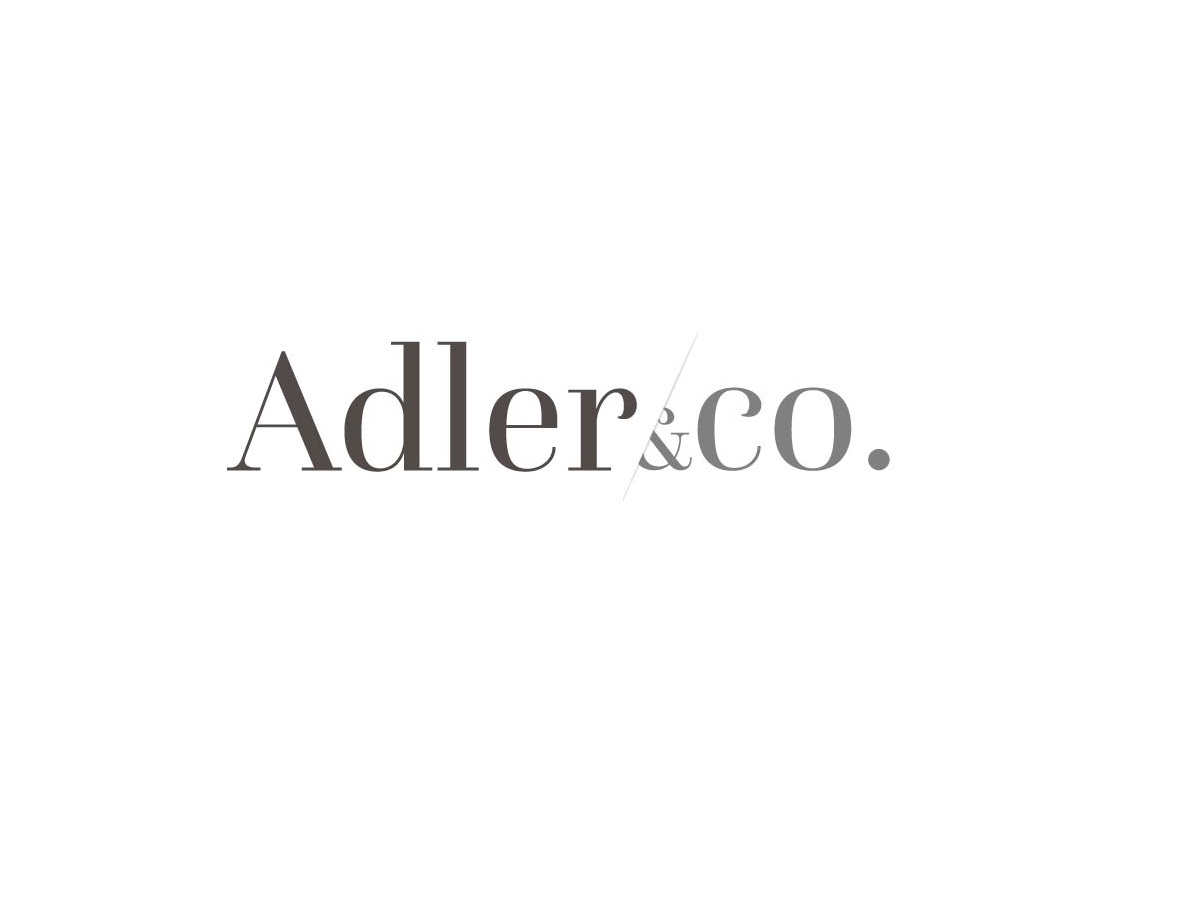
| Venture Capital Firm | Business Industry | Investment
Needed to project institutional trust without looking dated. We built a refined high-contrast serif wordmark with balanced spacing, the result was a mark that reads as established, credible, and modern across pitch decks and LP reports.
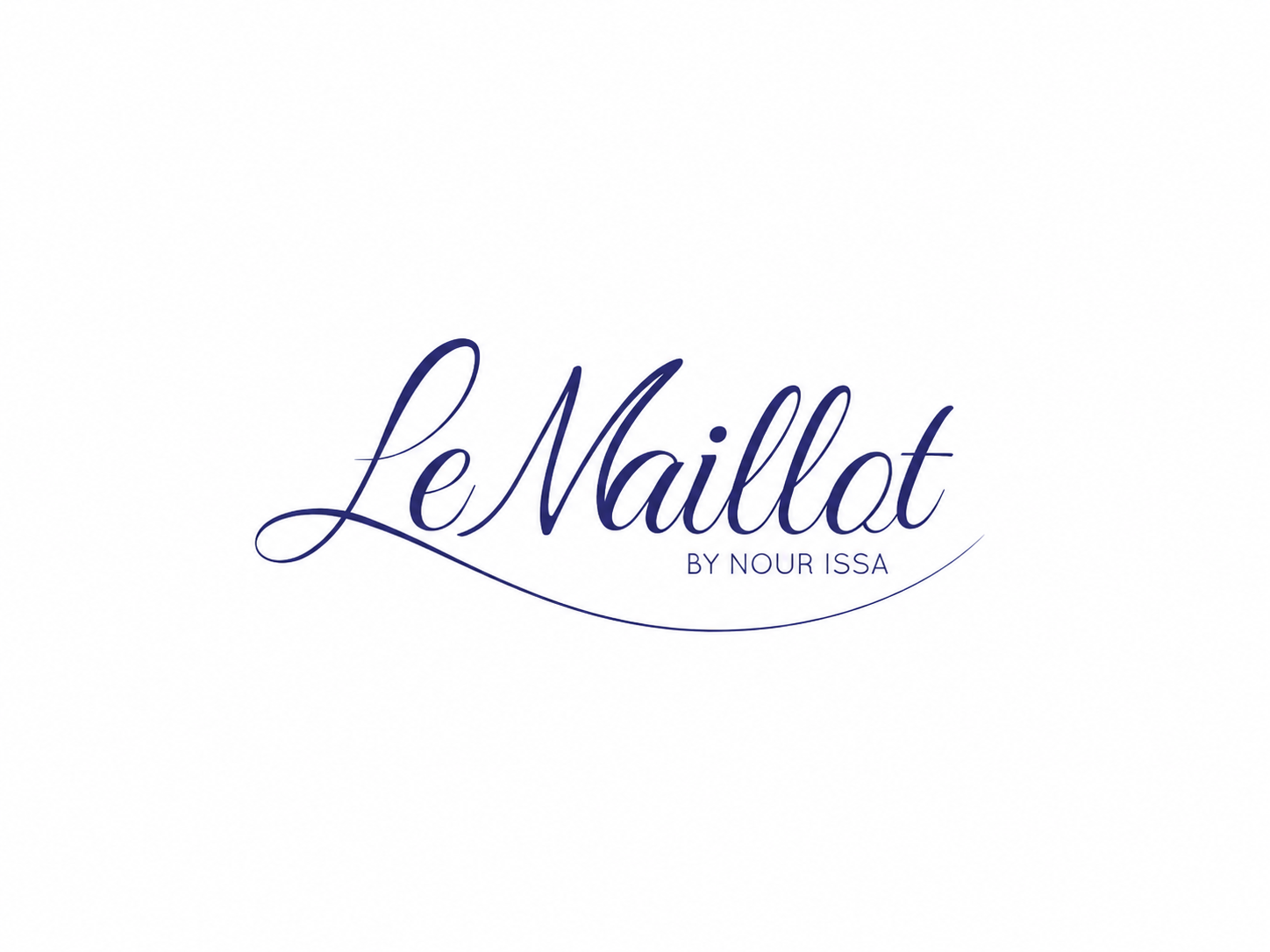
| Fine Jewellery Line | Luxury fashion | Retail & E-Commerce
Required distinctiveness and approachability in a crowded, symbol-heavy category. A custom flowing script wordmark with graceful swashes gave the brand a friendly, human tone that stood apart from icon-driven competitors.
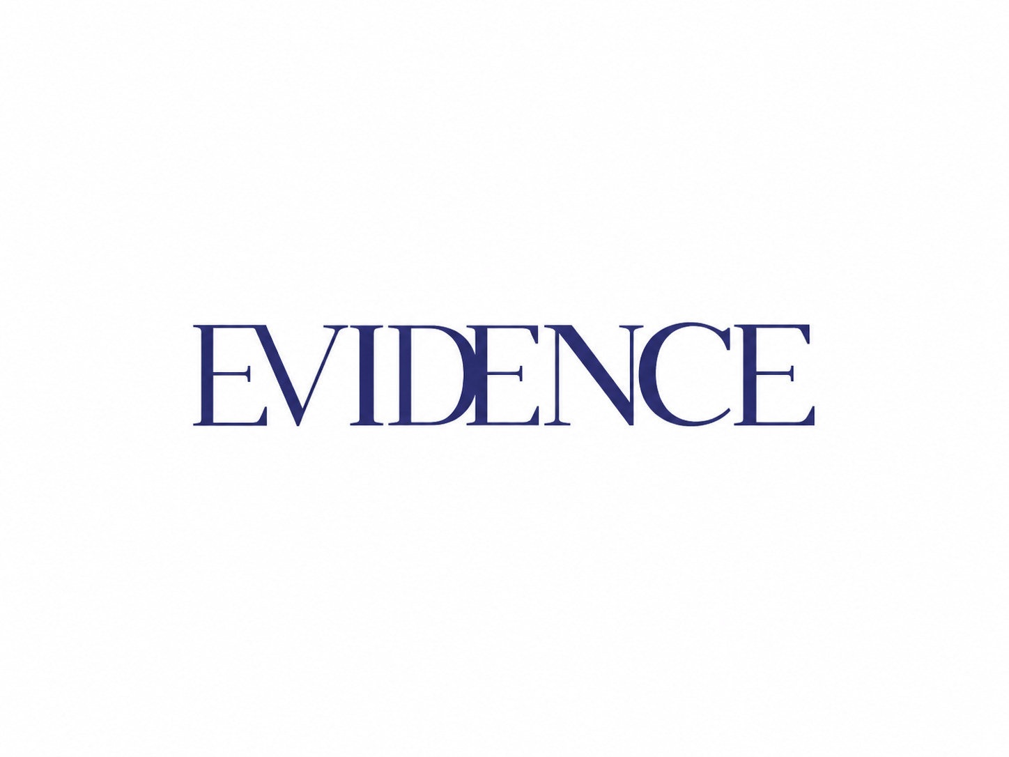
| Women Swimwear Brand | Fashion & Retail
Wanted elegance without relying on a typical swimwear symbol. We hand-refined high-contrast wordmark with elegant letterforms, producing a wordmark that feels premium on packaging, foil-stamped boxes, and Instagram alike.
What Is a Wordmark Logo?
A wordmark logo (also called a logotype) is a logo composed entirely of a brand's name rendered in custom or heavily customized typography. There is no icon, mascot, or abstract symbol — the letters themselves carry the brand's visual identity. This differs from a lettermark, which uses only initials (like IBM or HBO), and from a pictorial mark, which relies on an image or icon (like Apple's apple or Twitter's bird). According to design references such as the American Institute of Graphic Arts (AIGA), typographic logos are among the most enduring identity formats because they tie brand recognition directly to the name rather than a separate symbol.
Wordmarks are especially effective for companies with short, distinctive, or invented names, new businesses building name recognition from scratch, and B2B brands that want a clean, professional, text-forward presence.
See how we customize typefaces for each client →
Why Choose a Wordmark Logo? (And When It's the Right Call)
A wordmark makes the brand name itself the primary asset — every impression builds direct recognition rather than relying on a secondary symbol customers must learn to associate with you. Well-executed wordmarks are also remarkably versatile, scaling cleanly from a tiny app favicon to a storefront sign or billboard without losing legibility.
Because a wordmark is custom-drawn rather than a stock font typed in bold, it can potentially be registered as a distinctive trademark, offering stronger legal protection than a generic typeface treatment. That said, wordmarks aren't always the right choice: names that are very long, generic, or hard to pronounce often perform better with a supporting icon or a lettermark for smaller applications.
Not sure if a wordmark fits your brand? Get our recommendation →
Let's' look at the comparison table and best fonts suited for wordmark logos.
Wordmark | Lettermark | Combination | |
|---|---|---|---|
Best for | Short names | Long names | Growing brands |
Pitfall | Long names | Unfamiliar initials | More complex |
Scalability | High | High | Moderate |
Memorability | Name-led | Initial-led | Name + symbol |
Trademark | Needs distinct type | Initial conflicts | Stronger options |
Small sizes | Good if simple | Excellent | Symbol can lead |
Checklist: Is a Wordmark Right for You?
Mostly Yes?
A wordmark is likely a strong fit.
KM Digital Creatives: Strategic research, scalability testing, full brand system, cultural review, and post-launch support.
Freelance Designers: Quality and process vary by individual; strategy and testing may be limited.
Freelance Platforms: Access to many designers at different price points, but quality, consistency, and strategic involvement can vary significantly.
DIY Logo Tools: Fast and affordable, but offer limited customization, strategic input, and scalability testing.
How to Create a Modern, Readable Wordmark Logo?
Fresh wordmark ideas that still look professional share a few common traits: restrained customization, generous spacing, and confident simplicity. Here's how we approach it.
Our Four Step Wordmark Logo Design Process
DIHow to Create a Monogram Logo
DIHow to Create a Monogram Logo
DIHow to Create a Monogram Logo
DIHow to Create a Monogram Logo
DIHow to Create a Monogram Logo
DIHow to Create a Monogram Logo
DIHow to Create a Monogram Logo
We start with a consultation to understand your industry, audience, and positioning, then assess font psychology — should the brand feel bold and technical, or soft and premium? This audit narrows the typographic direction before any drawing begins.
This is where creative wordmark logo ideas take shape. We sketch letterforms by hand, then move to digital refinement — adjusting kerning, crafting custom ligatures, and embedding subtle hidden details (a negative-space cue, a unified stroke width, a signature terminal) that make the mark distinctive but still easy to read.
We present 2–3 concepts, gather feedback, and run focused revision rounds. Every concept is shown in real-world mockups — business cards, app icons, signage — so you can see how it performs before committing.
You receive full ownership transfer, trademark-ready vector files, and a complete brand kit covering color variations, spacing rules, and minimum-size guidelines.
Best Font Styles for a Wordmark Logo
Best Font Styles for a Wordmark Logo
Best Font Styles for a Wordmark Logo
Best Font Styles for a Wordmark Logo
There's no single "best" font style — the right choice depends on brand personality — but a few categories consistently perform well:
- Geometric sans-serifs for tech, finance, and modern B2B brands (clean, confident, highly legible at small sizes)
- Custom serifs for luxury, legal, and heritage brands (conveys authority and craftsmanship)
- Rounded sans-serifs for consumer, wellness, and lifestyle brands (approachable and friendly)
- Condensed or extended custom letterforms for brands needing a distinctive silhouette without extra ornamentation
To make a wordmark look premium without symbols, focus on precise kerning, consistent stroke weight, subtle ligatures between letter pairs, and generous negative space — restraint reads as confidence.
What's Included in Every Wordmark Package?
- Multiple initial wordmark logo concepts to explore
- Revision rounds to refine the selected direction
- Unlimited revisions available within the agreed project scope
- Final logo files in AI, EPS, SVG, PNG, and PDF formats
- Light and dark versions for flexible background use
- Simplified logo variations for different sizes and applications
- Scalable assets optimized for both web and print
- A defined color palette with HEX, CMYK, and RGB values
- A usage guideline covering spacing, sizing, and placement rules
Wordmark Logo Design: Pricing & Timeline
Wordmark logo projects typically start in the mid-hundreds range and scale up based on complexity and package tier, with most projects completed in 2–4 weeks from discovery to final delivery. Every quote is customized after an initial discovery call to match your brand's specific needs.
Get your custom quote →
Let's Talk!
Why KM Digital Creatives for Your Wordmark Logo?
- Custom lettering, not font templates — every wordmark is drawn and adjusted, never just typed in a heavy weight
- Trademark-aware design — we build with legal distinctiveness in mind from the first sketch
- Strategic, psychology-driven typography — font choice is grounded in brand positioning, not trends
- Complete, usable brand kit — every file format you'll actually need, ready to deploy
- Collaborative, revision-friendly process — your feedback shapes every stage
Famous Wordmark Logo Examples & Inspiration
- Coca-Cola: Its Spencerian script, in use since 1886, remains one of the most recognized wordmarks in history.
- Google: A playful multi-color sans-serif that balances approachability with legibility across every device size.
- FedEx: Famous for its hidden negative-space arrow between the "E" and "x," a masterclass in subtle custom detailing.
- Sony: A minimal, evenly weighted sans-serif that projects precision and global consistency.
These examples show why brand references and design historians consistently cite wordmarks as some of the most durable identity formats in commercial history.
A great wordmark combines custom typography, trademark-readiness, and a complete, deployable brand kit — everything your business needs to make its name instantly recognizable. Book your free 30-minute consultation with KM Digital Creatives today and let's design a wordmark worthy of your brand.
Ready to build a custom wordmark logo?
It usually starts with a simple message.
👋 A real human will personally read and respond to your message.
🔒 Your information is used only to respond to your inquiry. Read our Privacy Policy.
Frequently Asked Questions on Wordmark Logos 💬
Can I trademark a wordmark logo?
Yes. A sufficiently distinctive, custom-drawn wordmark can typically be registered as a trademark, unlike a name simply typed in a common stock font, which may lack the distinctiveness required for protection.
How long does a custom wordmark take to design?
Most projects take 2–4 weeks, depending on package scope and revision rounds.
What font styles work best for wordmark logos?
Geometric sans-serifs, custom serifs, and rounded sans-serifs each suit different brand personalities — the key is customization, not just font selection.
What's the difference between a wordmark and a logotype?
They're essentially the same thing, "logotype" is the traditional design term, while "wordmark" is the more common contemporary branding term for a text-only logo.
Do you provide source files?
Yes — professional package tiers include full source and vector files (SVG, EPS, PDF) alongside a brand guidelines document.
How is a wordmark different from a lettermark?
A wordmark spells out the full brand name; a lettermark uses only initials (like IBM). Wordmarks build name recognition directly, while lettermarks suit longer company names needing a compact form.