Black is one of the few colors in branding that never loses relevance. Across industries, geographies, and business sizes, companies with black logos continue to rely on this color to communicate clarity, authority, and confidence. From technology firms and media houses to professional services and global corporations, black remains a strategic branding choice rather than a design trend.
Unlike louder colors, black doesn’t compete for attention — it commands it. That subtle power is exactly why so many companies continue to adopt black in their visual identity.
Companies with black logos use the color black to communicate authority, simplicity, and reliability. Black logos are widely used across technology, media, fashion, and corporate industries because they are timeless, versatile, and remain visually effective across digital, print, and physical platforms.
Why do companies choose black logos?
Companies choose black logos because black represents professionalism, stability, and confidence while remaining adaptable across different branding environments. It works equally well on websites, packaging, signage, and mobile interfaces, making it a long-term branding solution.
Companies With Black Logos: A Strategic Branding Choice
Companies with black logos often prioritize longevity over trends. Black strips away visual noise and places emphasis on form, typography, and meaning. This makes it especially effective for companies that want to appear established or authoritative.
For example, Apple frequently uses black versions of its logo in premium contexts to reinforce simplicity and innovation. Sony relies on black typography to convey technical credibility and trust.
Black logos also scale exceptionally well, remaining legible whether displayed on large-format signage or small digital icons.
Companies Using Black Logos for Visual Consistency
Many companies using black logos do so because black ensures consistency across platforms. Unlike complex color palettes, black adapts seamlessly to different backgrounds and materials without losing impact.
Nike is a strong example. Its black swoosh works across footwear, apparel, advertising, and digital experiences. Similarly, Adidas uses black as a stabilizing element across both performance and lifestyle branding.
For companies operating across multiple touchpoints, black acts as a unifying visual anchor.
Companies That Use Black Logos to Convey Authority
Companies that use black logos often operate in sectors where credibility matters. Black naturally communicates seriousness without appearing aggressive or flashy.
Organizations like IBM and BBC use black logos to emphasize neutrality, trust, and professionalism. In these cases, black supports the message rather than becoming the message itself. This approach is common in technology, consulting, media, and education-driven industries.
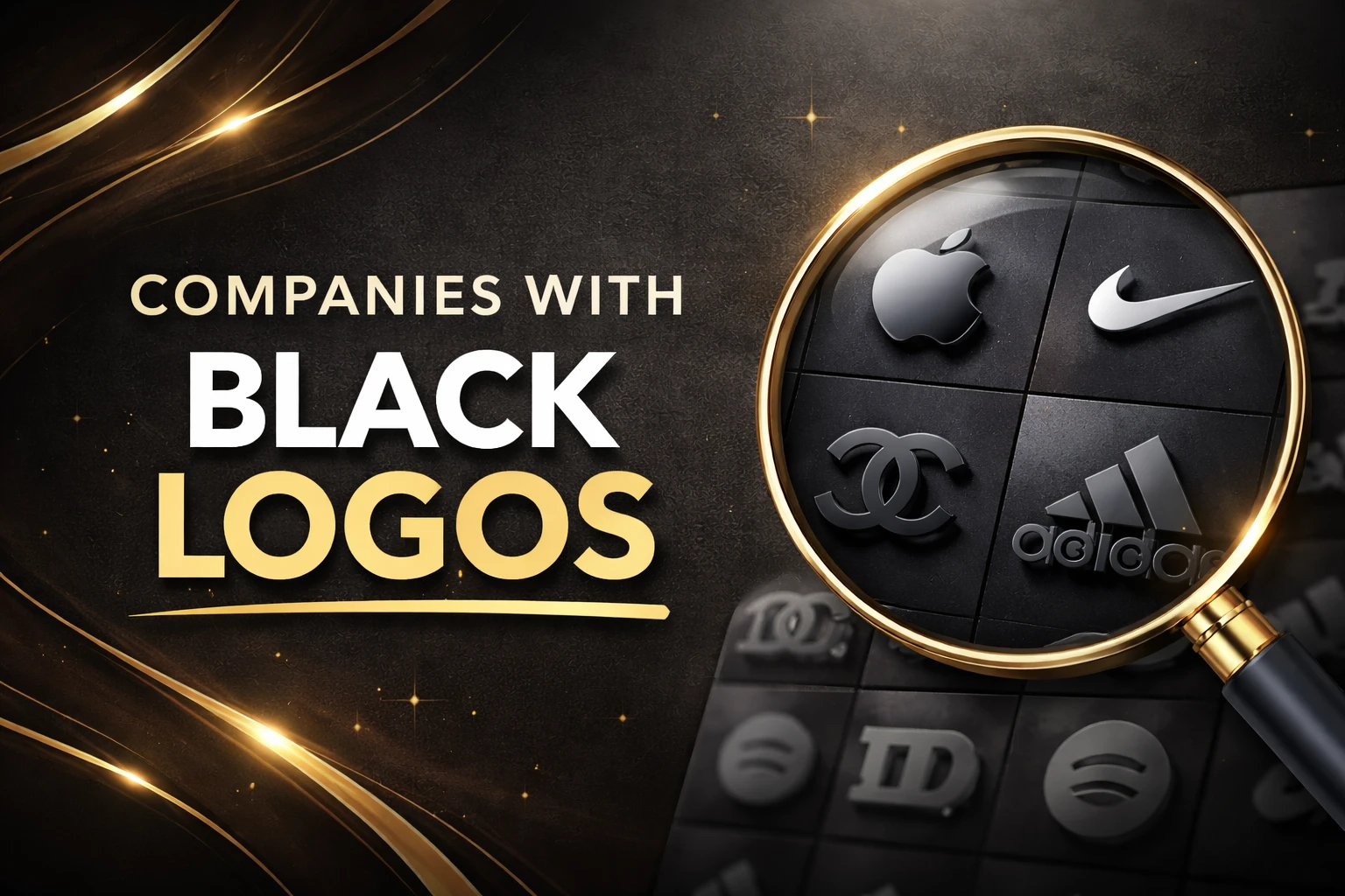
Many globally recognized brands rely on black logos to express luxury, authority, and timeless design—some of the most iconic examples are shown below.

These brands demonstrate how black logos remain visually powerful across fashion, beauty, and lifestyle industries, regardless of era or trend.
Companies With Black Logos (100 Brands)
-
Nike – The iconic Swoosh in black represents motion, power, and athletic excellence in its purest form.
-
Apple – The black apple silhouette conveys simplicity, innovation, and premium minimalism.
-
Adidas – Three black stripes symbolize endurance, performance, and sporting heritage.
-
Chanel – Interlocking black Cs communicate timeless luxury and refined elegance.
-
Gucci – The black double-G logo reflects heritage, exclusivity, and high-end fashion.
-
Sony – A bold black wordmark reinforces professionalism and technological reliability.
-
The New York Times – Classic black typography conveys authority, trust, and journalistic credibility.
-
Prada – The clean black logotype emphasizes sophistication and modern luxury.
-
Yves Saint Laurent – Elegant black initials reflect minimalism and couture heritage.
-
Montblanc – The black star logo represents craftsmanship and premium writing instruments.
-
Cartier – Scripted black lettering signifies classic elegance and fine jewelry prestige.
-
Zara – A minimalist black wordmark supports modern and fast-fashion appeal.
-
Coach – Black branding reflects heritage craftsmanship and timeless design.
-
L’Oréal – Black typography reinforces authority in beauty and personal care.
-
Guinness – The black harp logo is synonymous with tradition and stout heritage.
-
BBC – Black block lettering conveys neutrality, trust, and public authority.
-
Under Armour – A bold black emblem highlights strength and performance.
-
Calvin Klein – Clean black typography emphasizes minimalism and modern style.
-
Dolce & Gabbana – Black lettering reinforces Italian luxury and bold identity.
-
Hugo Boss – Strong black typography signals confidence and tailored sophistication.
-
Puma – The black puma silhouette conveys agility and athletic power.
-
Vans – Black logo styling reflects skate culture and street authenticity.
-
Converse – The black star emblem represents timeless casual fashion.
-
Reebok – Black logo variants emphasize performance and training heritage.
-
New Balance – Black typography reinforces reliability and athletic performance.
-
IBM – Monochrome branding communicates trust and enterprise authority.
-
Dell – Black logo versions emphasize professionalism and reliability.
-
HP – Black branding variants support a clean corporate identity.
-
Adobe – Black logo usage highlights creativity and digital authority.
-
BlackBerry – The black wordmark reinforces security and enterprise focus.
-
Netflix – Black branding supports cinematic focus and content dominance.
-
HBO – Bold black lettering conveys premium entertainment.
-
CNN – Monochrome logo usage emphasizes authority in global news.
-
Vogue – Elegant black typography represents fashion leadership.
-
Warner Bros – Black logo variants add cinematic gravitas.
-
Mercedes-Benz – Black emblem versions convey luxury and engineering excellence.
-
BMW – Black logo treatments reinforce performance and precision.
-
Audi – Black rings symbolize sophistication and innovation.
-
Porsche – Black branding highlights performance heritage.
-
Lamborghini – Dark logo variants reinforce power and exclusivity.
-
Rolex – Black logo usage emphasizes prestige and timeless luxury.
-
Cartier – Black branding reinforces elegance and heritage.
-
Tiffany & Co. – Black typography supports premium positioning.
-
Burberry – Black serif typography reflects British luxury.
-
Versace – Black Medusa imagery conveys bold luxury.
-
Medium – Simple black logo supports clean editorial design.
-
Squarespace – Black branding reflects modern digital design.
-
Notion – Minimal black logo conveys clarity and structure.
-
Behance – Black wordmark reinforces creative professionalism.
-
Dribbble – Black logo variants emphasize visual creativity.
-
Leica – Black branding reinforces precision and craftsmanship.
-
Bose – Black typography signals premium sound quality.
-
Yamaha – Black logo variants emphasize performance and reliability.
-
Harley-Davidson – Black badge styling reflects rugged identity.
-
Maserati – Black trident imagery highlights luxury performance.
-
Zegna – Black logo styling reinforces refined menswear.
-
Givenchy – Black geometric logo conveys modern elegance.
-
Fendi – Black typography reinforces Italian craftsmanship.
-
Valentino – Black logo variants highlight couture heritage.
-
Balenciaga – Stark black branding reflects contemporary fashion.
-
Supreme – Black logo versions support bold street identity.
-
Playboy – The black bunny icon symbolizes bold luxury.
-
NASA – Black logo usage reflects authority and exploration.
-
MoMA – Black typography emphasizes modern art authority.
-
Guinness World Records – Black branding supports credibility and recognition.
-
Ralph Lauren – Black polo emblem reinforces timeless style.
-
Tom Ford – Black typography signals luxury minimalism.
-
Uniqlo – Black logo usage reflects simplicity and utility.
-
H&M – Black typography supports modern retail identity.
-
IKEA – Black logo variants emphasize clarity and function.
-
Airbnb – Black logo usage conveys trust and global presence.
-
Dropbox – Black branding reinforces simplicity and utility.
-
Slack – Black logo variants emphasize professional collaboration.
-
Kickstarter – Black typography supports creative independence.
-
WeTransfer – Black branding reinforces clean digital design.
-
Bentley – Black winged emblem conveys heritage luxury.
-
Rolls-Royce – Black logo styling reflects ultimate prestige.
-
Ferrari – Black logo usage emphasizes racing heritage.
-
Aston Martin – Black wings represent elegance and performance.
-
Bugatti – Black branding underscores exclusivity.
-
Starbucks – Black logo variants highlight premium positioning.
-
Nespresso – Black branding reflects modern luxury.
-
Godiva – Black logo styling emphasizes indulgence.
-
Lindt – Black accents highlight premium quality.
-
Four Seasons – Black tree emblem conveys refined hospitality.
-
Ritz-Carlton – Black logo styling reflects timeless luxury.
-
Marriott – Black logo variants reinforce global professionalism.
-
American Express – Black branding conveys trust and authority.
-
Visa – Black logo usage supports corporate clarity.
-
Mastercard – Monochrome branding emphasizes global recognition.
-
Levi’s – Black logo variants highlight timeless denim heritage.
-
Diesel – Black typography reflects bold street identity.
-
Pepe Jeans – Black branding supports casual fashion appeal.
-
Asics – Black logo versions emphasize athletic performance.
-
Sketchers – Black branding supports mass appeal.
-
Red Bull – Black logo usage emphasizes energy and intensity.
-
Monster Energy – Black branding reinforces boldness and power.
-
Beats – Black logo styling highlights premium sound.
-
Sony Music – Black typography reflects industry authority.
-
Universal Music Group – Black branding supports global recognition.
Businesses With Black Logos: Not Just for Large Corporations
It’s a misconception that only global brands use black logos. Many businesses with black logos are small or mid-sized companies aiming to project maturity and reliability early in their lifecycle.
Design studios, SaaS startups, legal firms, and consultancies often adopt black logos to establish credibility and avoid frequent rebranding as they grow. Black gives these businesses visual stability from the start.

Companies With Black Logo Design: Letting Form Lead
Companies focused on black logo design place greater importance on structure, spacing, and typography. Without color variation, every design decision must be intentional.
Chanel relies on proportion and balance rather than color to convey luxury. Prada uses restrained black typography to communicate elegance and restraint.
Black logo design rewards simplicity and punishes excess, making it ideal for brands that value refinement.
Companies With Black and White Logos
Companies with black and white logos use contrast to achieve clarity and timelessness. This combination works particularly well for editorial, publishing, and knowledge-based organizations.
The New York Times uses black-and-white branding to reinforce authority and trust. Wikipedia relies on the same contrast to emphasize neutrality and accessibility.
Companies With Black and Red Logos
Companies with black and red logos balance power with energy. Black grounds the brand, while red introduces urgency and emotion.
Netflix uses red on black to create dramatic contrast and instant recognition. YouTube follows a similar approach to balance structure with creativity.
This combination is common in entertainment and media-driven industries.
Companies With Black and Green Logos
Companies with black and green logos combine stability with growth. Black conveys authority, while green introduces balance, sustainability, or innovation.
Spotify pairs green accents with black to stand out digitally. Animal Planet uses the same combination to reflect nature and credibility.
Companies With Black and Orange Logos
Companies with black and orange logos use orange to soften black’s intensity. This pairing feels energetic without losing structure.
Harley-Davidson uses orange to add boldness to its black-heavy identity, while SoundCloud uses orange highlights to feel creative and approachable.
Companies With Black and Gold Logos

Companies with black and gold logos often aim to communicate premium value. Black provides sophistication, while gold signals exclusivity and heritage.
This combination is frequently used by luxury services, hospitality brands, and premium product companies that want to appear refined rather than flashy.
Companies With Yellow and Black Logos
Companies with yellow and black logos use contrast for instant visibility. Yellow brings optimism and attention, while black maintains authority.
National Geographic is one of the most recognizable examples of this pairing worldwide.
Companies With Minimal, Modern, and Simple Black Logos
Companies with minimal black logos focus on clarity and restraint. Modern black logos often feature clean typography and generous spacing, while simple black logos rely on uncomplicated forms that remain recognizable over time.
Black logo branding allows companies to evolve visually without losing identity, making it a future-proof choice for many industries.
Why Black Logo Branding Continues to Work
Black logo branding continues to work because it is timeless, adaptable, and emotionally neutral. It scales easily across industries and platforms, maintains clarity in both digital and physical formats, and supports brand identities that range from bold and modern to understated and professional.
For companies focused on longevity, trust, and visual consistency, black remains one of the most effective and future-proof branding choices available.
Frequently Asked Questions About Black Logo Branding
Why do companies choose black logos?
Companies choose black logos because black communicates authority, professionalism, and clarity while remaining versatile across digital, print, and physical platforms. Black logos also age well, making them a long-term branding choice.
Are black logos only used by large or luxury companies?
No. While many global and luxury brands use black logos, small and mid-sized companies also adopt black branding to appear established, trustworthy, and professional early in their growth.
Do black logos work across different industries?
Yes. Black logos are used across technology, media, fashion, corporate services, and manufacturing because the color adapts easily to different brand personalities and business models.
Are black logos effective for modern branding?
Black logos remain highly effective for modern branding because they support minimal, clean design trends while maintaining strong contrast and readability across devices.
Is black logo branding a safe long-term decision?
Yes. Black logo branding is considered future-proof because it avoids trend-based colors, scales easily with brand growth, and rarely requires redesign as companies evolve.
Final takeaway
Black logo branding continues to work because it balances timeless design, practical versatility, and psychological trust. For companies focused on long-term recognition and brand stability, black remains one of the smartest visual identity choices available.
You’ve read this far, thank you.
And if it was useful, consider sharing it with someone who might like it.
✨🔗