Black is one of the few branding choices that never goes out of relevance. Across industries, cultures, and generations, brands with black logos continue to stand out without relying on trends or visual noise. From technology and fashion to media and consumer goods, black remains a deliberate, strategic choice rather than a default color.
Unlike bright or expressive palettes, black doesn’t compete for attention — it commands it quietly. That restraint is exactly why so many well-known brands continue to use black as the foundation of their visual identity.
Why Brands Often Choose Black Logos?
Brands choose black logos because black communicates authority, clarity, and confidence without requiring explanation. It carries no cultural bias, adapts to any background, and remains legible across digital screens, packaging, print, and physical products.
For brands that need to scale globally or remain visually consistent over time, black offers reliability. It doesn’t age, doesn’t clash, and doesn’t distract from the brand itself.
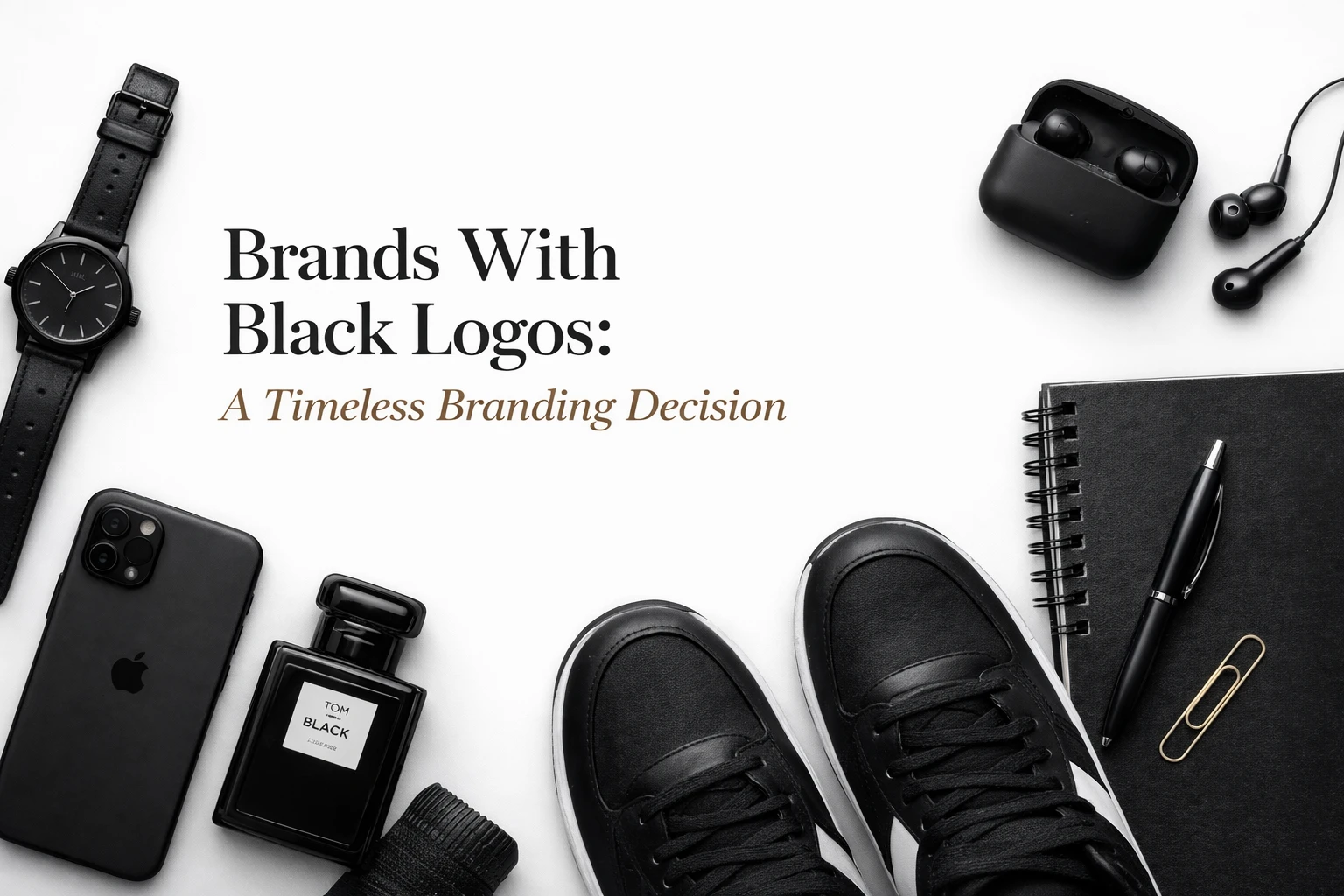
Brands With Black Logos: A Timeless Branding Decision
Brands with black logos often prioritise longevity over visual trends. Black strips branding down to its essentials — form, typography, and recognition. This allows the brand to remain relevant even as products, platforms, and audiences evolve.
Apple is a clear example. While its logo appears in different finishes, black versions are consistently used in premium contexts to reinforce simplicity and innovation. Sony uses black typography across products and packaging to communicate technical credibility and trust.
In both cases, black supports the brand message rather than becoming the message.
Popular Brands Known for Black Logos

Many popular brands with black logos rely on familiarity and recognition rather than color to attract attention. Black helps these brands stay visually consistent across a wide range of products and environments.
Nike’s black swoosh appears on footwear, apparel, advertising, and digital platforms without losing impact. Adidas uses black as a stabilising element across both performance and lifestyle branding. These brands don’t rely on color to explain who they are — the logo itself carries the identity.
Famous Brands With Black Logos
Some of the most famous brands with black logos use black to reinforce authority and neutrality. Black allows the brand to speak confidently without appearing aggressive or promotional.
IBM uses black to communicate reliability and seriousness in enterprise technology. The BBC relies on black typography to reinforce credibility across news, entertainment, and global broadcasting. In these cases, black supports trust — an essential requirement for brands operating at scale.
Brands With Black Logos by Industry
Black logos communicate different brand values depending on the industry they appear in. While the color black consistently signals authority and clarity, its meaning shifts slightly based on context such as technology, fashion, media, or consumer products.
The table below shows how well-known brands use black logos across industries and what those logos are designed to represent.
| Brand | Industry | What the Black Logo Represents |
|---|---|---|
| Apple | Technology | Simplicity, innovation, and premium quality without visual clutter |
| Nike | Sportswear & Apparel | Authority, confidence, and instant recognition across products |
| Adidas | Sportswear & Lifestyle | Stability, performance credibility, and global consistency |
| Chanel | Luxury Fashion | Elegance, restraint, and timeless luxury through minimalism |
| Gucci | Luxury Fashion | Heritage, exclusivity, and strong brand identity |
| IBM | Enterprise Technology | Reliability, seriousness, and long-term trust |
| BBC | Media & Broadcasting | Credibility, neutrality, and editorial authority |
| Netflix | Entertainment & Media | Focus, clarity, and a strong base for accent colors |
| Wikipedia | Knowledge & Education | Neutrality, accessibility, and trustworthiness |
| Harley-Davidson | Automotive & Lifestyle | Strength, heritage, and bold brand character |
While industries differ, black logos consistently help brands reinforce trust, recognition, and long-term relevance.
Global Brands That Use Black Logos
For global brands with black logos, consistency is everything. Black removes the risk of misinterpretation across cultures, languages, and markets.
Brands like Apple, Nike, and Chanel operate across continents while maintaining the same core identity. Black ensures the logo remains recognizable whether displayed on packaging, storefronts, mobile apps, or international campaigns.
This universality is one of black’s greatest strengths in branding.
How Black Logos Help Brands Stay Visually Consistent?
Many brands that use black logos do so to maintain visual consistency across platforms and materials. Unlike complex color systems, black adapts effortlessly to different surfaces — matte, gloss, digital, print, or physical products.
Netflix uses black as a base to let its red accent stand out without overwhelming the brand. Wikipedia relies on black and white to reinforce neutrality and accessibility across languages and devices. In both cases, black acts as a dependable anchor.
Brands With Minimal Black Logos

Brands with minimal black logos focus on restraint rather than decoration. These logos often feature clean typography, simple symbols, and generous spacing.
Chanel’s logo is a classic example of minimalism done right. Without gradients, textures, or color variation, the brand relies entirely on proportion and balance. This minimal approach reinforces luxury through discipline rather than excess.
Minimal black logos tend to age exceptionally well, making them ideal for brands focused on long-term recognition.
Simple Black Logo Examples From Top Brands
Brands with simple black logos prioritise clarity and memorability. Simple forms reduce cognitive load and make logos easier to recognise at a glance.
Wikipedia’s wordmark and Nike’s swoosh are both simple, black-based identities that remain effective regardless of size or context. Simplicity allows these brands to remain visually strong even in crowded digital environments.
A simple black logo rarely needs explanation — it becomes intuitive over time.
Iconic Black Logos and What They Mean
Some brands with iconic black logos have reached a level of recognition where color becomes secondary. The logo itself is instantly identifiable.
Apple, Nike, and Adidas all fall into this category. Their black logos function almost as symbols rather than design elements. At this stage, black reinforces authority while allowing the brand to evolve visually without losing recognition.
Iconic black logos prove that strong branding doesn’t require visual complexity.
Black Logo Branding Across Different Products
Black logo branding works particularly well when logos appear directly on products. Clothing labels, electronics, accessories, and packaging all benefit from black’s adaptability.
Harley-Davidson uses black to reinforce strength and heritage across motorcycles and merchandise. Spotify pairs black with a single accent color to maintain clarity across digital interfaces. In both cases, black provides structure while allowing flexibility.
For product-driven brands, black ensures the logo integrates seamlessly rather than competing with the product design.
Do Only Big Brands Use Black Logos?
It’s a common misconception that only global or luxury brands use black logos. Many emerging and mid-sized brands adopt black early to establish credibility and avoid frequent rebranding as they grow.
Startups, SaaS companies, and professional service brands often choose black logos to appear established from day one. Black provides visual stability, allowing these brands to scale without needing drastic identity changes.
Are Black Logos Effective in Modern Branding?
Yes — black logos remain highly effective in modern branding. In fact, as design trends move toward minimalism and clarity, black becomes even more relevant.
Black logos work seamlessly with modern UI design, responsive layouts, and mobile-first experiences. They support both bold branding statements and understated, professional aesthetics.
Modern branding doesn’t require more color — it requires clearer intent.
Why Brands With Black Logos Continue to Succeed
Black logo branding succeeds because it balances timeless design with practical versatility. It works across industries, scales across mediums, and adapts to evolving brand identities without losing clarity.
For brands focused on recognition, trust, and longevity, black remains one of the safest and smartest branding choices available.
Final Takeaway
Brands with black logos rely on black not because it is neutral, but because it is powerful in its restraint. Black allows brands to communicate confidence, consistency, and authority without visual excess.
From popular and famous brands to global and emerging names, black continues to prove that strong branding isn’t about standing out loudly — it’s about being remembered effortlessly.
For brands that value clarity over trends and longevity over novelty, black remains an enduring foundation for visual identity.
Image Credits: Unsplash