
Minimal Logo Design That Speaks Volumes
Brand Identity Portfolio & Minimal Branding
TL;DR: A minimal logo is a brand mark reduced to its essential elements, using simple shapes, intentional typography, negative space, and a restrained color palette. Minimalism is a design style rather than a logo type, making it adaptable across different kinds of brand marks while prioritizing clarity, recognition, and scalability.
Quick Answers
Definition: A minimal logo is a brand mark reduced to its essential elements, using simple shapes, intentional typography, negative space, and a restrained color palette.
Best for: Brands seeking a clear, modern, versatile identity that works across digital and physical touchpoints.
Key traits: Simple forms, purposeful typography, restrained color, and intentional use of negative space.
Scalability: Strong minimal logos remain recognizable from small digital icons to large-format applications.
Memorability: Simplicity helps reduce visual clutter, making the core brand idea easier to recognize and recall.
Cost: Pricing varies based on concept development, customization, brand strategy, and project scope.
Timeline: Most custom minimal logo projects take several days to a few weeks, depending on revisions and deliverables.
At KM Digital Creatives, we craft minimalist logos that build trust, scale across every touchpoint, and give growing brands an identity that actually holds up under pressure. (Last updated on September, 22, 2026)
Portfolio: Minimalism in Action & Featured Examples
Explore how minimalist logo principles translate into real brand identities from signature marks and monograms to refined wordmarks.
Get in Touch 👋
It usually starts with a simple message.
Featured Minimal Logos: Theory to Execution
Theory is easy; execution is where minimalism proves its worth. Across our portfolio, we applied minimalist principles across several logo types
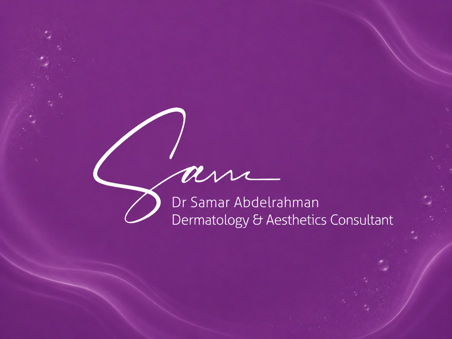
| Dermatology & Aesthetics Consultant | Signature Style
Designed a soft, premium identity for a skincare and aesthetics brand. We stripped the design back to a single fluid signature mark and clean typography, creating an elegant identity with minimal visual elements.
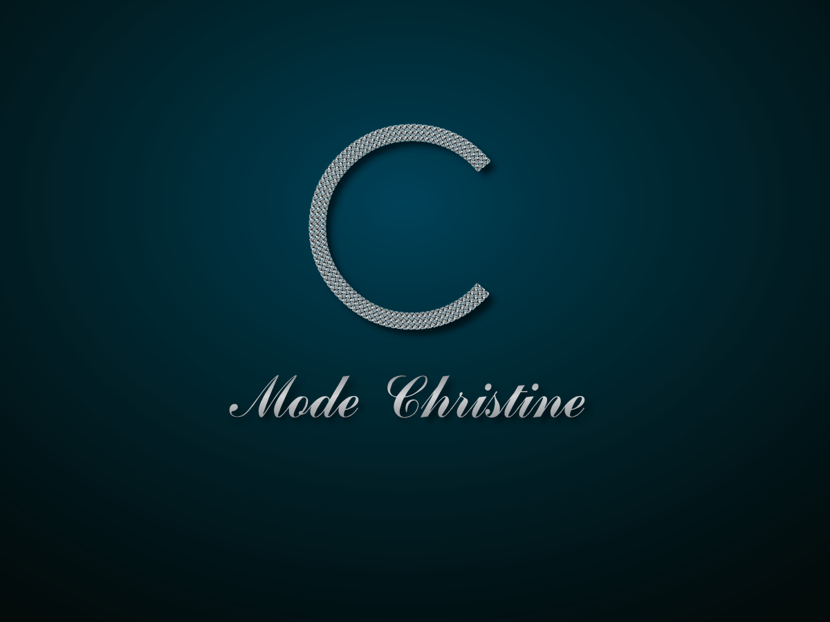
| Women's Fashion Boutique | Fashion & Retail | Monogram
Wanted a sophisticated yet minimal identity for a women's fashion boutique. We created a refined mark centered around a distinctive letterform and elegant typography, giving the brand a polished, fashion-forward presence.
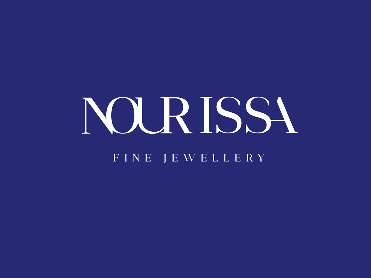
| Fine Jewellery Brand | Luxury Retail | Personal Line | Wordmark
Client needed a distinctive luxury identity for a fine jewellery brand. We kept the design minimal, relying on refined typography, balanced spacing, and subtle letterform details to create a timeless presence.
Standout Case: Minimal logos designed by KM Digital Creatives are more economical to produce and distribute, while remaining clear, consistent, and recognizable across print and digital touchpoints. We achieved this through Sam's simplified signature mark, Mode Christine's focused monogram, and NOUR ISSA's typography-led wordmark identity with no additional symbol. By simplifying each identity to its essential elements.
What Is a Minimal Logo? (The Strategic Definition)
Here's the definitional clarity most articles skip: minimalism is a style, applied across the seven established logo types — it is not one of the seven itself. A monogram can be minimal or ornate. A pictorial mark can be minimal or highly detailed. The style determines how a type is executed, not what the type is.
This matters because of cognitive fluency — a well-documented psychological principle stating that the brain processes simple shapes and clean visuals faster than complex ones. Faster processing builds a subconscious sense of trust and familiarity, which translates into faster brand recall at the shelf, on a screen, or in a crowded feed. At KM Digital Creatives, we treat minimalism not as "removing stuff," but as a strategic distillation process — identifying the one visual idea a brand must own, then eliminating everything that doesn't serve it.
Design your minimal logo today →
Why Choose KM Digital Creatives?
The logo design market is split between two failure points: expensive agencies with slow turnarounds, and DIY tools or templates that lack strategic depth. Here's how the options compare:
We built our process to bridge the gap — offering agency-level strategic rigor at a fraction of the cost and turnaround time.
Factor | KM Digital Creatives | Freelance Designer | DIY Logo Tool |
|---|---|---|---|
Brand Strategy | Brand audit + audience research | Depends on the designer | No strategic guidance |
Works at All Sizes | Tested from small icons to large formats | Not always tested | Limited testing |
What You Receive | Complete brand identity system | Usually a logo file | Basic logo files |
Cultural Relevance | Considered during the design process | Depends on the designer | Not considered |
Support After Delivery | Ongoing support available | Usually limited | No personal support |
KM Digital Creatives: Strategic research, scalability testing, full brand system, cultural review, and post-launch support.
Freelance Designers: Quality and process vary by individual; strategy and testing may be limited.
Freelance Platforms: Access to many designers at different price points, but quality, consistency, and strategic involvement can vary significantly.
DIY Logo Tools: Fast and affordable, but offer limited customization, strategic input, and scalability testing.
Our Process: From Concept to Cohesion
Selected concepts are vectorized and refined for precision — stroke weight, letter spacing, and geometric alignment are fine-tuned pixel by pixel.
We audit the brand, audience, and competitors to identify the single core idea the logo must communicate.
We choose the right logo type — wordmark, monogram, pictorial, abstract, or combination — based on industry norms and brand goals, then apply minimalist principles to execute it.
Every concept is designed in monochrome first. If it doesn't work in black and white, it doesn't move forward — this guarantees scalability and legibility before color is ever introduced.
The final deliverable isn't a single file. Clients receive a primary logo, submark, favicon, color palette, and typography rules — a complete, usable brand system.
What You Get: Our Minimal Logo Deliverables
Based on your branding package choice - KM Digital Creatives monogram engagement includes:
- Minimal logo files in AI, EPS, SVG, and PDF formats
- Light and dark versions for flexible background use
- Simplified logo variations for different sizes and applications
- Scalable assets optimized for both web and print
- A defined color palette with hex/CMYK/RGB values
- A usage guideline document covering spacing, sizing, and placement rules
To see how we've helped brands across fashion, wellness, luxury, retail, beauty, and many other niches turn their initials into lasting identities.
Book Your Free Consultation with KM Digital Creatives →
More of Modern Minimal Logo Design Portfolio
Let's Talk!
The 7 Types of Minimal Logos (Which One Is Yours?)
A common source of confusion is treating "minimal" as its own category. In reality, minimalism can be layered onto any of the seven recognized logo types:
- Minimal Wordmark — e.g., Google, Coca-Cola
- Minimal Monogram — e.g., HBO, IBM
- Minimal Pictorial — e.g., Apple, Twitter
- Minimal Abstract — e.g., Pepsi, Adidas
- Minimal Mascot — rare, but powerful in gaming and youth brands
- Minimal Combination — e.g., Lacoste
- Minimal Emblem — e.g., Starbucks, Harley-Davidson
Not sure which type fits your brand? Book a free 15-minute consultation with our team and we'll help you find out.
| How do I make a minimal logo feel premium?
Premium minimalism comes from precision perfect alignment, balanced spacing, and confident use of negative space and not from adding extra embellishments.
How to Create a Minimal Logo: Practical Guidance
DIHow to Create a Monogram Logo
DIHow to Create a Monogram Logo
DIHow to Create a Monogram Logo
DIHow to Create a Monogram Logo
DIHow to Create a Monogram Logo
DIHow to Create a Monogram Logo
DIHow to Create a Monogram Logo
The 5-Step Minimal Logo Design Process
DIHow to Create a Monogram Logo
DIHow to Create a Monogram Logo
DIHow to Create a Monogram Logo
DIHow to Create a Monogram Logo
DIHow to Create a Monogram Logo
DIHow to Create a Monogram Logo
DIHow to Create a Monogram Logo
Clarify the brand's personality, audience, positioning, and core message before exploring visual directions.
Study the competitive landscape to identify opportunities for differentiation and avoid generic minimal design trends.
Explore concepts in black and white, focusing on essential forms, negative space, and immediate recognition.
Select typography and supporting details that fit the brand, removing anything that doesn't strengthen clarity or recognition.
2026 note: Variable fonts offer greater typographic flexibility across responsive brand applications, while SVG-based logos help preserve clarity and scalability across different screen sizes and interface contextsTest the logo across sizes and real-world applications, refine weak points, and finalize a consistent, scalable identity.
Key Execution Checks
- Clear and recognizable at small sizes
- Works effectively in black and white
- Uses only necessary colors and details
- Maintains sufficient contrast and spacing
- Feels distinct from competing brands
- Performs consistently across digital and print applications
Below are answers to the questions we hear most often from founders and marketers exploring this process.
Minimal Logo Design (DIY) - FAQ's
DIHow to Create a Monogram Logo
DIHow to Create a Monogram Logo
DIHow to Create a Monogram Logo
DIHow to Create a Monogram Logo
DIHow to Create a Monogram Logo
DIHow to Create a Monogram Logo
DIHow to Create a Monogram Logo
Start with pure geometry — circles, lines, and negative space rather than gradients or textures. If a concept only "works" in color, it isn't minimal enough yet.
Uniqueness comes from a specific, brand-true idea, not from decoration. Anchor the mark in something ownable: a proprietary shape, a subtle negative-space detail, or a custom letterform tweak.
Clean sans-serifs or subtly customized geometric fonts tend to age best. Avoid ultra-trendy display fonts, they date quickly and undermine the longevity minimalism is meant to provide.
Begin with pencil thumbnails at a tiny scale (roughly the size of a thumbnail icon). If an idea reads clearly that small, it has real potential.
Detailed, illustrative logos can suit heritage or craft-based brands where storytelling detail adds value. Minimal styles suit brands that need fast recognition across digital platforms, apps, favicons, social avatars, where detail is lost anyway.
- Mistaking "simple" for "generic" or thoughtless
- Ignoring how the mark performs at favicon size
- Overusing trendy geometric shapes without brand relevance
| Minimal vs. Detailed Logos: Pros, Cons & When to Use Each
Weigh the pros and cons: choose minimalism for clarity and scalability, or a more detailed approach when storytelling and visual expression matter more
Minimal Logos | Detailed Logos |
|---|---|
Fast recognition | More storytelling |
Strong at small sizes | Details can be lost when scaled down |
Works well across digital touchpoints | Better suited to heritage or illustrative brands |
Relies on clarity and restraint | Relies on visual richness and complexity |
The Do's and Don'ts of Minimal Logo Design
DIHow to Create a Monogram Logo
DIHow to Create a Monogram Logo
DIHow to Create a Monogram Logo
DIHow to Create a Monogram Logo
DIHow to Create a Monogram Logo
DIHow to Create a Monogram Logo
DIHow to Create a Monogram Logo
Do's
- Start every concept in black and white
- Prioritize negative space as an active design element
- Test legibility at 16px favicon size
- Ensure the mark works in a single color
Don'ts
- Confuse minimal with boring or lazy
- Rely on trendy fonts that will date the brand quickly
- Ignore cultural context around symbols or hand gestures
- Skip formal brand guidelines after launch
Don't let your brand get lost in the noise. The right blend of vision and precision turns a simple mark into an unforgettable one. KM Digital Creatives refines every concept until you love it, no guesswork, no generic templates, just a logo system built to scale with your brand.
Ready to Build a Minimal Logo That Defines Your Brand?
It usually starts with a simple message.
👋 A real human will personally read and respond to your message.
🔒 Your information is used only to respond to your inquiry. Read our Privacy Policy.
Frequently Asked Questions on Minimal Logos 💬
How much does a professional minimal logo cost?
Freelancers typically charge $200–$800, while full agencies can charge $5,000 or more. Fill out the contact form with your project details, and we'll guide you through the next steps..
Can you redesign my existing complex logo into a minimal one?
Yes — our Logo Evolution service simplifies an existing mark while retaining the brand equity and recognition already built.
How long does it take to design a minimal logo?
Most projects take 2–3 weeks; rush delivery is available for urgent launches.
Do you offer personal branding logos?
Yes — we design tailored minimal marks for consultants, coaches, and independent creatives.
Do you offer trademark guidance for Minimal Logos?
We offer guidance on originality and distinctiveness during the design process and can point you toward the right next steps, though we recommend formal trademark clearance through a qualified attorney before registration.
What's the difference between a minimal logo and a flat logo?
Flat design refers to a 2D visual aesthetic (no gradients or shadows). Minimal refers to the philosophy of reduction. The two frequently overlap, but they aren't identical.