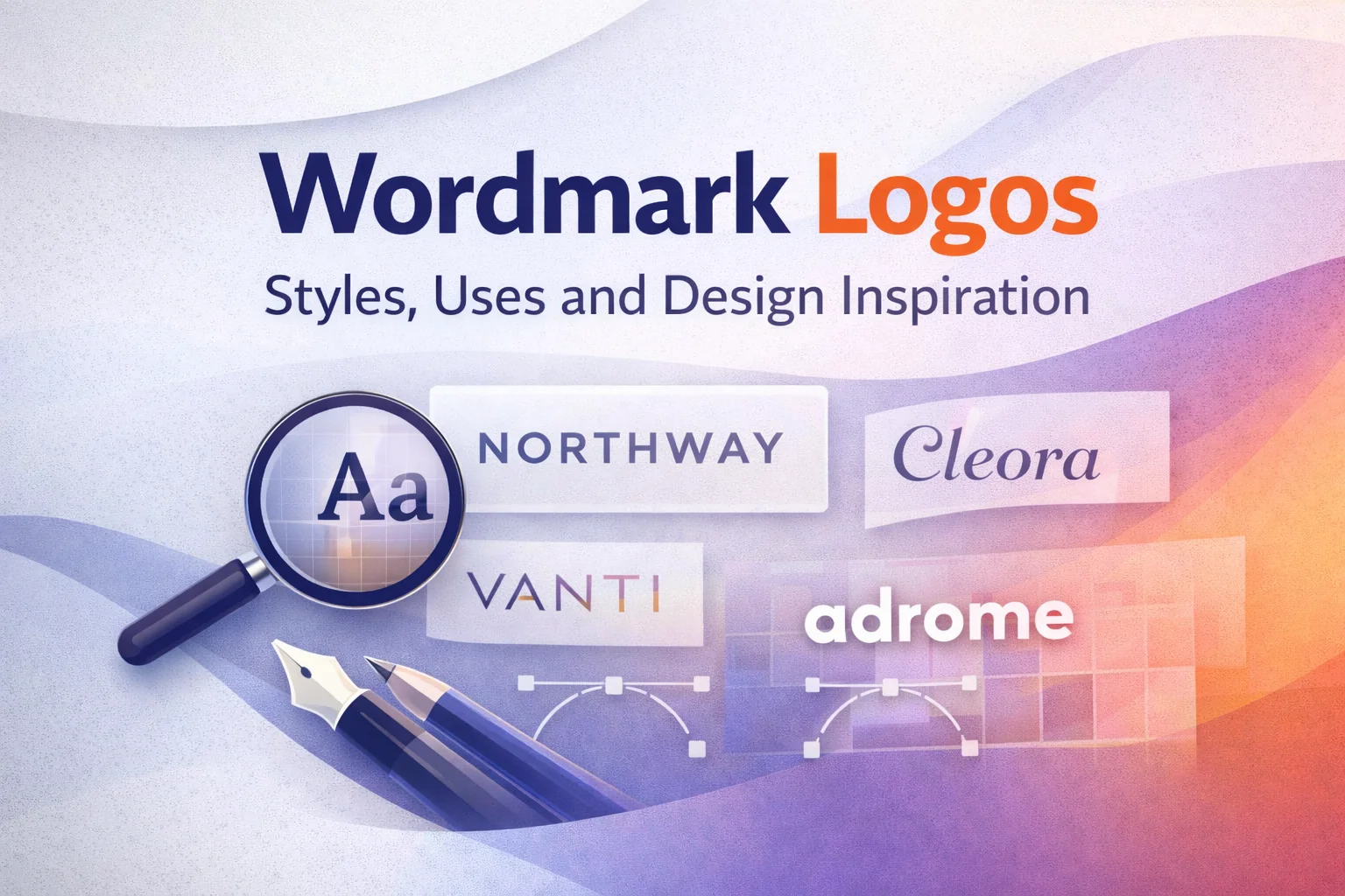
Introduction: Why Wordmark Logos Remain Popular Across Industries
Wordmark logos have stood the test of time in branding, even as visual trends shift and new logo styles emerge. A wordmark logo is built entirely from typography—no icons, symbols, or mascots—yet it often becomes one of the most recognizable assets a brand owns.
From global corporations to local service providers, wordmark logos remain popular because they communicate brand identity with clarity and confidence. When done right, a wordmark logo is instantly readable, scalable across platforms, and flexible enough to grow with a business over time.
In a mobile-first world, simplicity matters. Wordmark logos place the brand name front and center, reinforcing recognition every time it appears—on websites, invoices, social media, packaging, and signage.
Wordmark logos support brand name recognition and recall by repeatedly exposing audiences to the brand name rather than abstract symbols.
Different Types of Wordmark Logos
Minimal wordmark logos focus on clean typography, balanced spacing, and restraint. They avoid decorative elements and rely on clarity to make an impact. This style works especially well for modern brands and digital-first businesses that want a polished, timeless look.
Serif Wordmark Logos
Serif wordmarks use letterforms with small finishing strokes, giving them a traditional and authoritative feel. Brands in legal, publishing, and luxury industries often choose serif typography to communicate trust, heritage, and professionalism.
Sans-Serif Wordmark Logos
Sans-serif wordmarks remove decorative strokes for a clean, contemporary appearance. These logos are highly legible on screens, making them a popular choice for tech companies, SaaS platforms, and startups.
The choice between serif and sans-serif typography affects whether a wordmark feels traditional, modern, authoritative, or minimal.
Custom Typography Wordmark Logos
Custom wordmark logos are built from original letterforms rather than pre-made fonts. This approach allows designers to embed personality directly into the typography, resulting in a distinctive and difficult-to-replicate brand identity.
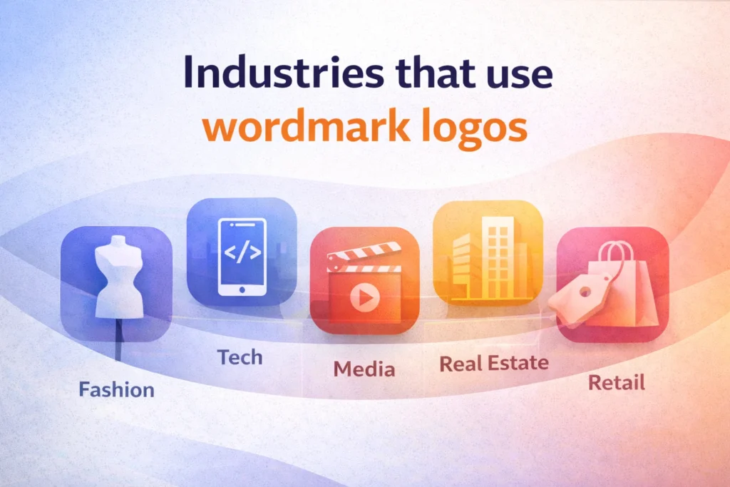
Industries That Use Wordmark Logos

Cleaning and Home Services
Wordmark logos help cleaning brands appear professional, trustworthy, and organized. Their clarity works well across uniforms, vehicles, and marketing materials.
Technology and Software
Tech companies favor wordmarks for their scalability and digital readability. A simple typographic logo adapts easily across apps, dashboards, and product interfaces.
Fashion and Lifestyle Brands
Fashion brands often use wordmarks to let typography become the signature. These logos translate seamlessly across labels, packaging, and storefronts.
Professional Services
Consultants, agencies, and financial firms rely on wordmarks to establish credibility. A refined typographic logo supports authority without visual distraction.
Advantages of Wordmark Logos
Strong Brand Recall
Wordmark logos emphasize the brand name itself, making it easier for customers to remember and recognize the business over time.
Learn the key differences between a wordmark vs logo and how to choose the right branding approach.
Scalability Across Platforms
Because they rely on typography alone, wordmark logos maintain clarity at any size—from mobile screens to large-format signage.
Clear Brand Personality
Typography communicates tone. Weight, spacing, and letterform style allow wordmark logos to feel bold, elegant, approachable, or authoritative.
While the style may vary, successful wordmark logos share one thing in common: strong typography decisions. Our wordmark typography logo design portfolio highlights how these principles are applied across different brand contexts.
Common Mistakes in Wordmark Logo Design
Using Generic Fonts
Overused fonts reduce originality and brand distinction. Without customization, a wordmark can look forgettable.
Poor Spacing and Alignment
Kerning issues and inconsistent spacing hurt readability and signal low-quality design.
Over-Decoration
Adding unnecessary effects weakens clarity. Wordmark logos perform best when simplicity is preserved.
FAQs About Wordmark Logos
✅ What is a wordmark logo?
A wordmark logo is a logo design made entirely from text, using typography to represent a brand name without symbols, icons, or illustrations.
✅ What are examples of wordmark logos?
Examples of wordmark logos include brands that rely only on typography to display their name, using custom or carefully selected fonts instead of icons or symbols.
✅ Are wordmark logos effective?
Yes, wordmark logos are effective because they improve brand name recognition, remain highly readable across platforms, and scale well for both digital and print use.
✅ What is the difference between a wordmark and a logo?
A wordmark is a type of logo that uses only text, while a logo can include symbols, icons, illustrations, or a combination of text and visuals.
✅ Are wordmark logos good for small businesses?
Wordmark logos are ideal for small businesses because they are cost-effective, versatile, and help customers remember the business name more easily.
✅ Why do companies use wordmark logos?
Companies use wordmark logos to keep branding simple, improve name recognition, and maintain consistency across multiple platforms and sizes.
Conclusion: Wordmark Logos as a Long-Term Branding Choice
Wordmark logos are a strategic branding solution, not a passing trend. When typography is chosen thoughtfully and executed with precision, a wordmark logo can remain effective for decades.
For brands that prioritize clarity, scalability, and name recognition, wordmark logos provide a strong foundation for long-term growth and brand consistency.