A tech company with bright yellow logo stands out by signaling innovation, optimism, and confidence. While yellow can help technology brands feel modern and human, it must be used strategically to avoid trust and usability issues. The right branding approach determines whether yellow strengthens or weakens perception.
Let’s be honest — most tech brands look the same. Blue logos, clean fonts, and safe choices everywhere. So when you suddenly see a tech company with bright yellow logo, it instantly feels different. It catches your eye before you even realize why.
This shift isn’t random. It reflects how technology branding itself is changing — from purely functional to emotionally driven.
Why Tech Companies Are Moving Away from Traditional Colors
More tech companies are choosing yellow not because it’s trendy, but because users today want brands that feel human. Yellow feels optimistic. It feels fast. And in a digital space full of sameness, that energy can make a real difference.
For years, blue dominated technology branding. It symbolized trust, logic, and reliability. But as digital products evolved, brands realized something important — functionality alone no longer wins loyalty.
Modern users connect with brands that feel intuitive, approachable, and expressive. This is why the rise of the tech company with bright yellow logo is becoming increasingly visible across startups, SaaS platforms, and consumer-focused tools.
The Psychology of Yellow in Technology Branding
Color psychology plays a major role in how technology brands are perceived — often within seconds.
Yellow is commonly associated with:
- Innovation and new ideas
- Optimism and positivity
- Energy and momentum
- Creative confidence
When used thoughtfully, yellow helps technology feel less intimidating. It softens complexity and signals that a product is built for people — not just engineers.
This emotional layer is exactly why many modern brands are exploring a bright yellow brand identity instead of relying on conventional palettes.
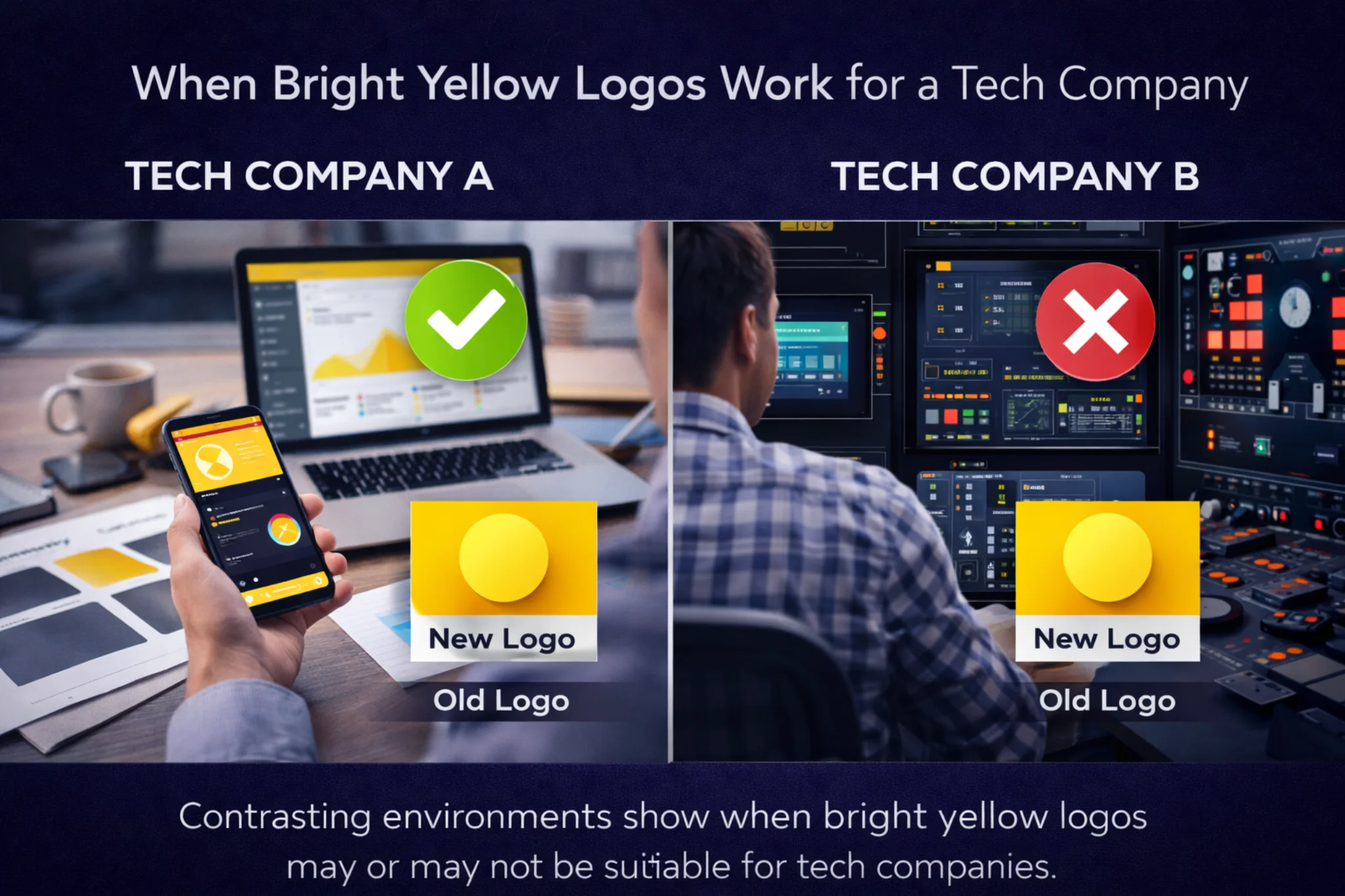
When a Bright Yellow Logo Works for a Tech Company

A tech company with bright yellow logo works best when the product is simple, user-friendly, and built for everyday people. When the experience is smooth, yellow adds personality instead of confusion. It helps the brand feel approachable rather than intimidating.
1. User-Focused Products
Consumer-facing platforms like Snapchat show how yellow can support everyday usability by making digital experiences feel lighter and more approachable.
If the platform is designed for daily interaction — such as productivity tools, communication software, or creator platforms — yellow reinforces accessibility and ease of use.
2. Competitive Markets
In crowded tech spaces where brands visually blend together, yellow creates instant differentiation.
In highly saturated digital spaces, brands such as Bumble demonstrate how yellow can help a product stand out quickly without relying on complex visuals. It improves recall and helps the logo stand out across websites, apps, and digital ads.
3. Personality-Driven Brands
Some tech companies lead strongly with brand voice and character. For these businesses, yellow supports a bold, confident narrative — especially when paired with clean typography and structured layouts.
Platforms like Mailchimp reflect how yellow can reinforce an expressive, confident brand personality when creativity and communication are central to the product.
When Yellow Does NOT Work
But yellow doesn’t work everywhere. In industries where trust, security, or data protection are critical, the same color can feel risky. Without the right strategy, a bright yellow logo may appear playful when the brand needs to feel dependable.
High-Risk or Compliance-Driven Sectors
Cybersecurity, enterprise infrastructure, and fintech compliance platforms often require visual seriousness. In such cases, yellow may need to be limited to accents rather than serving as the primary identity color.
Accessibility Challenges
Yellow can cause contrast and readability issues if not tested properly. Poor accessibility weakens user experience and credibility.
This is where many brands struggle — choosing yellow emotionally rather than strategically.
Yellow vs Blue: A New Branding Conversation
Different technology contexts can influence whether a bright yellow logo feels appropriate or out of place.The shift from blue to yellow isn’t about rejecting trust — it’s about redefining it.
Blue communicates stability. Yellow communicates confidence.
Today’s users increasingly trust brands that feel transparent and relatable. That’s why a tech company with bright yellow logo can feel modern and self-assured when designed correctly.
Still, the strongest identities often balance yellow with neutral tones to maintain clarity and professionalism.
Why Consulting a Branding Studio Matters
This is exactly why color decisions should never be made in isolation. Before becoming a tech company with bright yellow logo, brands need clarity — on audience, perception, and long-term positioning. That’s where a branding studio brings structure to creativity.
Professional branding discovery considers:
- Target audience psychology
- Competitive landscape
- Brand personality
- Digital usability
- Long-term scalability
Without this process, even a visually striking logo can fail to support business goals.
How Branding Studios Use Yellow Strategically

A branding studio doesn’t simply choose “yellow.” It explores the right shade, intensity, and application.
This includes:
- Testing warm vs bold yellows
- Defining primary and accent usage
- Creating contrast systems
- Ensuring accessibility compliance
- Aligning visuals with brand voice
When done correctly, a bright yellow brand identity feels confident — not chaotic.
Final Thoughts
Yellow isn’t good or bad on its own. What matters is intent.
When chosen strategically, a bright yellow logo can make a tech brand unforgettable. When chosen emotionally, it can create confusion. The difference lies in discovery — not design trends.
The rise of the tech company with bright yellow logo shows that technology branding is evolving. Brands that understand why they choose yellow — not just that they chose it — are the ones that build lasting recognition.
