Some logos announce themselves loudly. Others earn recognition quietly — through consistency, restraint, and time.
When you look at logos that start with the letter N, a pattern begins to emerge. Many of these brands didn’t rely on decorative symbols or complex visuals. Instead, they focused on clarity, confidence, and strong letterforms that scale effortlessly across cultures and platforms.
This guide explores famous brand logos that start with N, how their designs differ, and why some brands choose a simple letter while others build an entire visual identity around the name.
Whether you’re browsing out of curiosity or studying logo design more closely, this is a calm, visual walkthrough — not a directory.
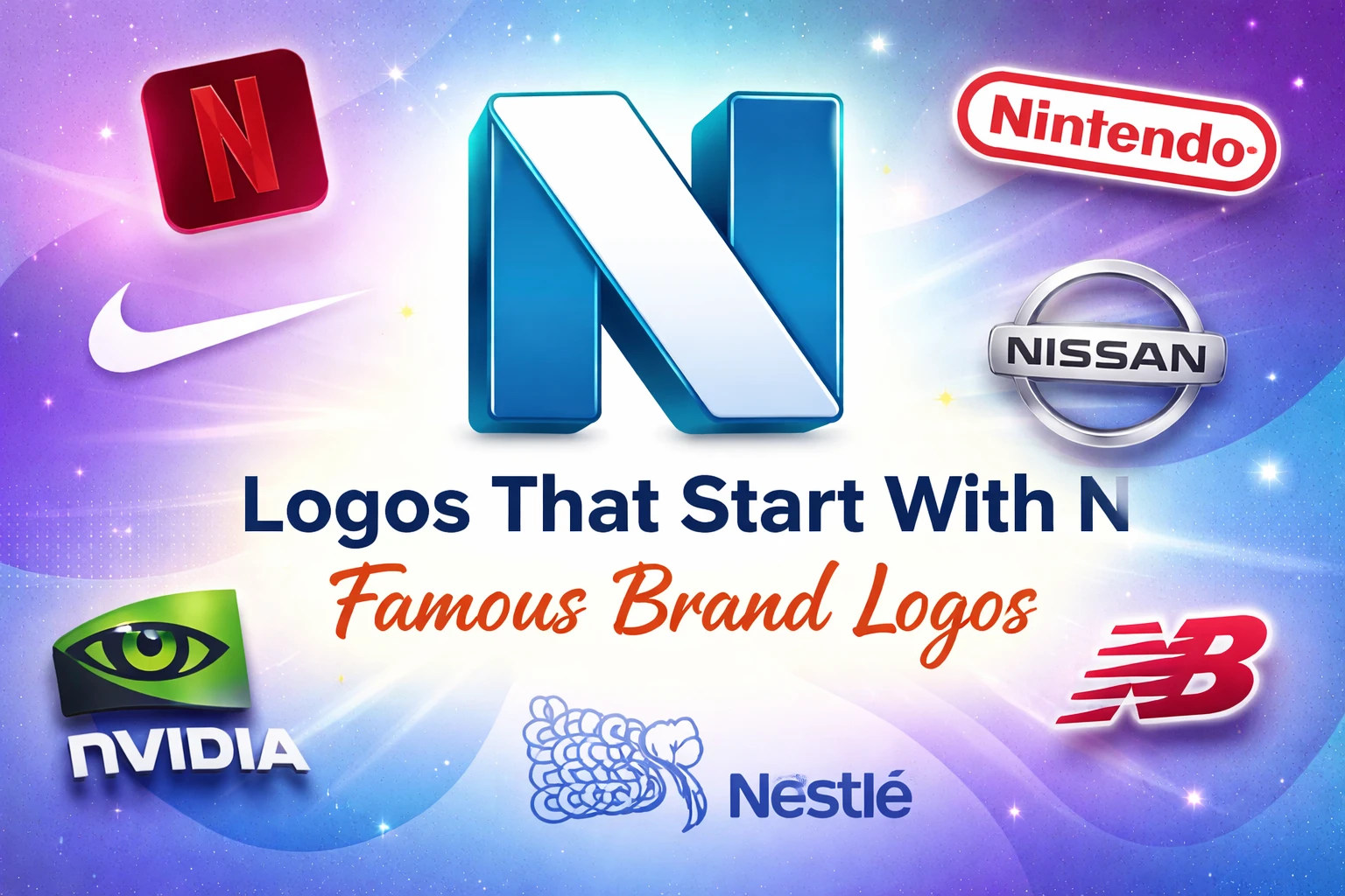
Famous Logos That Start With N
Some of the most recognisable logos in the world begin with N — not because the letter itself is special, but because of how confidently it’s used.
Across industries, famous logos that start with N tend to share a few traits:
-
Strong typography
-
Minimal colour palettes
-
Easy scalability (from apps to billboards)
Instead of relying on illustration, these brands let form and spacing do the work. This approach keeps the logo adaptable as the brand grows.
Design is the silent ambassador of your brand.
— Paul Rand
That philosophy shows clearly in many N-based logos — they don’t explain themselves; they signal trust.
Brands That Start With N and Their Logo Design Approach
When we look at brands that start with N, an interesting distinction appears.
Some brands:
-
Use wordmarks (the full name)
-
Others rely on letter-driven identities
-
A few combine both, depending on context
What matters isn’t the letter — it’s how the brand wants to be remembered.
Brand logos that start with N usually prioritise:
-
Legibility over decoration
-
Neutral shapes that work globally
-
Flexible systems rather than fixed marks
This is why many company logos that start with N feel timeless. They’re designed to survive rebrands, platform changes, and new audiences without losing recognition.
Letter N Logos vs Brand Logos Starting With N
At first glance, a letter-only logo and a full brand logo might seem like a purely aesthetic choice. In reality, the decision reflects how a brand wants to be recognised, remembered, and encountered in daily life.
| Logo Type | When Brands Use It | Relevant Brand Examples |
|---|---|---|
| Letter N Logos | Digital-first brands, apps, platforms needing instant recognition | Netflix (app icon), NVIDIA (product ecosystems) |
| Full Brand Logos | Trust-led brands where name clarity matters | Nestlé, Nissan |
| Combined Logos | Brands balancing recognition and flexibility across platforms | Nintendo, National Geographic |
| Scalability | Letter logos scale better on small screens and icons | Netflix (mobile), Nike (symbol-first usage) |
| Brand Maturity | Full brand logos work better for established, legacy brands | Nestlé, Nikon |
| Emotional Tone | Letter logos feel modern; full logos feel familiar and reassuring | Netflix (modern), Nestlé (reassuring) |
Letter N logos
Letter N logos focus purely on the letter itself — not the name behind it.
They are usually:
-
Minimal and visually restrained
-
Symbolic rather than literal
-
Abstracted or stylised to work at very small sizes
Brands often choose this approach when recognition needs to happen instantly, even without context. On a phone screen, in an app grid, or as a social avatar, a single letter can travel faster than a full word.
This is why letter-based logos are common when a brand wants:
-
Quick visual recall
-
App-icon friendliness
-
A monogram-style identity that feels modern and flexible
Over time, the letter stops being “just an N” and becomes a visual shortcut for the brand itself.
Finding this helpful?
Pass it along to someone who might like it.
✨🔗
Brand logos starting with N
Brand logos starting with N work best when name clarity and trust matter, while letter N logos work best when instant recognition and scalability are the priority.
Letter N logos act as visual shortcuts, while full brand logos act as clear signatures.
These logos usually rely on:
-
Strong, carefully chosen typography
-
Thoughtful letter spacing for readability
-
Little to no standalone symbol
This approach works best when the name itself carries meaning or trust. For established or global brands, seeing the full word reinforces familiarity and reduces ambiguity — especially across languages and cultures.
Full brand logos are often preferred when:
-
Brand equity is already strong
-
Pronunciation matters
-
Clarity and credibility outweigh abstraction
Rather than acting as a shortcut, the logo functions as a clear, confident signature.
So, are letter N logos better than full brand logos?
Not universally. The better option depends on brand maturity, platform use, and how quickly recognition needs to happen.
Why both approaches work
This difference explains why two brands starting with the same letter can look completely different — yet both feel right.
Neither approach is more correct. Each responds to context, scale, and audience expectation.
Good logo design isn’t about choosing the trendier option.
It’s about choosing the form that allows recognition to happen with the least effort.
Industry Patterns in Logos That Start With N
Looking across sectors reveals subtle patterns:
Technology & digital brands
-
Prefer clean wordmarks
-
Use neutral or high-contrast colours
-
Optimised for screens first
Automotive & engineering
-
Strong geometry
-
Solid letterforms
-
Logos that convey stability and precision
Media & consumer brands
-
Softer typography
-
Friendlier spacing
-
Logos designed to feel familiar, not intimidating
These patterns aren’t rules — but they explain why certain logos that start with N feel instantly appropriate within their industries.
Clothing & Fashion Brands That Start With N
Fashion logos behave differently.
For clothing brands that start with N, logos often balance:
-
Style
-
Personality
-
Cultural relevance
Instead of pure minimalism, fashion logos may:
-
Use serif typography
-
Experiment with spacing
-
Embrace subtle elegance over neutrality
This is why brands that start with N in fashion tend to feel expressive rather than corporate. The logo becomes part of the aesthetic, not just an identifier.
Why Logos That Start With N Feel So Balanced
From a design psychology standpoint, the letter N has a few advantages:
-
Strong vertical strokes (stability)
-
Natural symmetry when stylised
-
Easy integration into geometric systems
That makes it ideal for:
-
Digital-first logos
-
Long-term identity systems
But the real reason these logos work isn’t the letter itself — it’s restraint. The best designs resist over-explaining and let consistency do the work.

Frequently Asked Questions
◆ What are some famous logos that start with N?
Many well-known global brands use logos starting with N, often relying on clean typography and minimal design rather than complex symbols.
◆ Are letter N logos better than full brand logos?
Neither is better — it depends on brand goals. Letter logos work well for minimal, digital-first brands, while full brand logos offer clarity and trust.
◆ Why do so many brand logos that start with N look simple?
Simplicity improves recognition, scalability, and longevity — especially across global and digital platforms.
◆ Do clothing brands use N logos differently?
Yes. Fashion brands often treat logos as part of the visual style, not just identification, which allows for more expressive typography.
You’ve read this far, thank you.
And if it was useful, consider sharing it with someone who might like it.
✨🔗
Final Thoughts
Logos that start with N show how strong branding relies less on decoration and more on clarity, consistency, and choosing the simplest form that people remember effortlessly.
They remind us that good branding isn’t about standing out loudly — it’s about being remembered quietly, consistently, and clearly.
If you’re exploring logos for inspiration or studying how brands build visual trust, these examples offer one clear lesson:
Strong design doesn’t need to shout. It just needs to last.