Most people don’t choose a law firm by reading credentials first.
They pause.
They observe.
And within a few quiet seconds, they decide whether the firm feels trustworthy.
That feeling rarely comes from words alone. It comes from design — especially the logo and the website behind it.
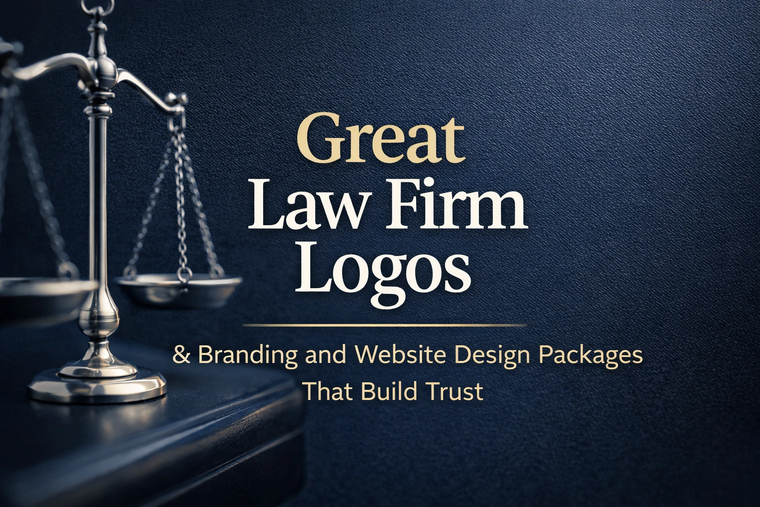
This is why great law firm logos matter far more than many firms realize. Long before a consultation is booked, branding begins shaping confidence, expectations, and trust.
The moment clients start forming opinions
When someone lands on a law firm website, they are often already uncertain. They may be dealing with a dispute, a compliance issue, or a serious business decision.
In that moment, visual clarity becomes reassurance.
A strong law firm logo placed within a clean website layout instantly communicates order and professionalism.
When branding feels thoughtful, visitors feel calmer. When it feels inconsistent, hesitation creeps in — even if the legal expertise is solid.
Design doesn’t replace credibility, but it strongly influences whether credibility is believed.
Why great law firm logos feel different
The most effective legal brands rarely try to impress. Instead, they aim to reassure.
Great law firm logos often feel balanced and composed. Typography is clear. Colors are controlled. Nothing feels rushed or decorative.
Many of the most respected firms globally rely on minimal wordmarks or refined symbols because these designs age well. They look equally confident on digital screens, printed documents, and legal correspondence.
This timeless quality is what allows great law firm logos to remain relevant even as design trends change.
The quiet evolution of modern legal branding
Over the years, law firm branding has slowly shifted.
While tradition still matters, firms today are also expected to feel modern and accessible — especially when working with startups, founders, and international clients.
Many modern firms are also moving away from overused visuals and leaning toward cleaner, more contemporary identities…
This has led to the rise of more cool law firm logos that maintain professionalism while embracing cleaner layouts and contemporary typography.
These designs don’t chase trends. They simplify them.
Modern branding, when done well, helps law firms appear current without losing authority — a balance that is increasingly important in today’s digital-first environment.
A logo alone can never carry the full brand
One of the most common misconceptions in legal marketing is believing that a logo is enough.
In reality, clients never encounter cool law firm logos by itself. They experience it through the website, contact pages, emails, proposals, and online listings.
When these elements lack consistency, even a strong logo loses impact.
This is where branding and website design packages play a critical role. They transform individual visuals into a unified system — one that looks intentional at every touchpoint.
When branding is consistent, trust builds naturally. When it isn’t, doubt quietly grows.
How branding shapes trust before conversation
Most visitors won’t consciously analyze design choices.
They won’t think about font weights or spacing.
But they will sense when something feels off.
A cluttered page, outdated layout, or mismatched visual tone can make a firm feel uncertain. On the other hand, a well-structured website supported by thoughtful branding and website design packages creates calm confidence.
Clients feel guided rather than overwhelmed.
That emotional response often determines whether they proceed to make contact.
What we often notice in strong law firm brands
Over time, one pattern appears consistently.
Law firms with refined branding tend to attract clearer, more confident enquiries. The questions are better. The expectations are more aligned. The conversations start smoother.
This isn’t coincidence.
Strong branding signals organisation and intent. It shows that the firm pays attention to detail — a trait clients deeply associate with good legal practice.
Great law firm logos don’t shout credibility. They quietly suggest it.
When law firms usually decide to rebrand
Rebranding is rarely impulsive.
It often happens during moments of growth — when a firm expands services, targets higher-value clients, or realises its online presence no longer reflects its reputation.
At that point, updating firm logo to cool law firm logos and aligning it with modern branding and website design packages becomes less about aesthetics and more about accuracy.
The brand needs to reflect where the firm is now — not where it started.
Why branding is more than a visual upgrade
Branding is often misunderstood as cosmetic.
In practice, it influences perception, pricing confidence, and long-term recall.
Two firms may offer similar services, yet the one with a stronger branding often feels more established. That perception affects trust even before expertise is evaluated as cool law firm logos speaks a brand’s seriousness.
This is why investing in branding and website design packages is ultimately an investment in clarity — clarity about who the firm is, what it represents, and how it should be perceived.
The role of consistency in long-term growth
Consistency builds familiarity.
Familiarity builds trust.
And trust drives decisions.
When a law firm maintains consistent visuals — from logo usage to website structure — it becomes easier for clients to remember and recommend the brand.
This is the long-term value of great law firm logos supported by thoughtful systems rather than isolated design pieces.
Final thoughts
Great law firm logos are rarely dramatic. They are composed, confident, and deliberate.
When supported by strong branding and website design packages, they help law firms present themselves with authority, calmness, and credibility in an increasingly competitive digital space.
Branding doesn’t replace legal expertise — but it ensures that expertise is seen, trusted, and taken seriously.