Brands that are orange are companies that use orange as a primary color in their logo or visual identity to signal energy, creativity, affordability, or approachability. From global tech platforms to food, retail, and logistics brands, orange logos are commonly used to stand out in competitive markets and create a bold, memorable brand presence.
This article explains why companies use orange logos, when the color works, and when it can backfire.
Choosing a logo color often feels like a visual decision. In reality, it’s one of the earliest strategic branding choices a company makes. Color shapes perception before customers understand your product, pricing, or positioning.
What Are Orange Logos?
Companies with orange logos use orange as a primary or dominant color in their logo or visual identity system. Brands use orange to convey energy, creativity, approachability, and value, making it effective for standing out in crowded markets.
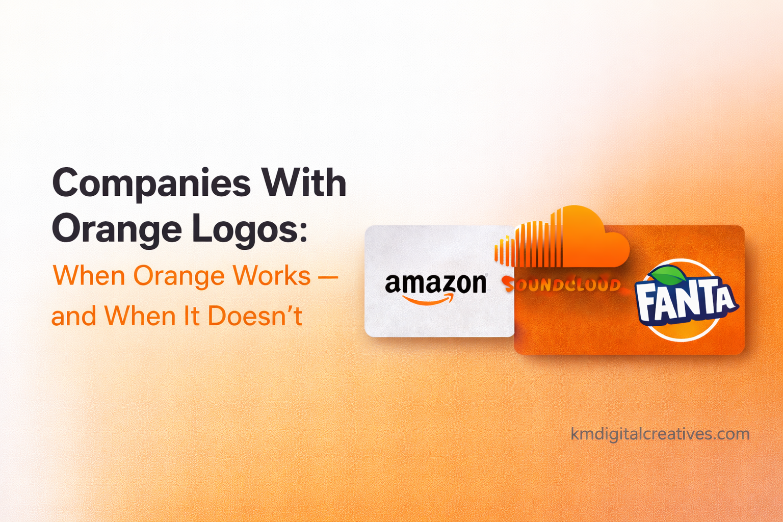
Famous Brands That Are Orange
This article isn’t a gallery of orange logos. Instead, it breaks down when orange works, when it doesn’t, and what founders should consider before choosing it.
Below are some of the most recognizable companies with orange logos and how the color supports their positioning.
| Brand | Industry | How Orange Is Used | Why It Works |
|---|---|---|---|
| Amazon | E-commerce | Orange smile/arrow in logo | Friendly, customer-first, approachable |
| Fanta | Beverage | Bright orange wordmark | Matches product flavor & energy |
| Nickelodeon | Media & Entertainment | Solid orange logo | Playful, youthful, creative |
| Dunkin’ | Food & Beverage | Orange + pink branding | Fun, energetic, mass appeal |
| Harley-Davidson | Automotive | Orange shield accent | Power, rebellion, boldness |
| The Home Depot | Retail | Orange square wordmark | Visibility, strength, DIY energy |
| JBL | Audio / Electronics | Orange logo badge | Youthful, modern, high impact |
| SoundCloud | Music / Tech | Orange cloud icon | Creativity, accessibility |
| Blogger | Tech / Publishing | Orange “B” icon | Simplicity, creator-focused |
| Mozilla Firefox | Tech / Browser | Orange fox + flame tones | Speed, warmth, memorability |
Orange is one of the most noticeable logo colors. It’s bold, energetic, and hard to ignore — which is why many well-known companies with orange logos stand out instantly. That said, orange is also a color that can work exceptionally well or create the wrong impression, depending on how and where it’s used.
💡 Designer insight: Orange works here because the brand emphasizes approachability and visibility, helping it feel energetic and accessible rather than formal or corporate.
What Orange Communicates in Branding
Before looking at examples, it helps to understand what orange typically signals.
In branding, orange is often associated with:
-
Energy and momentum
-
Friendliness and approachability
-
Creativity and youthfulness
-
Speed, affordability, or accessibility
Psychologically, orange sits between the urgency of red and the optimism of yellow. Research in color psychology shows that warm colors like orange grab attention and evoke positive emotional responses, which is why orange often feels active and modern in branding contexts. In visual identity design, orange is associated with friendliness, enthusiasm, and approachability in branding, making it especially effective for consumer-facing and digital-first brands.
However, this same energy can also come across as:
-
Informal
-
Loud
-
Less serious or less premium
Because of this dual nature, orange needs to be chosen intentionally — not emotionally.
What Companies With Orange Logos Get Right
Many successful companies with orange logos didn’t choose the color to stand out alone. Instead, orange supports how they want to be perceived.
Orange Works When the Brand Is Consumer-Focused
In many cases, orange helps brands feel welcoming and accessible. For consumer-facing businesses, this lowers barriers and creates a sense of ease, especially during early adoption.
Orange Works When Energy Is Part of the Value Proposition
If speed, action, or momentum is central to the business, orange reinforces that message visually. Brands that operate in fast-moving environments often benefit from this sense of motion and urgency.
Orange Works When the Brand Isn’t Competing on Luxury
Orange isn’t subtle — and that’s not a flaw. Companies that succeed with orange usually prioritize clarity and confidence over elegance. When the goal is memorability rather than restraint, orange can be highly effective.
When Orange Doesn’t Work (And Why It Backfires)
That said, orange isn’t a universal solution.
Orange Can Undermine Trust in Serious Industries
In industries like finance, cybersecurity, healthcare, or enterprise software, trust and stability often matter more than energy. In these cases, orange can feel too playful or risky if not carefully balanced.
Orange Can Clash With Premium Positioning
Luxury and high-end brands rely on subtlety and timelessness. Because orange naturally demands attention, it can work against a premium or exclusive image.
Orange can backfire when trust, restraint, or premium positioning matter more than energy.
Finding this helpful?
Pass it along to someone who might like it.
✨🔗
Orange Without Balance Feels Overwhelming
One of the most common mistakes founders make is overusing orange. Successful orange logos are almost always balanced with neutral tones, strong typography, and generous spacing. Without that balance, the color quickly becomes exhausting.
This is why successful orange logos are almost always balanced with neutral colors and strong typography.

What Founders Should Learn From Companies With Orange Logos
The real takeaway isn’t “use orange” or “avoid orange.” Instead, the lesson is this:
Color works when it reinforces your positioning — not when it replaces it.
Before choosing orange, founders should ask:
-
What should people feel when they first see our brand?
-
Are we signaling energy, trust, innovation, or authority?
-
Will this color still support us as the company grows?
Companies with orange logos tend to succeed when their audience, industry, and tone align naturally with what orange communicates.
Curious how orange looks in actual brand systems? Visit our Orange Branding Portfolio to see professionally executed logo and identity projects where orange plays a strategic visual role.
Is Orange Right for Your Startup’s Logo?
Orange can be a strong choice if:
-
Your brand is consumer-facing
-
You want to feel energetic and approachable
-
Standing out visually is a priority
-
Formality is not a core signal
Orange may be the wrong choice if:
-
Trust and stability are the primary signals
-
You’re positioning as premium or enterprise
-
Long-term restraint matters more than visibility
Because logo colors are difficult to change later, it’s worth thinking beyond trends and examples.
You’ve made it this far — thank you.
This might be worth passing on to someone working on something similar.
✨🔗
Final Thoughts
Looking at companies with orange logos is useful—not to copy them, but to understand when the color works and when it doesn’t. Orange is expressive by nature, and expressive colors demand clarity, intention, and restraint.
When chosen strategically, orange can strengthen a brand. When chosen casually, it can limit one.
Frequently Asked Questions About Orange Logos

1. Are Companies With Orange Logos More Memorable?
Yes. Orange is a high-visibility color that signals energy and approachability, which can improve brand recall when used intentionally.
2. Is Orange a Good Logo Color for Startups?
Yes, in the right context. Orange works well for startups that want to feel modern and approachable, but less so for premium or trust-heavy brands.
3. Do Logo Colors Affect How Customers Perceive a Brand?
Absolutely. Logo colors shape first impressions and emotional responses, influencing whether a brand feels energetic, trustworthy, premium, or approachable.
4. Can a Startup Change Its Logo Color Later?
Yes, but it’s risky. Changing logo colors can be costly and may confuse audiences or weaken brand consistency if done without strategy.
5. Should Startups Copy Companies With Orange Logos?
No. Logo examples should inform decisions, not be copied, because what works for one brand may not suit another audience or goal.