There is a quiet moment in branding when visuals stop being decorative and start becoming decisions.
It usually appears when a company looks at its logo and senses something is missing — not broken, just unsettled.
The colors work. The symbol makes sense. Yet the brand doesn’t feel as confident as it should.
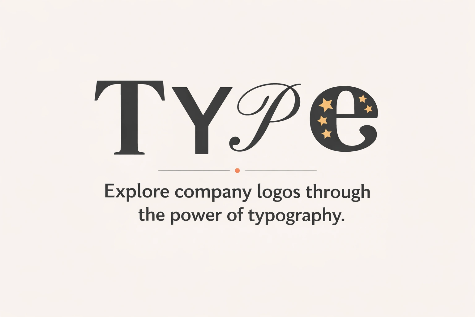
More often than not, when evaluating the best fonts for company logos, the reason sits in the typography.
The best fonts for company logos rarely announce themselves.
They don’t demand attention.
They shape perception long before anyone consciously reads the letters.
Two companies can exist in the same industry, speak to the same audience, and offer similar services — yet feel entirely different.
That difference often begins with type.
Why typography quietly controls perception
When considering the best fonts for company logos, typography becomes one of the earliest signals the human brain processes.
Before meaning, before logic, before understanding — shape comes first.
The width of a letter. The sharpness of an edge. The space between characters.
These details form impressions faster than content ever can. That’s why the best fonts for company logos tend to feel balanced even when viewed for just a second.
They don’t confuse the eye. They don’t compete for attention. They simply sit with certainty.
This is especially important for brands that are still building familiarity. When trust has not yet been earned through time, typography often carries that responsibility.
A common pattern seen across strong brands
Whether it’s technology companies like Google or Airbnb, global platforms such as Spotify or Stripe, or legacy brands like IBM and Sony, the typography rarely tries to impress on its own.
A common pattern begins to appear when observing the best fonts for company logos across strong brands.
Not in sameness — but in restraint.
It simply holds the name with confidence.
The best fonts for company logos often behave this way.
They don’t compete with the brand.
They create space for it.
How font personality shapes brand tone
Every font speaks — even when it says nothing.
Some feel calm. Some feel structured. Some feel open. Some feel firm.
This is why fonts for business branding cannot be chosen in isolation. A font does not exist on its own. It exists beside brand values, audience expectations, and long-term direction.

A technology-led brand may lean toward clarity and geometry. A consultancy may feel grounded through proportion and spacing. A growing startup may search for modernity without instability.
In all cases, startup logo typography becomes less about style and more about alignment.
Observation: where most logos begin to feel dated
When reviewing the best fonts for company logos over time, logos rarely age because of color. They age because of type. Fonts that lean too heavily into trends often feel exciting at launch — and uncomfortable a few years later. What once felt bold begins to feel unfamiliar.
The best fonts for company logos tend to avoid this problem by staying neutral enough to evolve.
They don’t try to define the entire personality. They support it.
A simple comparison seen in real branding work
These contrasts often emerge when comparing the best fonts for company logos across different branding environments.
| Typography choice | How the brand often feels |
|---|---|
| Overly stylized fonts | Visually loud, hard to scale |
| Extremely thin fonts | Elegant, but fragile |
| Balanced modern fonts | Confident and adaptable |
| Heavy decorative fonts | Memorable short-term, limiting long-term |
This isn’t about rules — just patterns that appear repeatedly across branding projects.
The best fonts for logo design usually sit in the middle ground. Not too expressive. Not too silent.
A short branding moment
A brand once reached a point where its logo no longer felt fully aligned.
Not incorrect.
Just slightly unsettled.
The assumption was that something new needed to be added.
But as the work continued, the symbol stayed where it was.
Only the typography shifted — spacing adjusted, weight refined, balance reconsidered.
There was no dramatic change.
Yet the logo began to feel calmer.
More certain.
More itself.
Nothing was announced.
Nothing was explained.
It simply started to sit better.
Corporate logo fonts and the idea of stability
Corporate logo fonts are often misunderstood as being boring.
In reality, they are calm by intention.
common pattern seen across strong brands
◆ Longevity over impact
These fonts are not designed to impress in a single glance.
They are meant to remain comfortable and familiar over years of use.
◆ Presence across everyday brand moments
They appear quietly in proposals, presentations, websites, contracts, and internal systems.
In these spaces, consistency matters more than expression.
◆ Authority without tension
Corporate typography doesn’t try to dominate attention.
Its confidence comes from restraint rather than emphasis.
◆ Stability through balance
Proportion, spacing, and readability do most of the work.
The result feels steady — almost effortless.
Where clarity begins to matter most is rarely on a website

A logo lives in smaller, less considered spaces — inside icons, on invoices, in email footers, across everyday brand moments that rarely receive design attention.
In these contexts, typography has very little room to perform.
The best fonts for company logos survive because they don’t rely on presentation.
- They remain legible.
- They remain recognizable.
- They remain themselves.
Over time, that consistency creates familiarity.
And familiarity, slowly, becomes trust.
This is why the search for the best font style for logo can often feel misleading. When choosing the best fonts for company logos, style alone rarely provides clarity, because typography is not meant to decorate a brand — it is meant to support its intention.
The best fonts for company logos work quietly beneath the surface. Rather than announcing a visual identity, they create structure, balance, and direction that allows the brand to feel settled and coherent.
When that clarity exists, the font begins to feel inevitable — as though it could not have been anything else. This sense of inevitability is what separates effective logo typography from design choices that simply look appealing.
And that feeling is never accidental. It emerges when the best fonts for company logos are chosen with long-term perception in mind, not momentary style.
Why long-term brands think beyond aesthetics
Brands that last tend to think in systems.
Typography becomes one of those systems — a foundation that supports growth instead of limiting it, which is why the best fonts for company logos are often chosen with long-term structure in mind.
The best fonts for company logos allow for flexibility without losing identity. They adapt across digital platforms, print materials, and evolving visual languages.
Nothing about them feels temporary.
Closing reflection
Choosing the best fonts for company logos is not a design trend decision. It is a perception decision — one that shapes how a brand is experienced long before its message is understood.
Typography influences how serious a business feels, how reliable it appears, and how confidently it presents itself to the world. These signals are rarely noticed individually, yet together they form a lasting impression.
When chosen thoughtfully, the font stops being something people actively see and begins to feel familiar instead. Over time, that familiarity turns into trust — the kind that doesn’t need explanation.
And often, it is that quiet confidence that allows a logo to truly last.