Orange is one of the most expressive brand colors — energetic, confident, and action-driven. This portfolio showcases how orange branding can be applied across logos, digital interfaces, packaging, and marketing creatives to build strong visual identities.
Portfolio of Orange Brand Identity Designs
These logo designs highlight how orange can be balanced with typography, contrast, and structure to create memorable brand identities across different industries.







Orange in Digital Branding
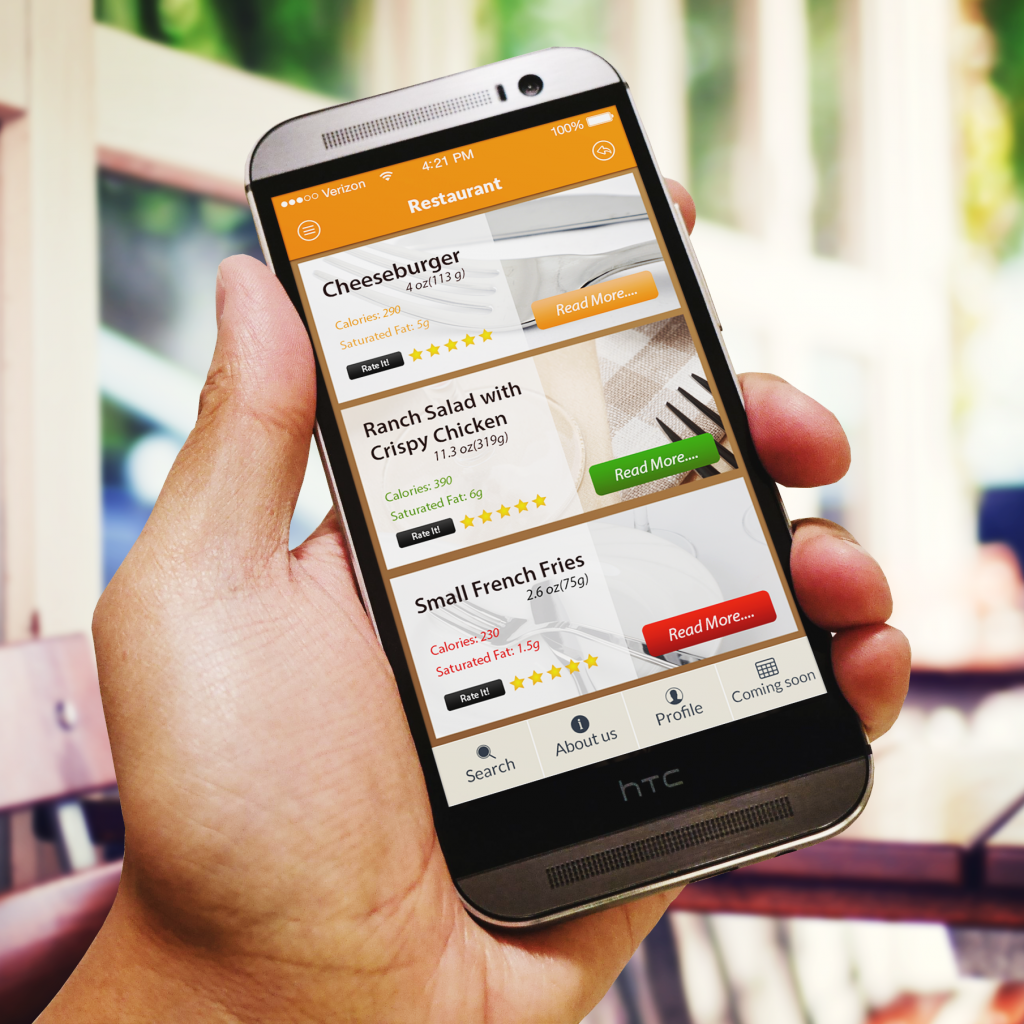
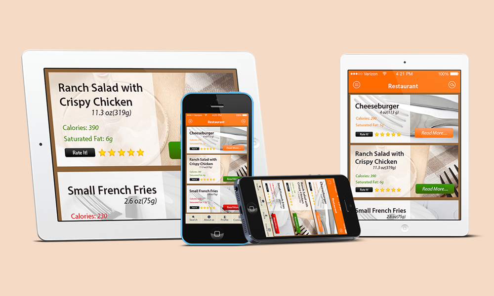
In digital branding, orange is often used to highlight actions, interactions, and engagement, making it a popular choice for companies with orange logos. When paired with clean layouts, it improves usability while strengthening brand recognition across websites and applications.
Marketing and Promotional Design Using Orange
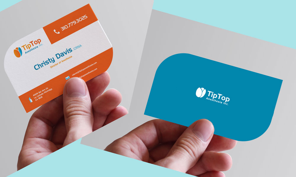
Orange is widely used in promotional materials such as flyers, banners, and event creatives, making it a common choice among brands that are orange. Its energetic yet warm tone helps companies with orange logos achieve strong visibility and clarity when paired with structured typography. In packaging design, orange improves shelf impact and conveys freshness without overwhelming essential product details.


Our Approach to Color-Based Branding
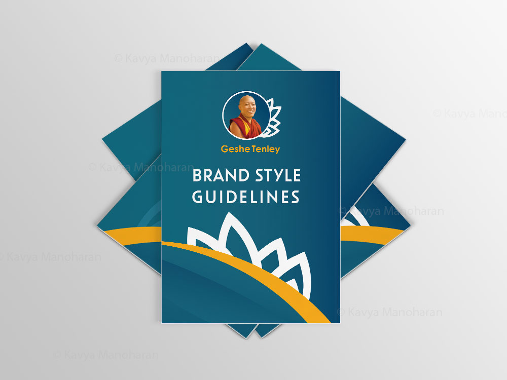
Our approach to color-based branding starts with understanding the brand’s personality and industry context. We select the right shade of orange, pair it with balanced typography, and test contrast across digital and print applications to ensure clarity, consistency, and strong visual impact.
Looking to Build an Orange-led Brand Identity?
It often starts with an idea. Drop a message to begin the conversation.

